Logo proposal process
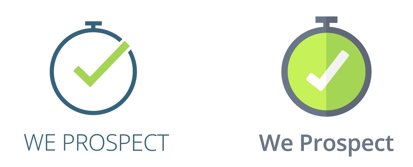
1. Logo Concept
This logo proposal is a merged stopwatch with a check icon. The stopwatch is a watch whose accuracy has been checked and certified, the fusion of both elements symbolizes the efficiency and effectiveness with which the company works. Bringing projects to fruition and returning a monetary value, represented through the green color of the logo.
For the logo typography, a sans serif font is used. Sans serif fonts are clean, modern, and attractive. They are used by brands that want to demonstrate a direct, simple, and meaningful attitude. The practical and straightforward nature of sans serif fonts makes them perfect for brands that want to put clarity first and not distract the view with decorative elements.
The top logo is a minimalist proposal that through its simplicity, denotes seriousness and neatness. Then the second proposal is a variant of the logo with full color, which gives it more strength and visibility.
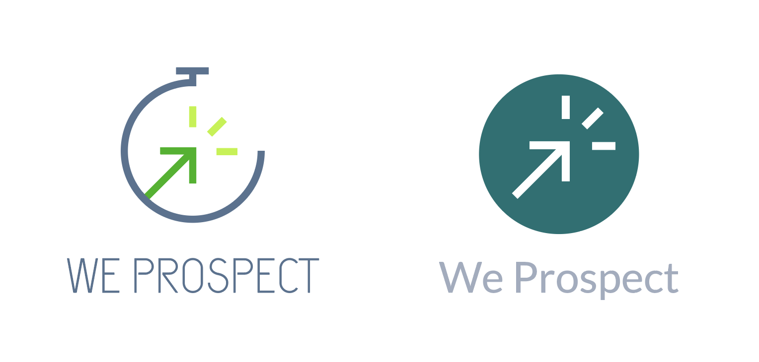
2. Logo Concept
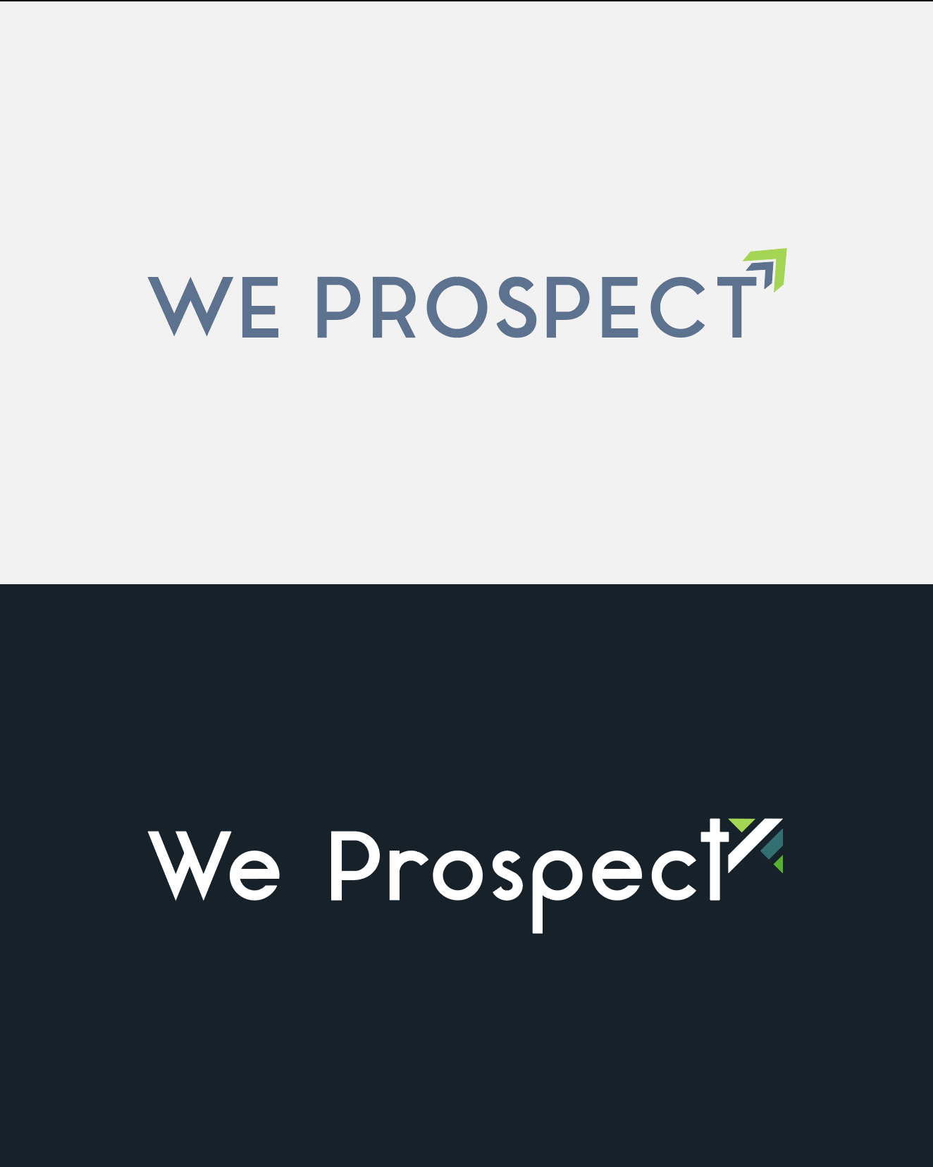
This logo proposal is a chronometer fused with an arrow pointing to the upper right, which according to semiotics denotes positivism and excellent results. The fusion of these two elements symbolizes productivity and efficiency when working, obtaining monetarily positive results, effectively represented with the use of green colors.
The top logo is a minimalist proposal that through its simplicity, denotes seriousness and neatness. Then the second proposal is a variant of the logo with full color, which gives it more strength and visibility.
3. Logo Concept
This logo proposal is a chronometer fused with a lightning bolt, which represents strength, energy, and speed. The fusion of these two elements symbolizes speed and power at the time of carrying out a project.
The top logo is a minimalist proposal that through its simplicity, denotes seriousness and neatness. Then the second proposal is a variant of the logo with full color, which gives it more strength and visibility.
Regarding the color of this proposal, yellow stimulates eyesight and acts on the nervous system. It is linked to mental activity and creative inspiration as it awakens the intellect and acts as an energizer.
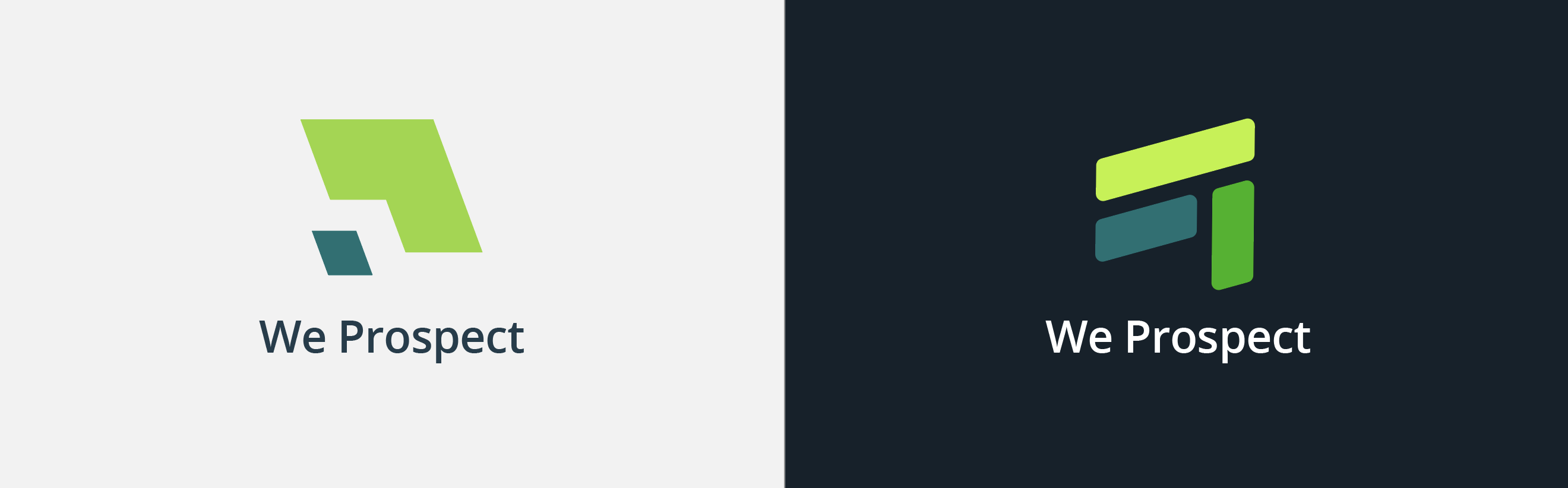
4. Logo Concept
The first proposal symbolizes the projection of a plane, generating an imaginary channel between both parties. Each of the sections represents an actor in the prospecting process. The projection is sectioned in such a way that a complement is generated between the two parts, and a link is created that transcends from one area to another of the logo.
The second proposal represents three planes that are part of the prospecting process, these three planes point to the future, tilted slightly upwards. The inclination alludes to the positivism that this process entails and its ascending completion. In addition, the ascending planes form an arrow, which is also pointing up.
Regarding color, green usually has a tremendously positive set of connotations in the human psyche. First of all, it is linked to birth, life, strength, and energy. It is a color deeply associated with economic growth: it is a symbol of wealth. In addition, as tradition says, green is also the color of hope, optimism, and good luck. Finally, it is one of the colors most linked to the idea of balance, serenity, and calm.
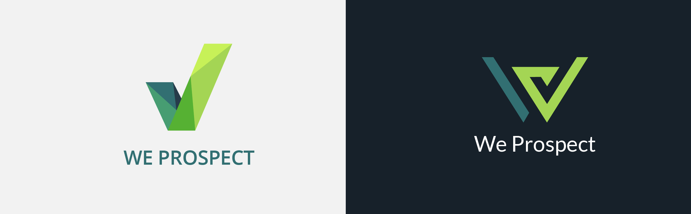
5. Logo Concept
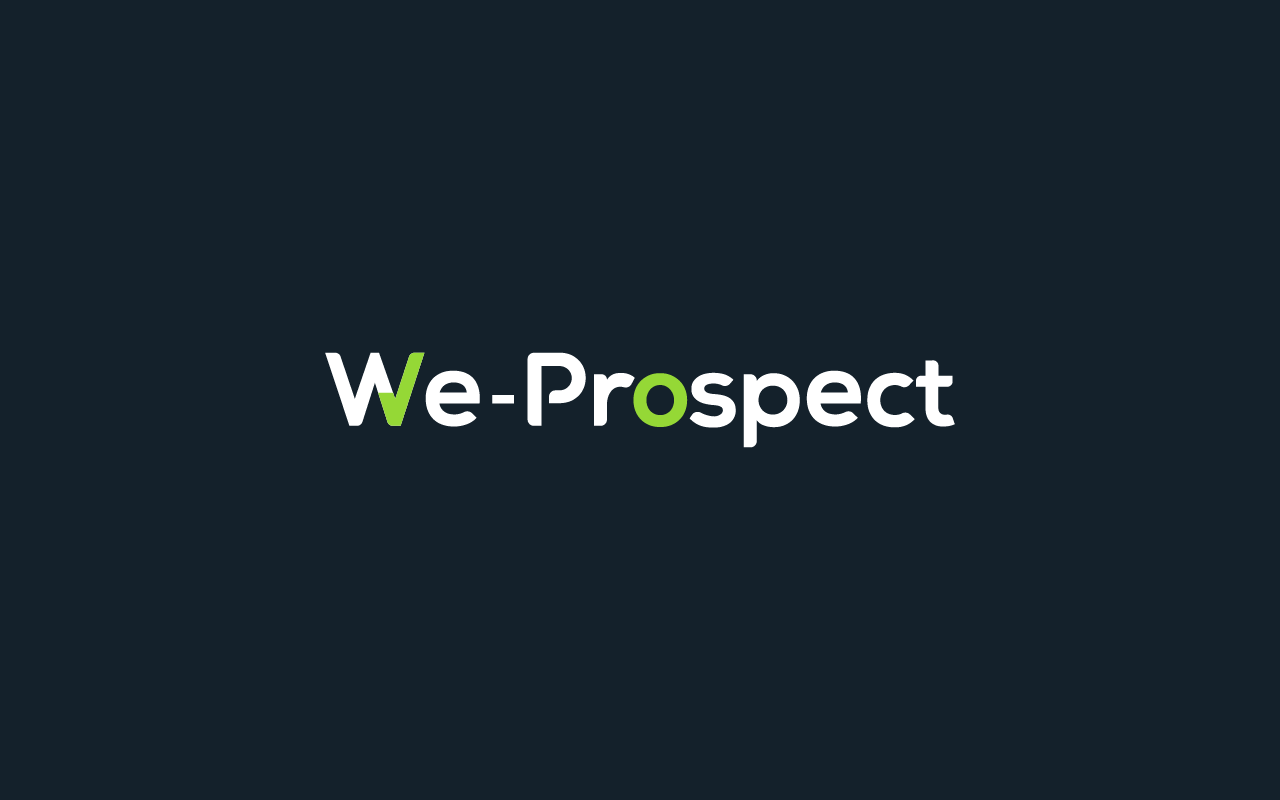
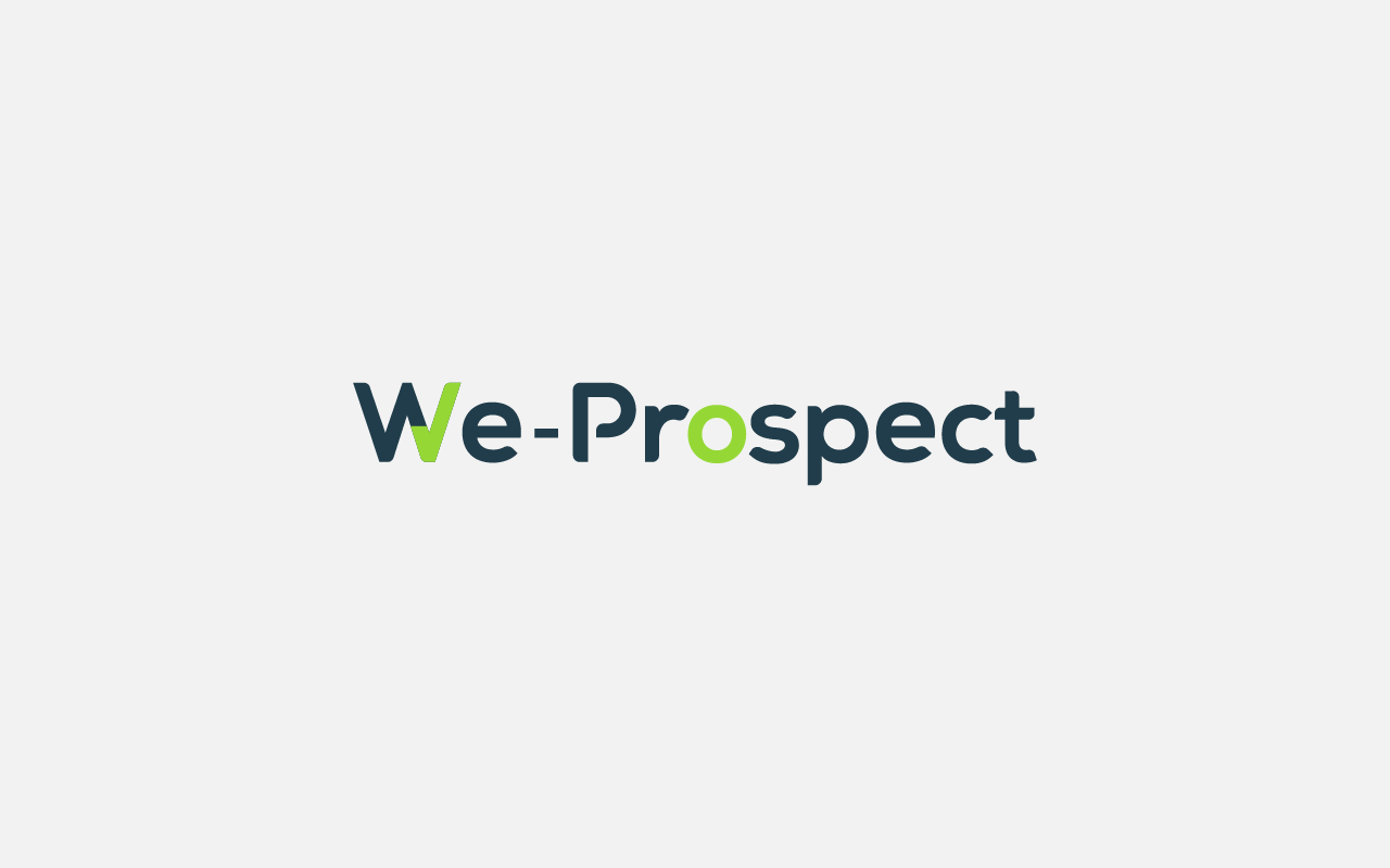
The first proposal refers directly to the check symbol, which represents effectiveness, finishing tasks, and finishing processes. The pattern that is filling the shape is made up of planes and diagonals, which symbolize parts of the process of prospecting and development of the project, with different nuances that go from the darkest to the most illuminated area that symbolizes the successful completion of the process.
The second proposal refers to the W of We Prospect mixed with a check symbol, which we previously defined.
For the logo typography, a sans serif font is used. Sans serif fonts are clean, modern, and attractive. They are used by brands that want to demonstrate a direct, simple, and meaningful attitude. The practical and straightforward nature of sans serif fonts makes them perfect for brands that want to put clarity first and not distract the view with decorative elements.
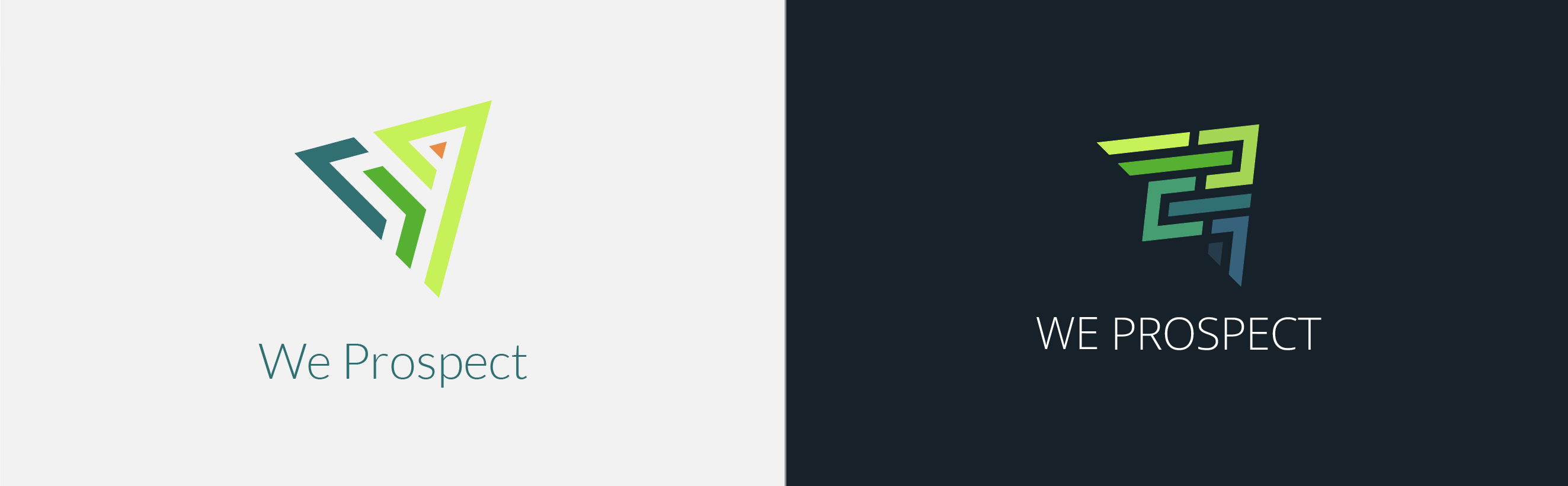
6. Logo Concept
This proposal represents an upward arrow, sectioned to form a simplified maze so that it is easy to navigate. This refers directly to the cumbersome process that companies have to carry out in their prospecting process and that We Prospect simplifies for them, which is why the labyrinth ends with a brighter color to the upper right of the logo.
On the other hand, this labyrinth simulates the shape of an arrow that is pointing towards the future, points upwards, towards the completion of the process, which in addition to the above proposal is symbolized with the color orange, which is a creativity stimulant.
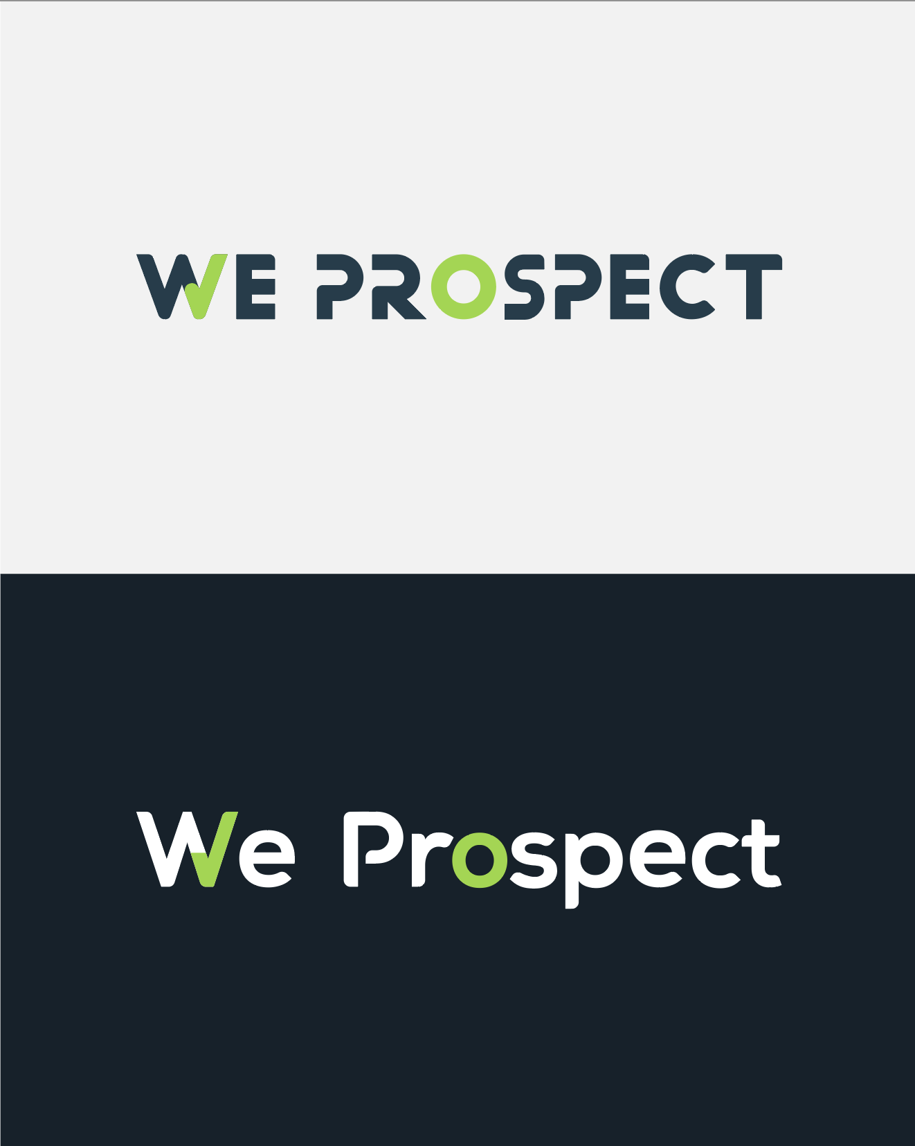
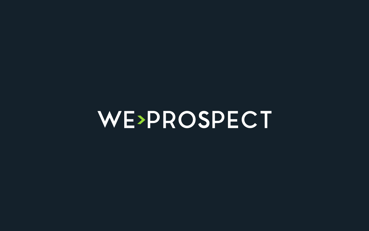
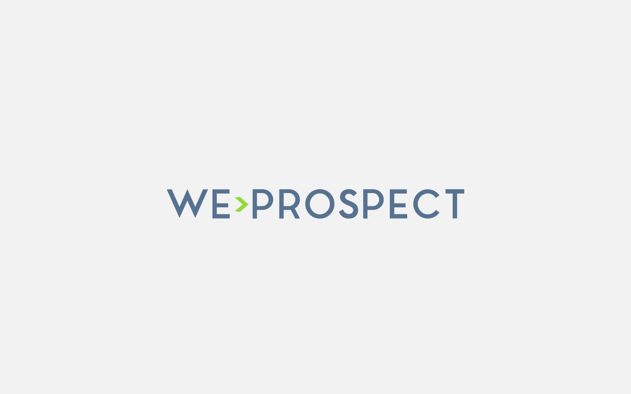
7. Logo Concept
The proposal here is organized and structured typography accompanied by an arrow symbol that represents effectiveness.
Sans serif fonts are clean, modern, and attractive. They are used by brands that want to demonstrate a direct, simple, and meaningful attitude. When it comes to typography in logo design, sans serif solutions indicate a sense of honesty and sensitivity.
The practical and straightforward nature of sans serif fonts makes them perfect for brands that want to put clarity first. Often, these typefaces are found in clothing brands, technology companies, and companies that focus on the ideals and future-oriented brand goals.
In the last proposal integrates the check symbol in the W of the logo. This, in addition to the color related to monetary effectiveness, denotes efficiency when organizing projects and tasks.
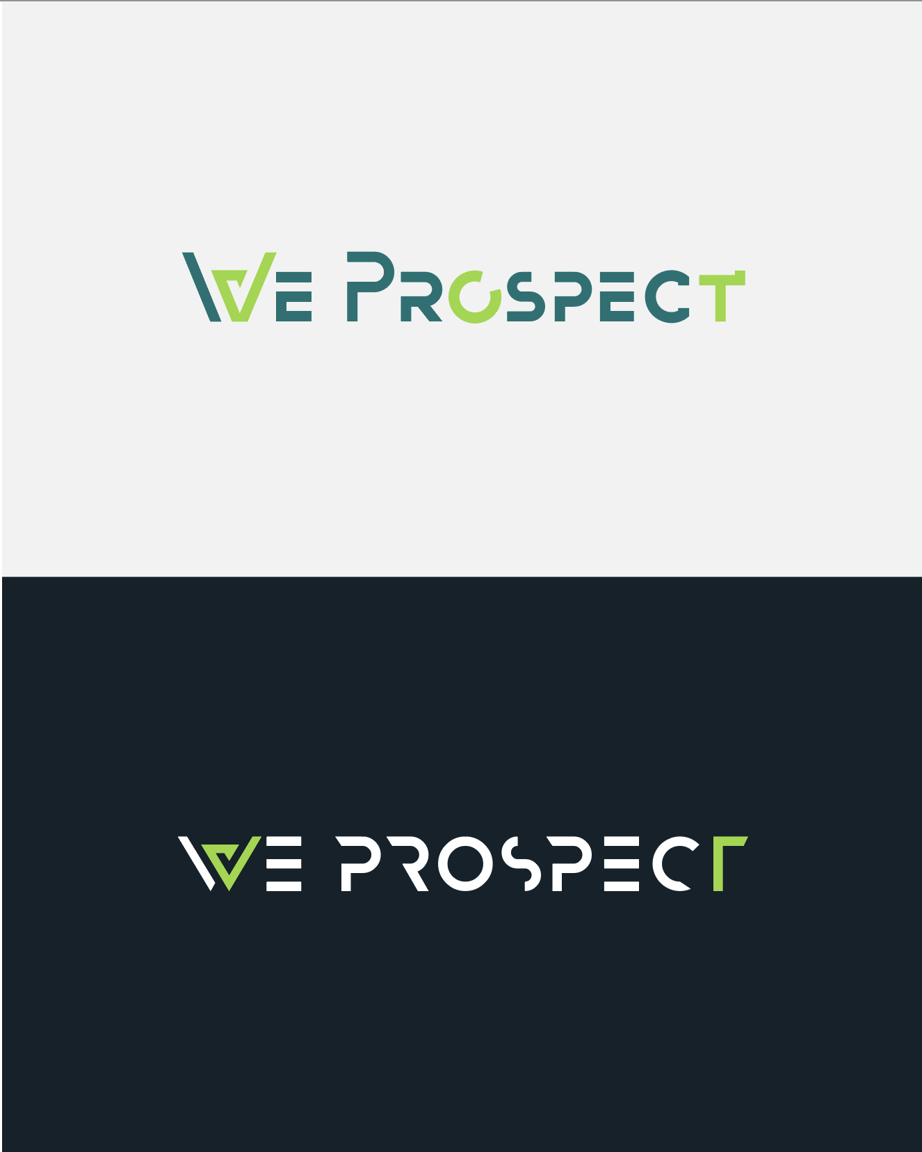
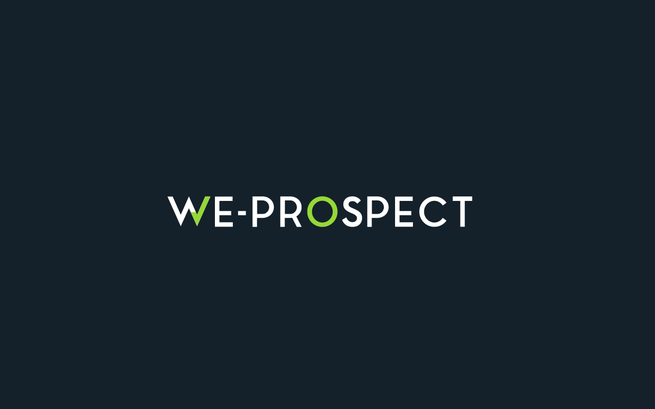
8. Logo concept
The proposal is an organized and structured typeface accompanied by an arrow symbol that represents the effectiveness also served through the color in the logo.
The circle marked with color is associated with perfection, equality, lack of division, or distinction. With no beginning, no end.
At the level of color, we have the use of green, which projects an image of trust, loyalty, stability, seriousness, and intelligence.
Sans serif fonts are clean, modern, and attractive. They demonstrate a direct, simple, and meaningful attitude. The practical and straightforward nature of sans serif fonts makes them perfect for brands that want to put clarity first.

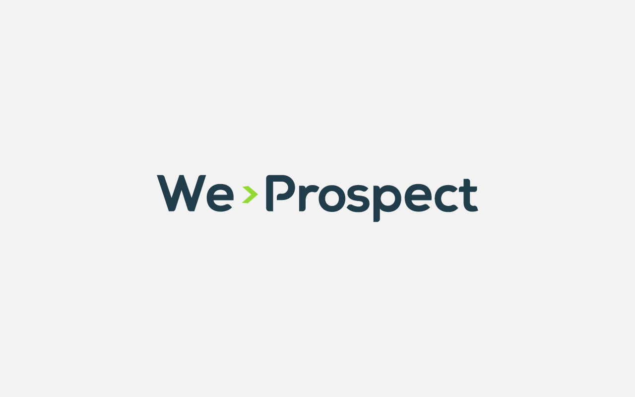
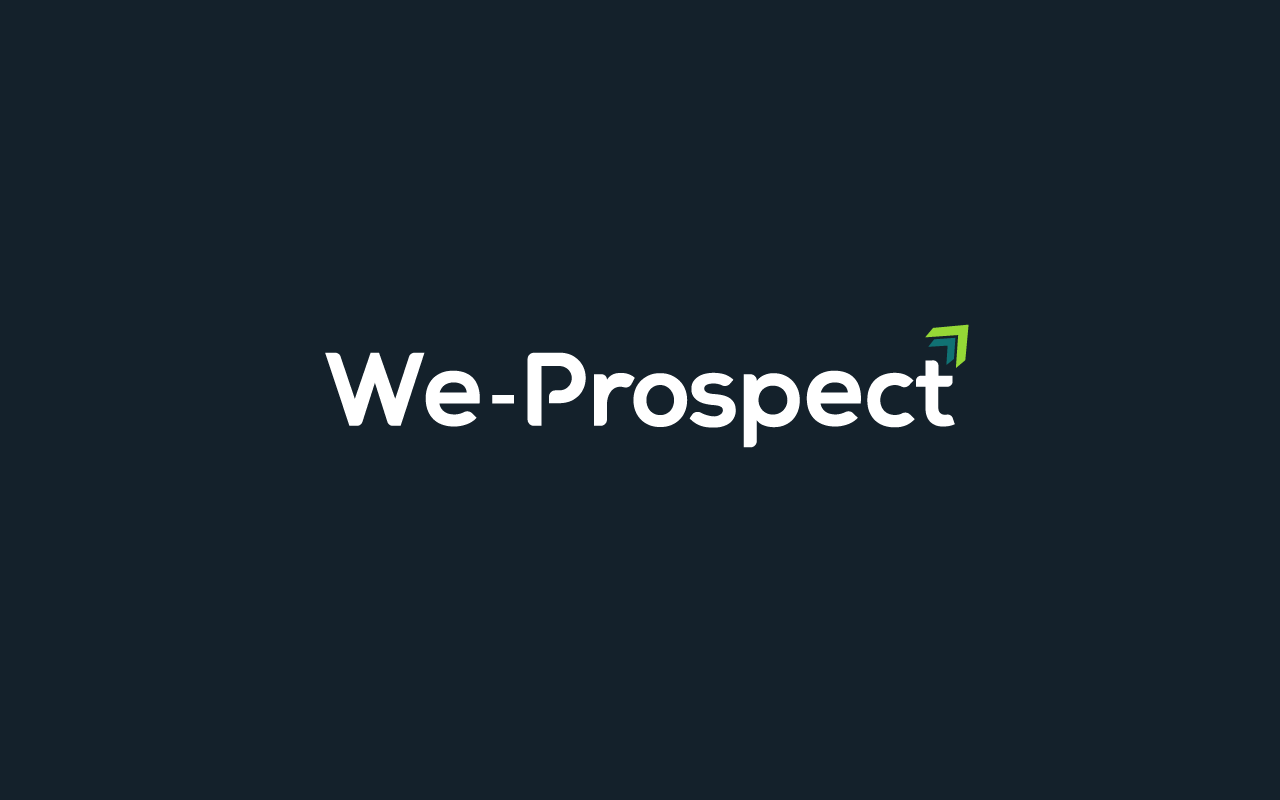
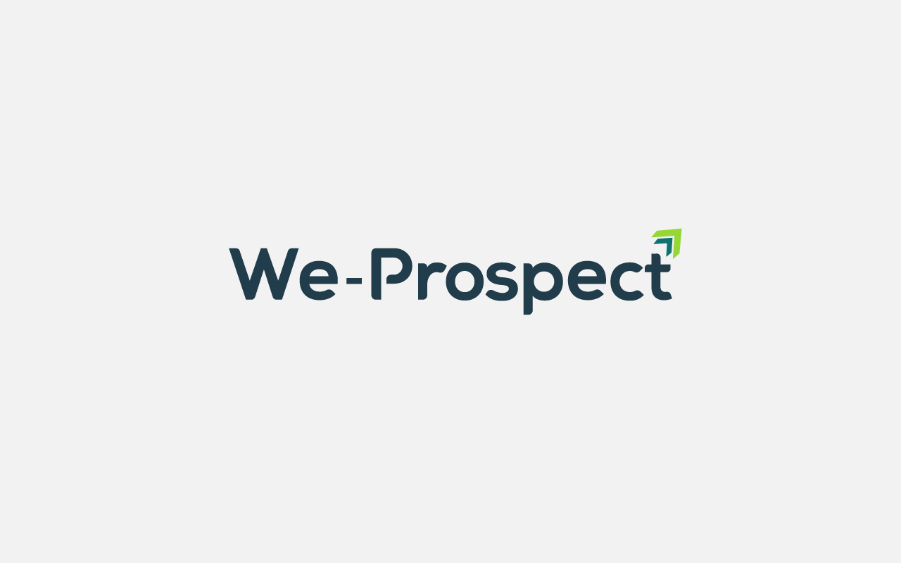
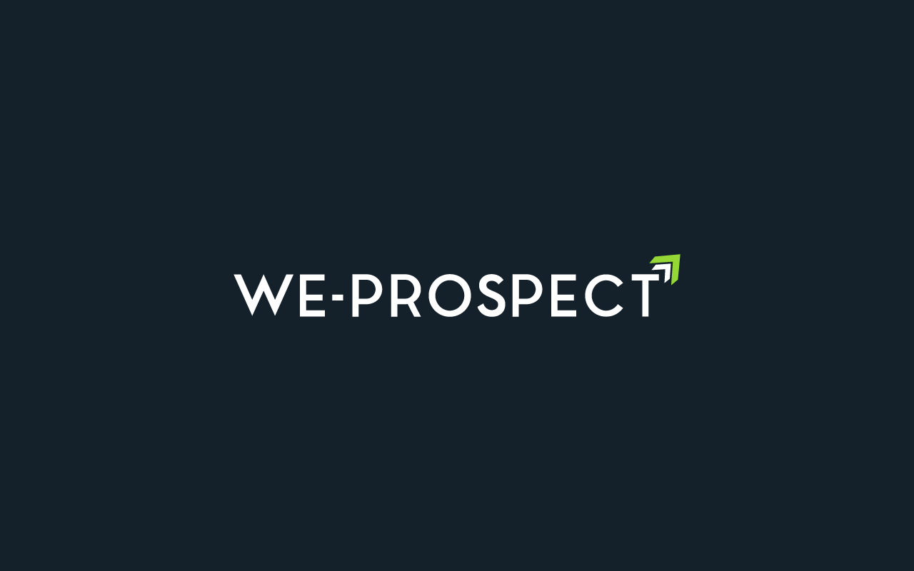
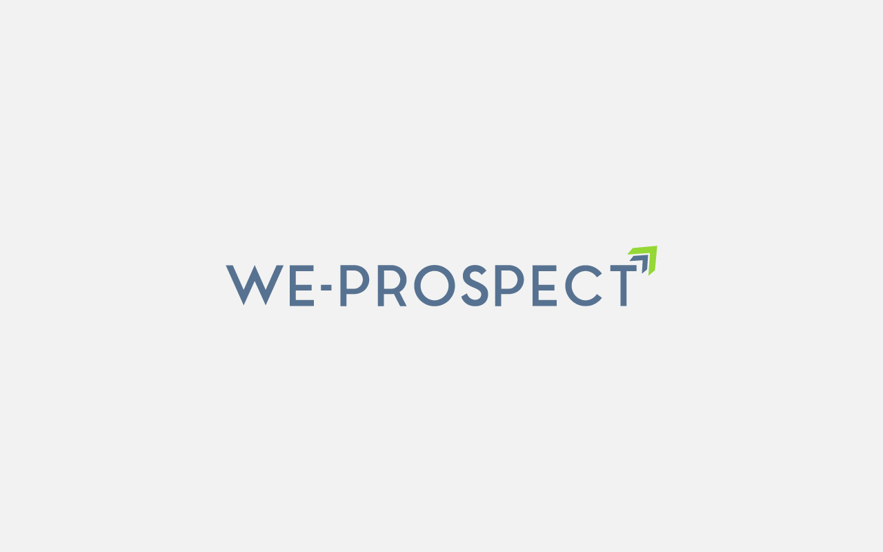
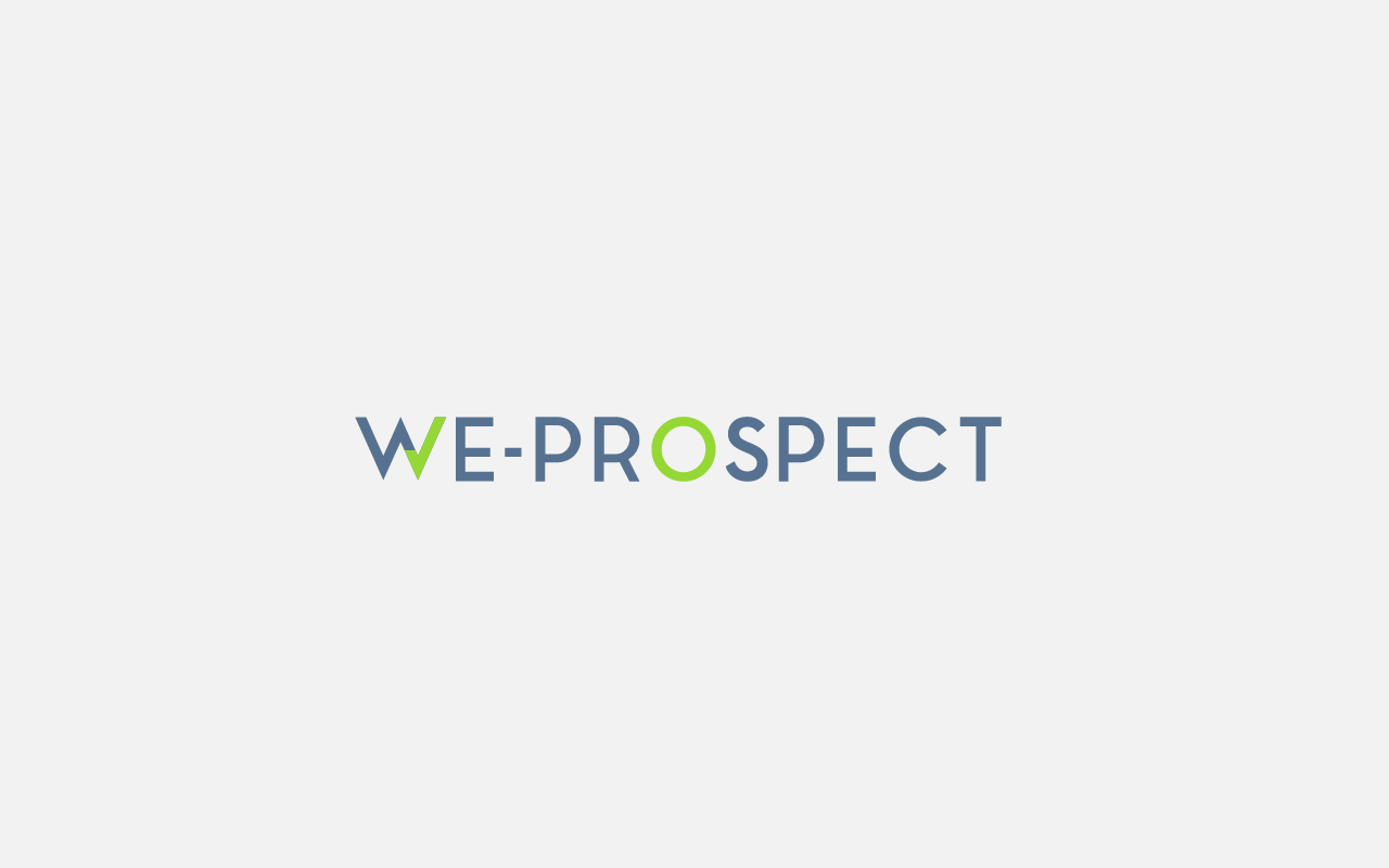
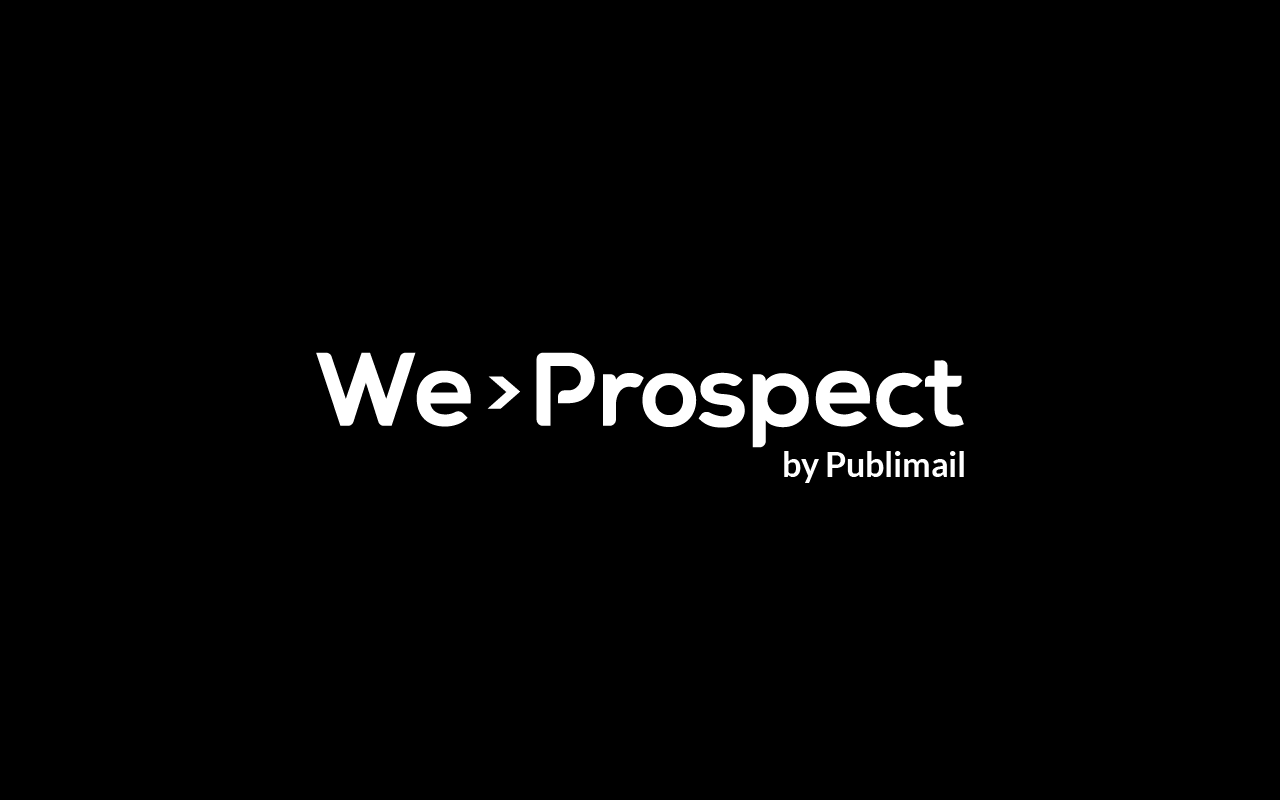
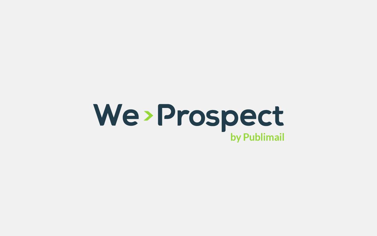
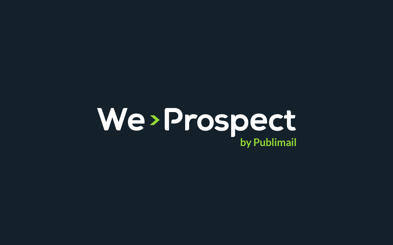
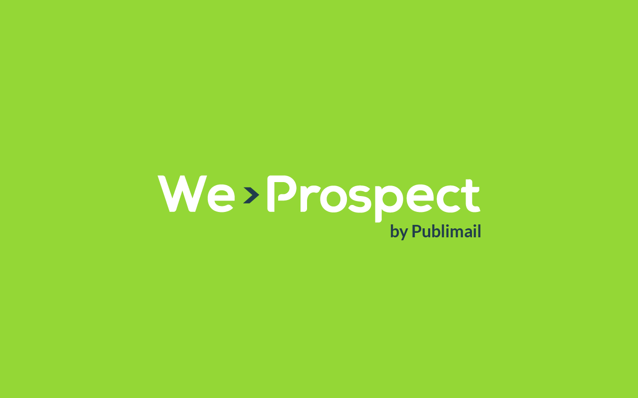
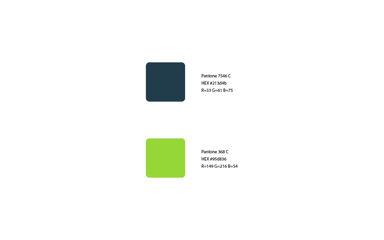
Chosen Logo
We-Prospect logo is constructed by an organized and structured typeface accompanied by an arrow symbol that represents the effectiveness and efficiency with which we work.
Sans serif fonts are clean, modern, and attractive. They demonstrate a direct, meaningful, and straightforward attitude. The practical and honest nature of sans serif fonts makes them perfect for brands that want to put clarity first.
At the level of color, we have the use of blue and green, which project an image of trust, loyalty, stability, seriousness, and intelligence.