
About XMS
XMS Business Solutions IT services company specialized in the implementation of Microsoft solutions for the digital transformation of companies, business enhancement, and data management, among many other things.
The objective of the XMS identity is to be a visit as a reliable, honest, authentic brand, with something to contribute, with a positive vision of the world, with character and that takes over. With a statement of intent, do things right and have a positive impact.
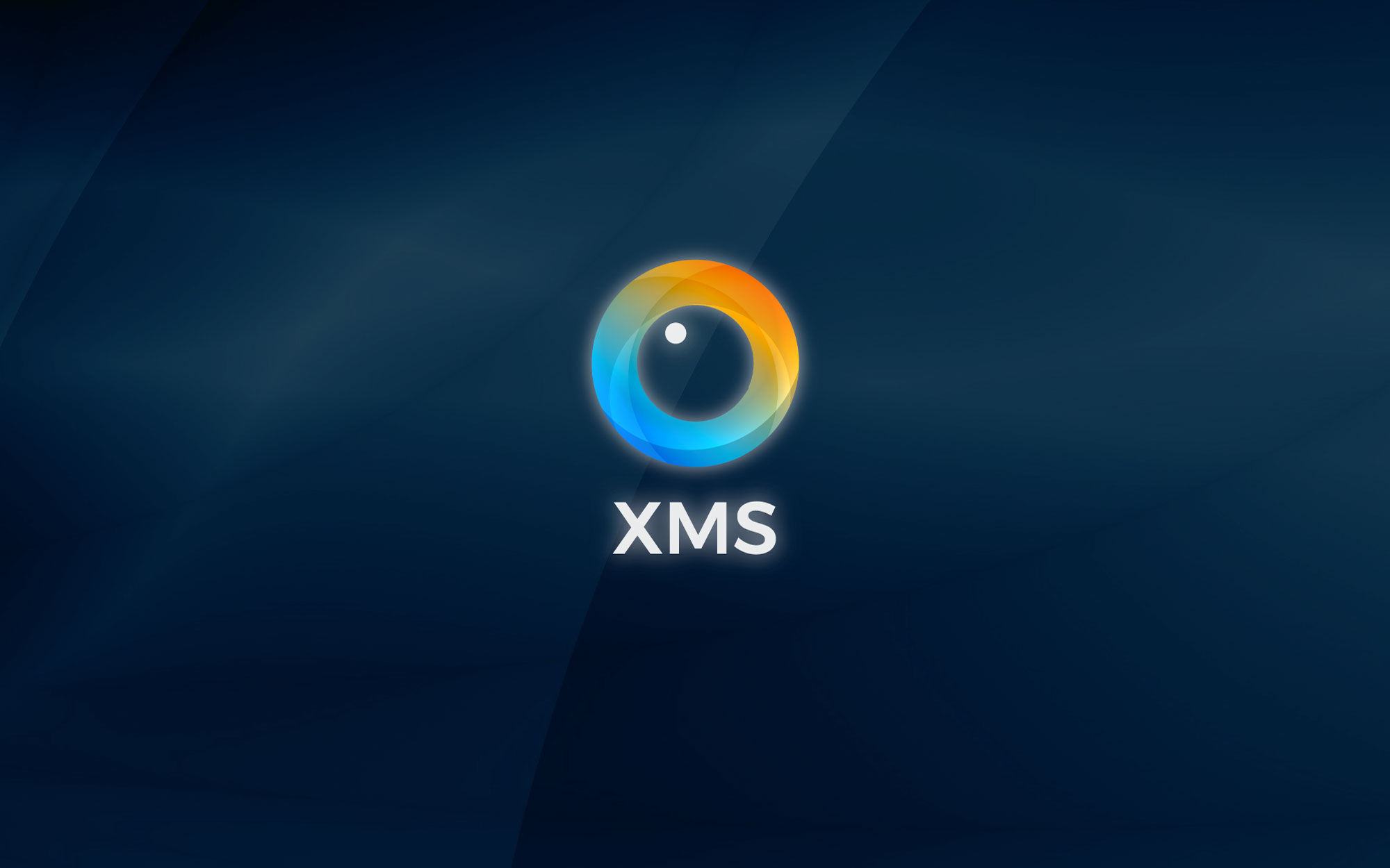
The identity of XMS Business Solutions is the abstraction of the eye with which XMS observes and communicates. The logo looks at you with an ethereal look, demonstrating transparency and innocence; the identity of XMS is circular.
The circular shape of this logo is memorization and strength; the circle is associated with perfection, equality, lack of division, or distinction. I have no beginning, no end, the ring is also a sign of God, of the eternal and protection.
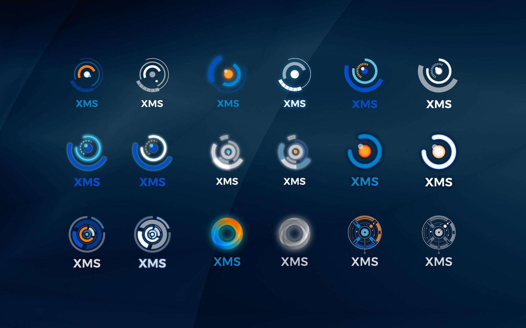
Logo proposal process
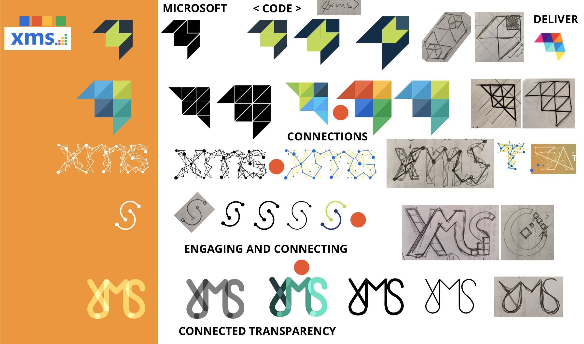
Conceptualization Logo 1
This logo is the abstraction of the connections between letters, this connection produces a constant flow that goes from beginning to end of the brand, symbolizing the link that the brand has with its customers, also the connection with technology and continuous development.
This logo also represents transparency and honesty, symbolized through the intersections that link the letters of the logo. This proposal is reinforced through the colors used. In this sense, green has tremendously positive connotations in the human psyche, it is linked to birth, life, strength, and energy.
Green represents the birth of this new brand and is a statement of the values that XMS is building.
Conceptualization Logo 2
This logo is the abstraction of the commitment, the connection between two parties, creation of a connected world, also supported by colors. This proposal is the commitment that XMS wants to show to the world, to educate through development, connect people with Better technological solutions.
This logo also represents the cyclic flow and the perfect fit between parts, with blue as the base, supporting and stabilizing the figure, green looks to the future and projects optimism. The colors selected represent the maturity and experience that XMS possesses, the blue base presents calm and serenity, and the green gives it life and strength.
Conceptualization Logo 3
This proposal is the faithful representation of the promise of XMS, “We Deliver”. The delivery of products and services of the best quality and on time. The promise of always delivering the best is represented by an airplane and reinforced by the selected colors. Moving the cornerstone of XMS, the proposal combines four colors, the colors of freshness, optimism, maturity, and responsibility.
The celestial tone means, in this type of activities, peace, relaxation, freedom, freshness, and fullness, ideal to control or lower the intensity of emotions. Green is the color associated with nature, so is healing and healing, freshness. In addition, as tradition says, green is also the color of hope, optimism and good luck. Blue is usually linked to introspection, tolerance, serenity, and calm. The turquoise projects an image of trust, loyalty, stability, seriousness, intelligence, and generosity.
Conceptualization Logo 4
This logo is the representation of the globalized world through the three letters of the logo, the connections between letters through the color blue and the link and contact between other points within the brand is represented by yellow. All this set of connections symbolize through color and form energy and calm, movement and stillness, union and segregation of the parts.
We live in a globalized world that needs a connecting entity, needs that energy and technological commitment, so that we can all live in a better and more connected world with technology, XMS is that commitment, it is the pivot between software development and client, who through experience delivers the best solutions.
Next Stage
Conceptualization Logo 5
This logo is a target, an electronic eye. With which XMS observes and communicates at the same time, it is a goal that ethereally points to market objectives. This logo is also a circle that represents the open eye of God, whose purpose is a revelation. Wrapped in three circles, alluding to the trinity of the body, the mind, and the soul, where the soul would be the inner circle, the intellect the central circle and the outer circle represents the person, his body.
This proposal is reinforced through the colors used. In this sense, green has tremendously positive connotations in the human psyche; it is linked to birth, life, strength, and energy. Green represents the birth of this new brand and is a statement of the values that XMS is building.
Conceptualization Logo 6
This logo is the abstraction of the target presented above; it is also an enclosed circle, symbolizing technological processes, their movement similar to the focus of a camera lens. That observes the future, which is highlighted by orange, a color of high strength and energy.
The color blue means, in this type of activities, peace, relaxation, freedom, freshness, and fullness, ideal for controlling or lowering the intensity of emotions. Green is the color associated with nature, so is healing and healing, freshness. Also, as tradition says, green is the color of hope, optimism, and good luck. Blue is usually linked to introspection, tolerance, serenity, and calm. The turquoise projects an image of trust, loyalty, stability, seriousness, intelligence, and generosity.
Conceptualization Logo 7
This proposal is the abstraction of the eye, carried in an organic and circular way. The circle is associated with perfection, equality, absence of division, or distinction. Having neither beginning nor end, the ring is also a sign of God, of the eternal and protection.
The circle also symbolizes the vast sky. The ring symbolizes celestial activity, its dynamic insertion in the cosmos, and its ability to relate to the things of the earth.
At the level of color we have the use of turquoise green which projects an image of trust, loyalty, stability, seriousness, intelligence and generosity with a touch of orange that stimulates the mind, renews the illusion in life and is the perfect antidepressant. It is the intellectual force in full swing and in full search of knowledge.
Conceptualization Logo 8
This proposal is the abstraction of the eye, an electronic eye. With which XMS observes and communicates. This logo is also a circle that represents the open eye of God, whose purpose is a revelation. Wrapped in three progressive circles, alluding to the trinity of the body, mind, and soul, where the soul would be the inner circle, the intellect the central circle and the outer circle represents the person, his body.
The circles and cuts of them generate mechanical movements that take the logo to be very dynamic; the logo observes you with an ethereal and innocent look. The upward diagonal symbolizes the future and the projection of growth.
The circular shape of this logo provides memorability and strength; the circle is associated with perfection, equality, lack of division, or distinction. Having neither beginning nor end, the ring is also a sign of God, of the eternal and protection.
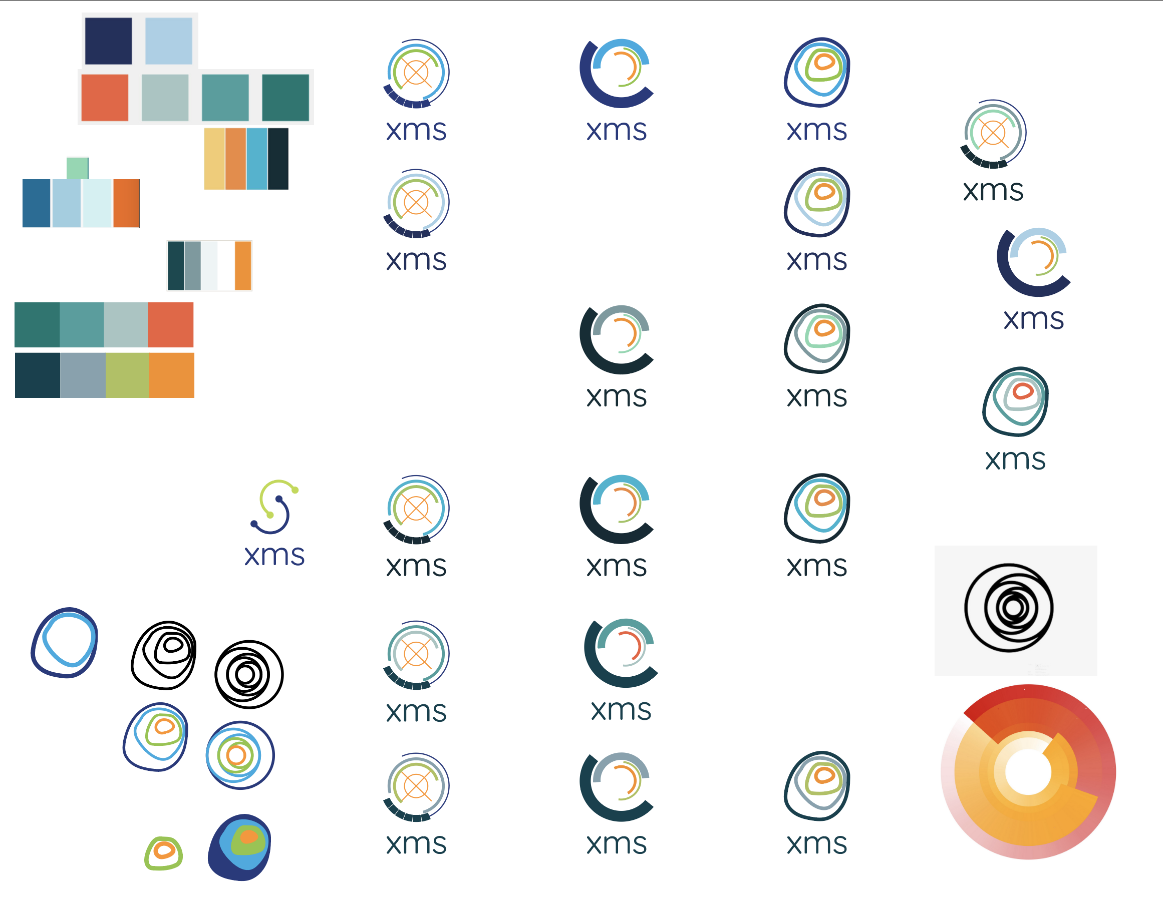
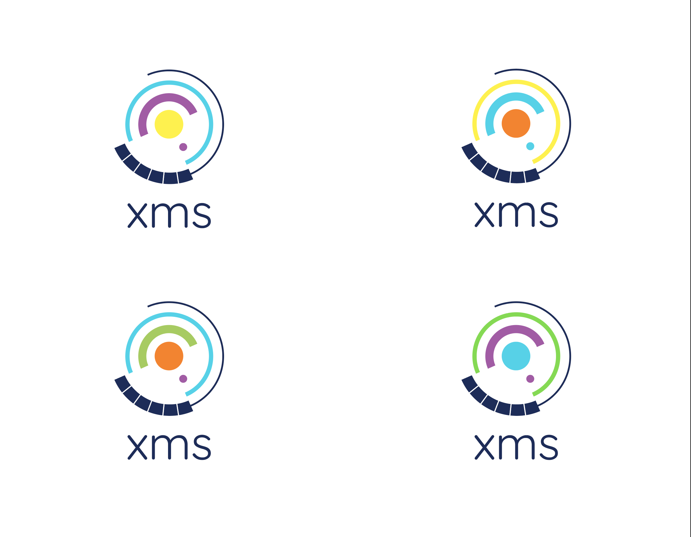
Color tests
The colors are based on XMS solutions, which are directly related to the values and mission of XMS.
Green has tremendously positive connotations in the human psyche; it is linked to birth, life, strength, and energy. In this case, it represents the birth of this new brand.
Purple is associated with nobility, magic, creativity, intellectuality, and spirituality. Stimulates the imagination and inspires high ideals. It is an introspective color that allows us to get in touch with our deepest thoughts.
The light blue is peace, relaxation, freedom, freshness, and fullness, ideal for controlling or lowering the intensity of emotions. Project an image of trust, loyalty, stability, seriousness, intelligence, and generosity.
Blue represents the maturity and experience that XMS has, the base blue supports and stabilizes the isotype. It symbolizes calm and serenity, introspection, tolerance, serenity, and calm.
Orange represents joy, enthusiasm, and fun. It stimulates the mind and is the perfect antidepressant. It is the intellectual force in full swing and in full search of knowledge. It brings well-being and good humor.
Yellow is known as a color that brings happiness and intuition. It is a bright and cheerful color that is associated with the intellectual part of the mind and the expression of feelings and thoughts.
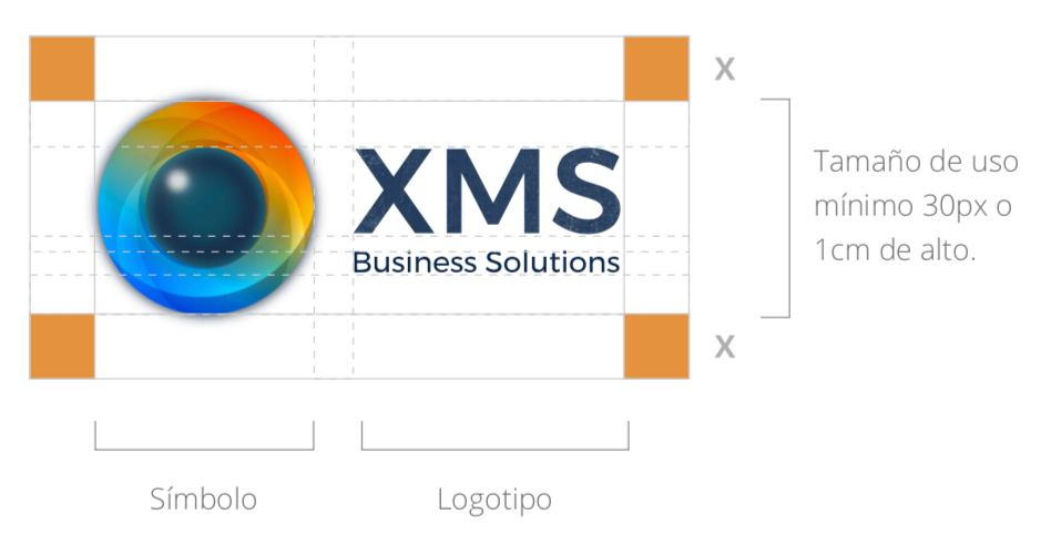
Corporate Identity
A corporate identity manual is an essential tool to manage how the brand is expressed through the elements and signs that allow consumers to recognize it.
This document contemplates the rules that must be followed to include a brand’s logo, as well as the different visual elements that make it up.
The main objective is to guarantee the correct application of the logo and its symbology, and the consistency of its expression in all types of media, both graphic, physical, audiovisual, or interactive.
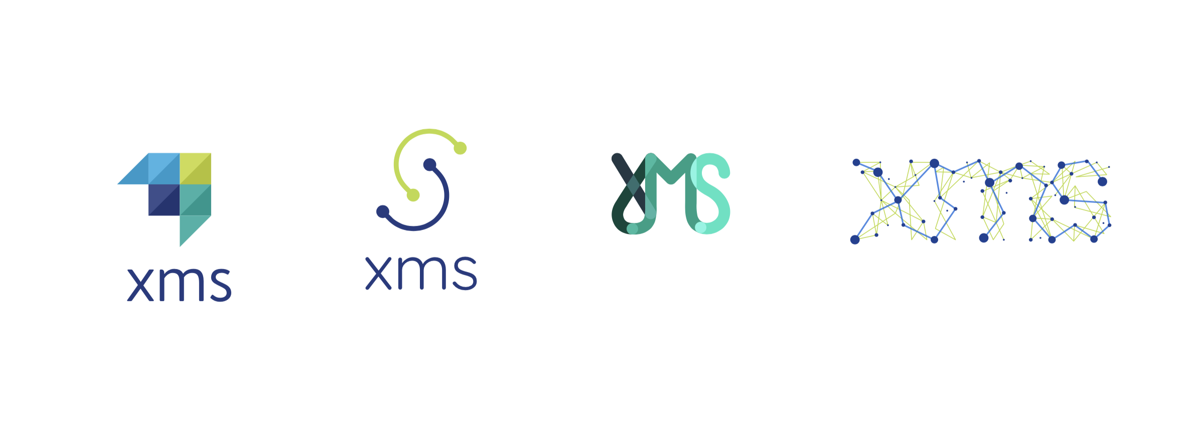
Chosen Logo
The XMS brand is built based on a symbol, a logo, and corporate colors that must be respected for its correct use.
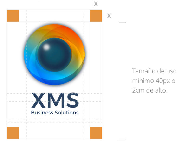
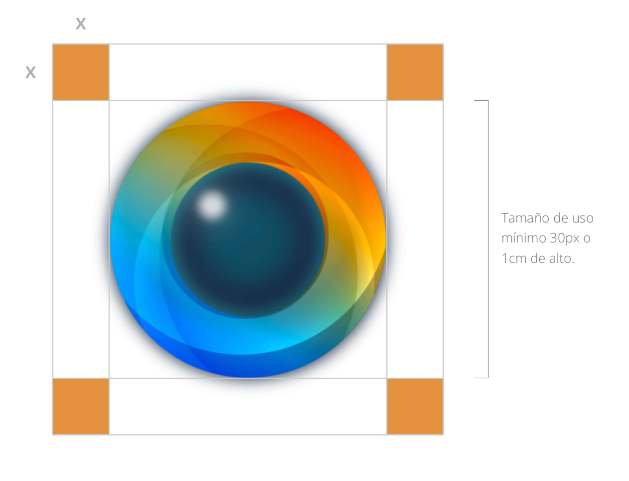
MINIMUM SIZES
A security area has been determined that establishes a minimum distance from the texts and graphic elements equivalent to the logo symbol itself. This will prevent the brand from being invaded by elements that are alien to it.
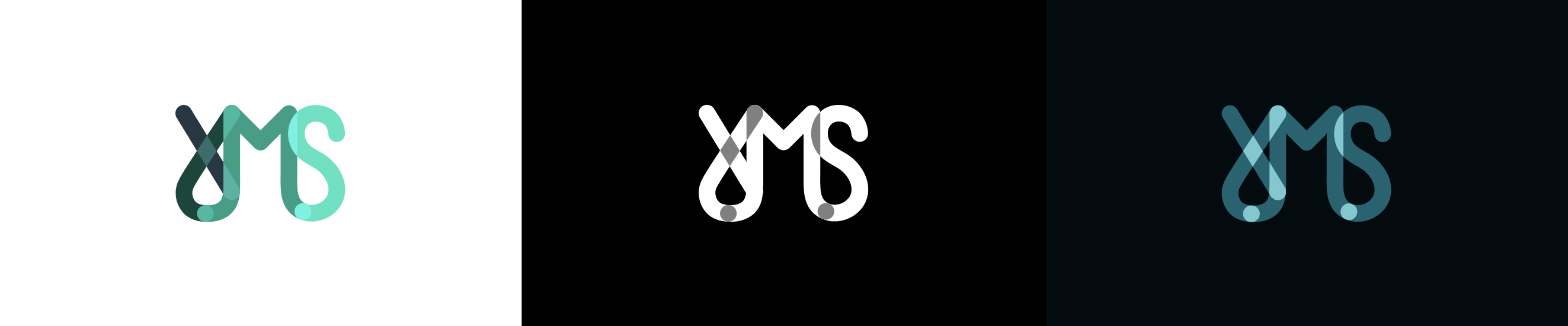
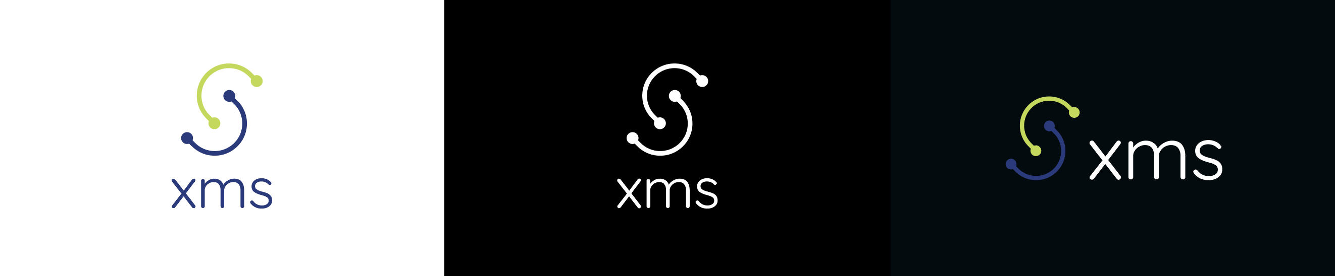
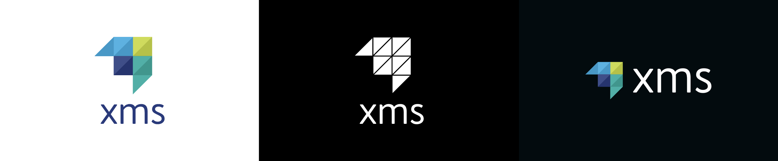
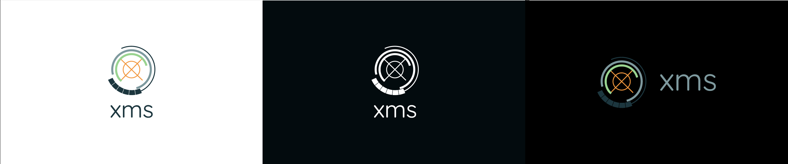
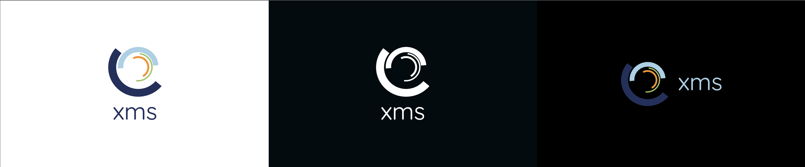
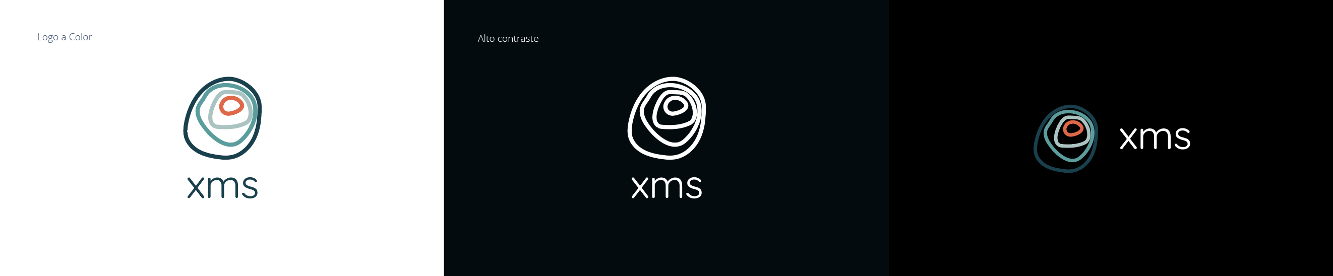
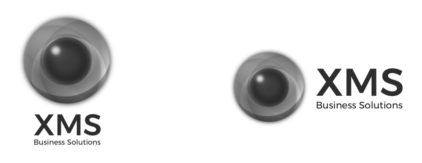
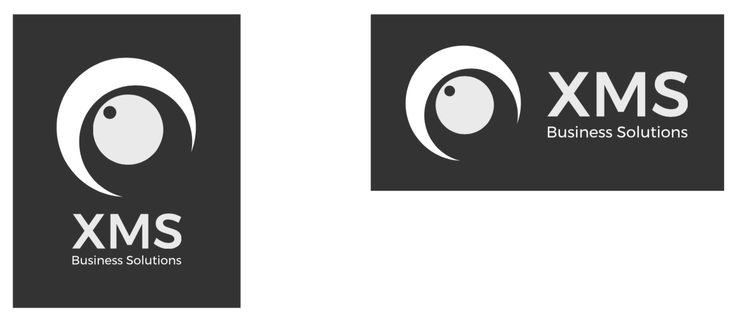
Grayscale and High Contrast Logo
On this page, the versions of the logo are presented when the color logo cannot be applied. They can also be used when there are technical restrictions that prevent the use of the preferred alternative.
The grayscale version is established for use in reproduction systems that do not allow the printing of colors but do support the use of grays.
Besides, the pen version of the brand is established. This only admits flat colors and should be used only for printing systems that do not allow the use of colors or gray.
Isotype
The isotype is the symbolic or iconic part of a logo. That is, the “icon” or “drawing.” It is used to represent a logo in a simplified way.
At a glance, the isotype reminds you of the brand, identifies it. You have to consider that in new brands you need more time to enter the minds of users, but then, it works very well independently and is very visual and powerful.
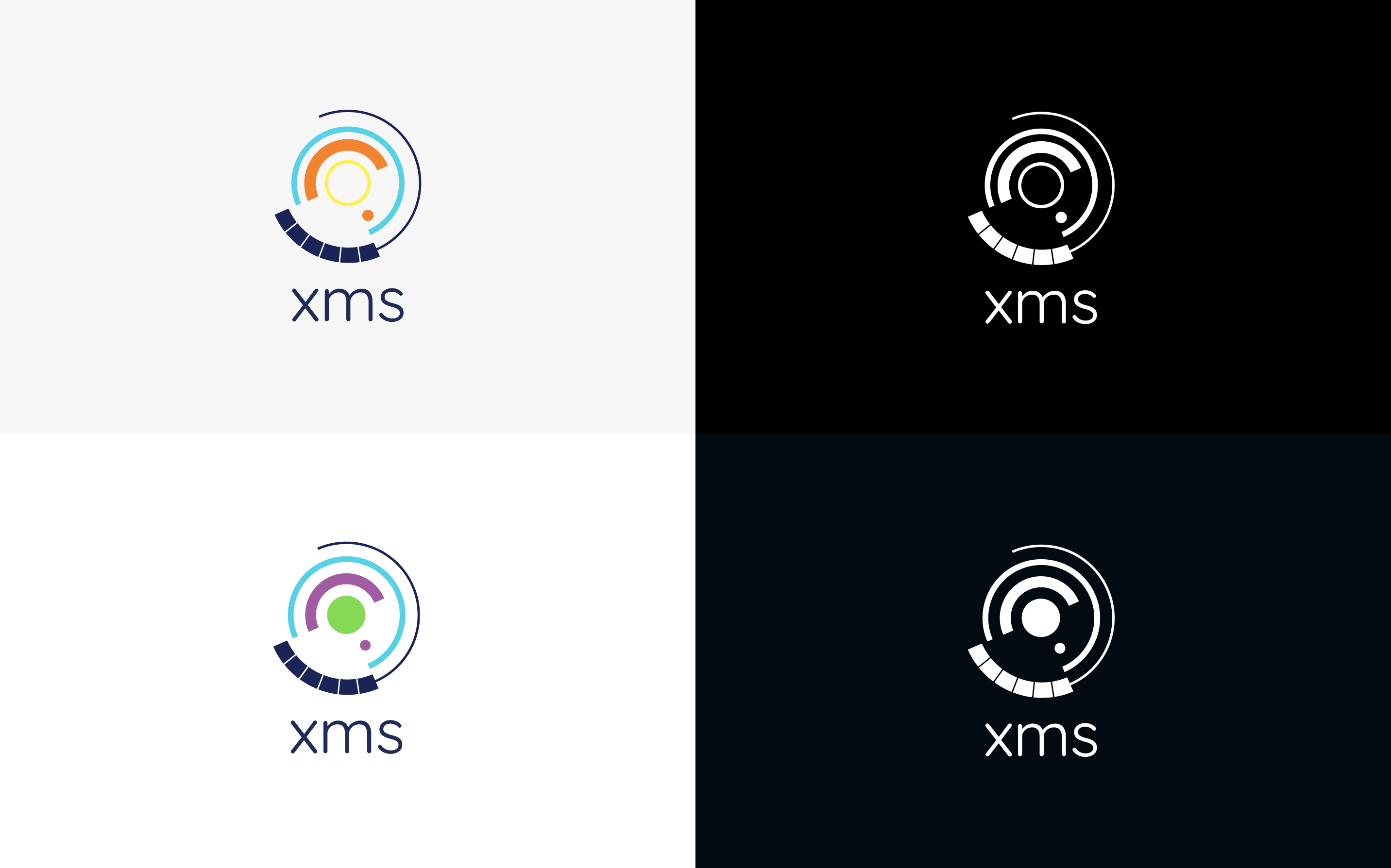
Background variations
Here the uses of color in the brand are presented, according to the context in which it is located and the particularities of the piece of communication in which it is working, you can choose the version of the logo that best suits the needs.
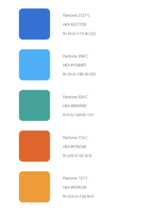
Color palette
The XMS color references are the Pantones specified here. If the printing conditions do not allow its use, the logo may be printed in four colors or black.
For digital use, it is recommended to use Hexadecimal colors or else RGB.
Blue represents the maturity and experience that XMS has, the base blue supports and stabilizes the isotype. It symbolizes calm and serenity, introspection, tolerance, serenity, and calm.
Orange represents joy, enthusiasm, and fun. It stimulates the mind and is the perfect antidepressant. It is the intellectual force in full swing and a comprehensive search of knowledge. It brings well-being and good humor.
The color references are the HEX, RGB, and Pantone specified here.
If the printing conditions do not allow its use, the logo may be printed in four colors or black.
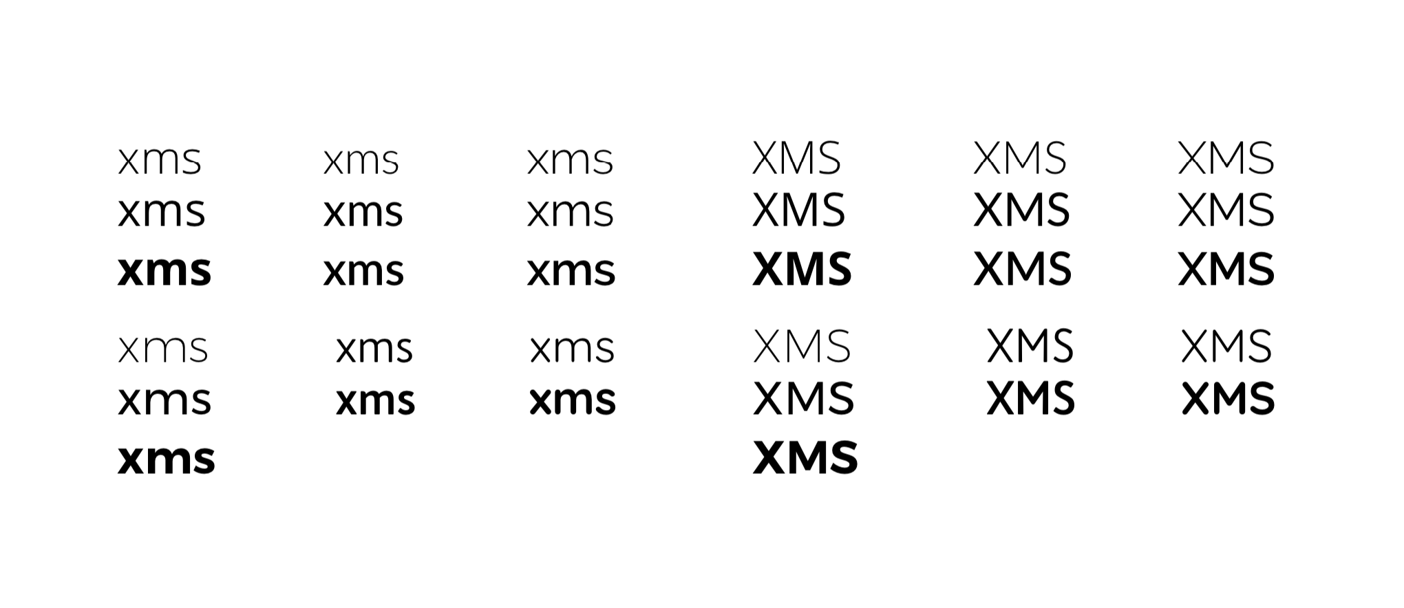
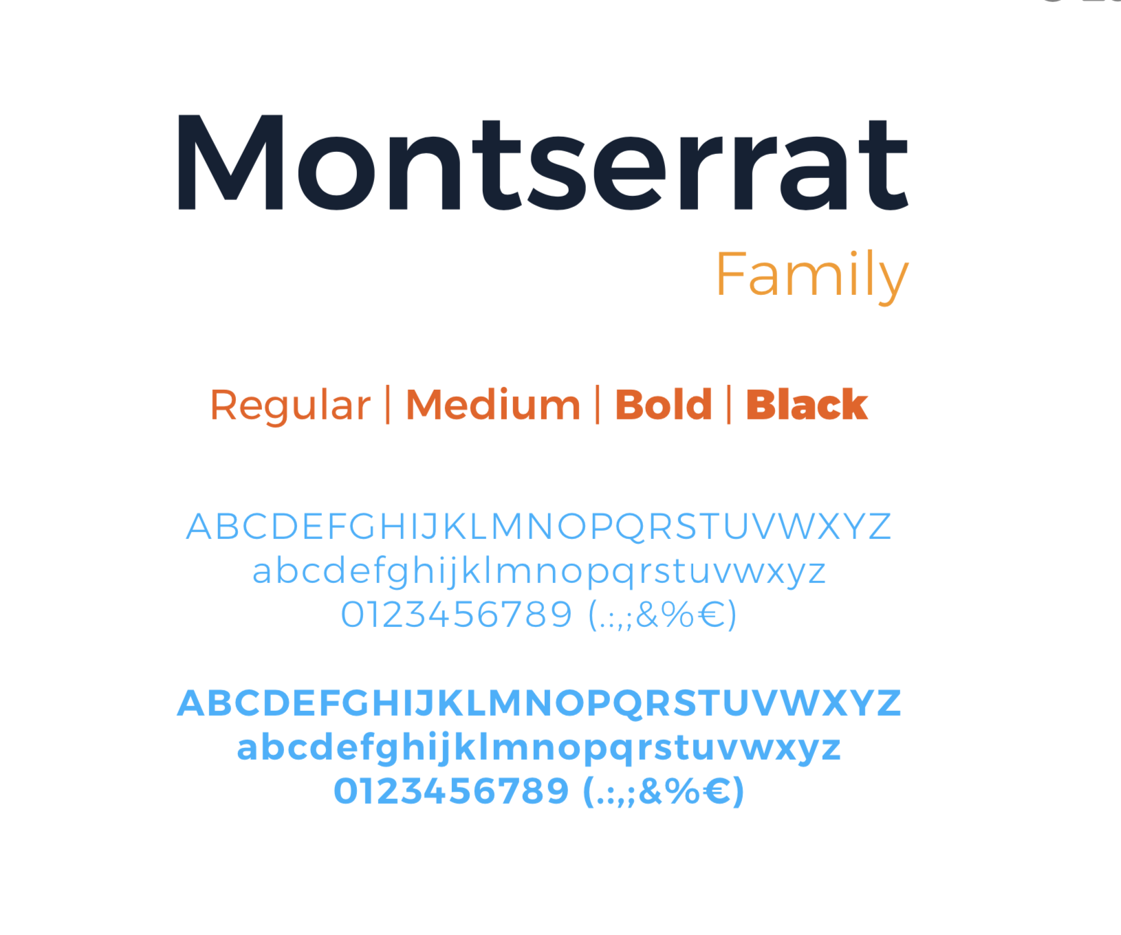
Typography
Corporate typography is the Montserrat family in its Light, Regular, Bold, Black versions. Studios and design agencies will use this.
Recommended for use in titles and headings. As complementary typography, Open Sans will be used for text bodies and more great content.
For media or applications that, for technical reasons, do not allow the use of corporate typography, for example on the Web page, or the texts edited by the company, the Open Sans typography will be used.
► VIEW THE BRAND IDENTITY MANUAL