
When developing a corporate image we consider many different associations with elements, colors, and typography. These connections trigger powerful ideas and emotions; This means choosing the right font, shape, and colors in your logo design help communicate your brand personality.
When the logo design process is finished, we create a logo manual that includes the logo in a black and white version, a grayscale version, and a color version.
About Linkellun
It was born as a need to generate paradigm changes in the way of recruiting and selecting people in the National labor market.
A new model that provides state-of-the-art technology for both companies and individuals, activating the role of the person who becomes visible and promotes their profile, mobilizing the job offer, without intermediaries, at low cost and in real-time.
We are an innovative company that through technology develops and strengthens the processes in recruitment and selection of people online, speeding up the search for work in real-time, the development of people’s skills, and their competitive visibility in the global market, expanding the options job placement.
Naming
Wichan (ally)
athtekun (to fix)
KÜmetunwentetu (top)
Wentu
Kellun (help)
Inkan (defend, help)
Tremen (grow)
aikellun
Innkan
Müpum (Fly)
Mongeten (to be alive)
Acutun (Back)
Rüpu (Path)
Repü (to open a path – wengamen)
lleKü (close)
Ñemün (match)
Kelluwen (contributor)
Reke (comparison)
AiKelluwen
KelluwenTec
KelluwenAi
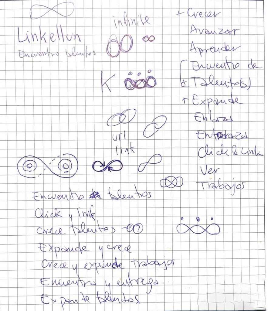
Isotype sketches
It starts with a form, idea, or concept then it is simplified, working, and modifying until reaching a final proposal.
Proposal 1
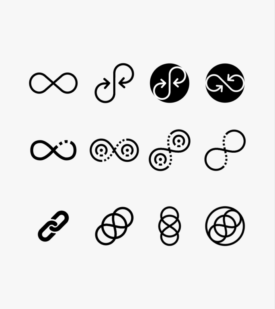
This first proposal begins with the idea of infinity and the connection with constant and recurring work and training that this platform delivers in its value proposition that is represented by arrows.
The concept of infinity can be understood from both the mathematical and the philosophical aspects. The infinite is definable as everything that has no limits, coming from the Latin word infinite, or that has no end.
In terms of color, we have turquoise that is linked to calm, serenity, and peace of mind, as well as mental clarity. It encourages creativity and is associated with balance and emotional stability.
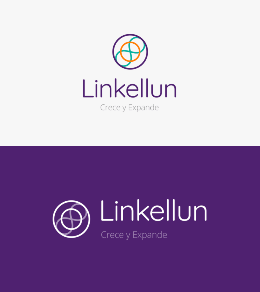
Proposal 2
This proposal begins with the link icon that is sealed with two circles, symbolizing union and selection within the shape. And the infinity icon represents the collaboration and help delivered by the platform.
The circle is one of the most flexible and widely used geometric shapes. It is also synonymous with protection, movement, and adaptability. In some areas, it is also used to transmit social life and creativity.
The primary color of this proposal is purple, it is associated with sensitivity, magic, creativity, intellectuality, and spirituality. Stimulate the imagination and inspire high ideals. It is an introspective color that allows us to get in touch with our deepest thoughts.
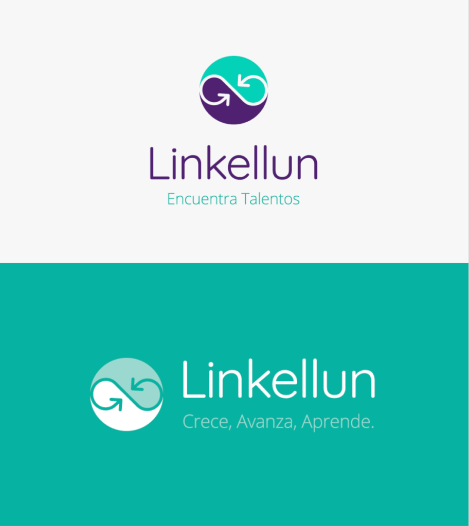
Selected proposal
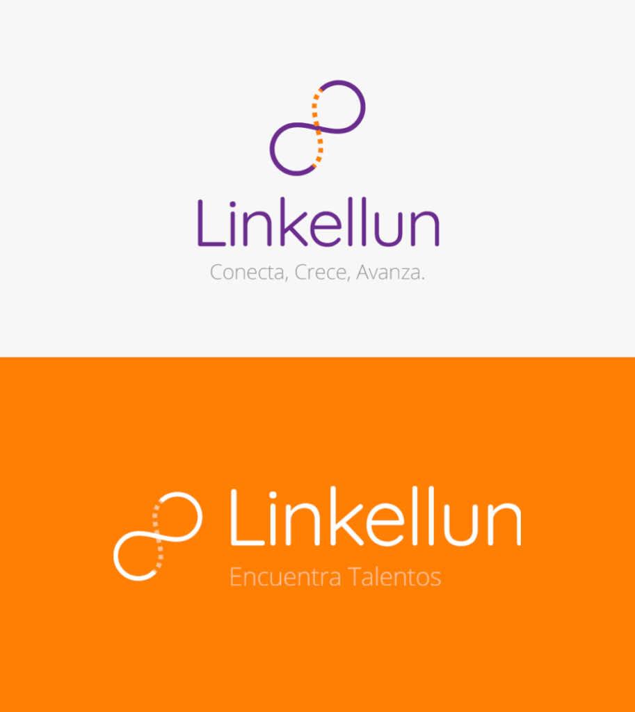
In this proposal, we begin with the infinity icon, which is directly related to the link icon, which symbolizes the connection between two worlds, in this case, the corporate and social world that you want to connect with this platform.
The proposal shows a segmented line that represents the opening of the market for people who are related to the job search.
At the color level, we include orange, which represents joy, enthusiasm, and fun. Stimulates the mind and is the perfect antidepressant. It is the intellectual force at its peak and in full search of knowledge. Provides well-being and good humor.
The typeface used is sans serif, according to the psychology of typography they convey modernity, security, joy, and on certain occasions neutrality or minimalism.
Concept
The infinity is directly related to the link icon, which symbolizes the connection between two worlds, in this case, the corporate and social world that you want to connect with this platform. The segmented line represents the opening of the market for people who are searching for a job.
The infinity symbol is related to all time, it is part of our past, it is part of our present and it will be part of our future.
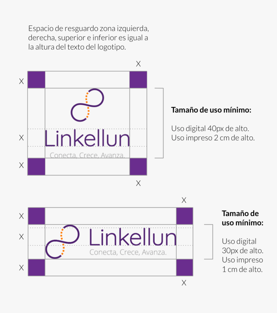
Sizes and space
For the correct use of the logo, we have security spaces and minimum sizes of use. Since by excessively reducing the space of your logo or the logo itself, there is a point where it is not legible and that visually your brand is not seen properly.
MINIMUM USE SIZE
For enlargement sizes there are usually no problems, for small-scale sizes perception is usually distorted. To facilitate reading and / or maintain the brand’s pregnancies, its reduced applications must respect a minimum size, which is expressed on this page.
GUARD
Here it is established which is the minimum white space or protection area that must be respected in its application. This will prevent the brand from being invaded by elements that are alien to it.
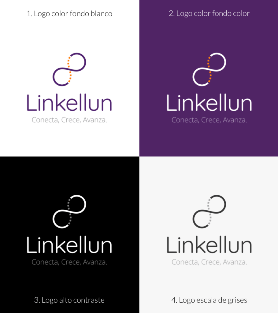
Logo Versions
The color version and other variants are presented on this page. These can be applied when there are technical restrictions that prevent the use of the preferential alternative.
GRAYSCALE LOGO AND HIGH CONTRAST
This page establishes the grayscale version for use in reproduction systems that do not allow color printing but do support the use of grayscale.
Also, the high-contrast version of the brand is established. This only supports spot colors and should only be used for printing systems that do not allow the use of colors or grays.
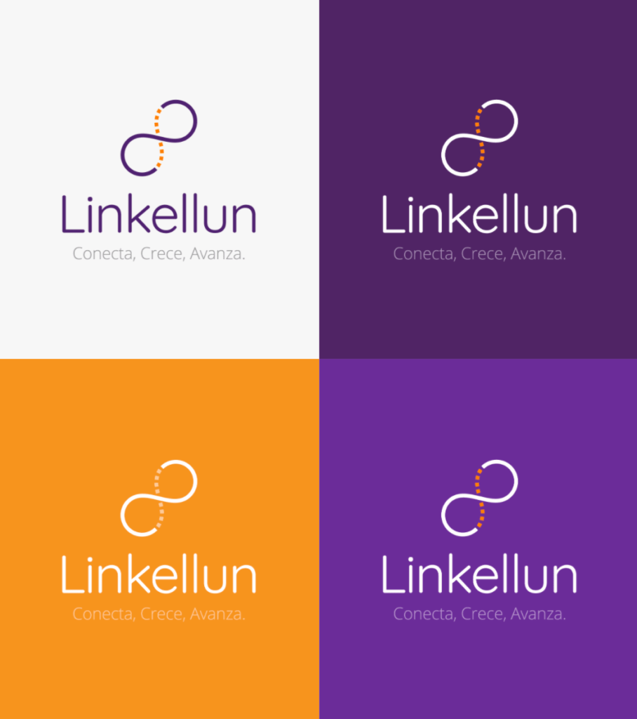
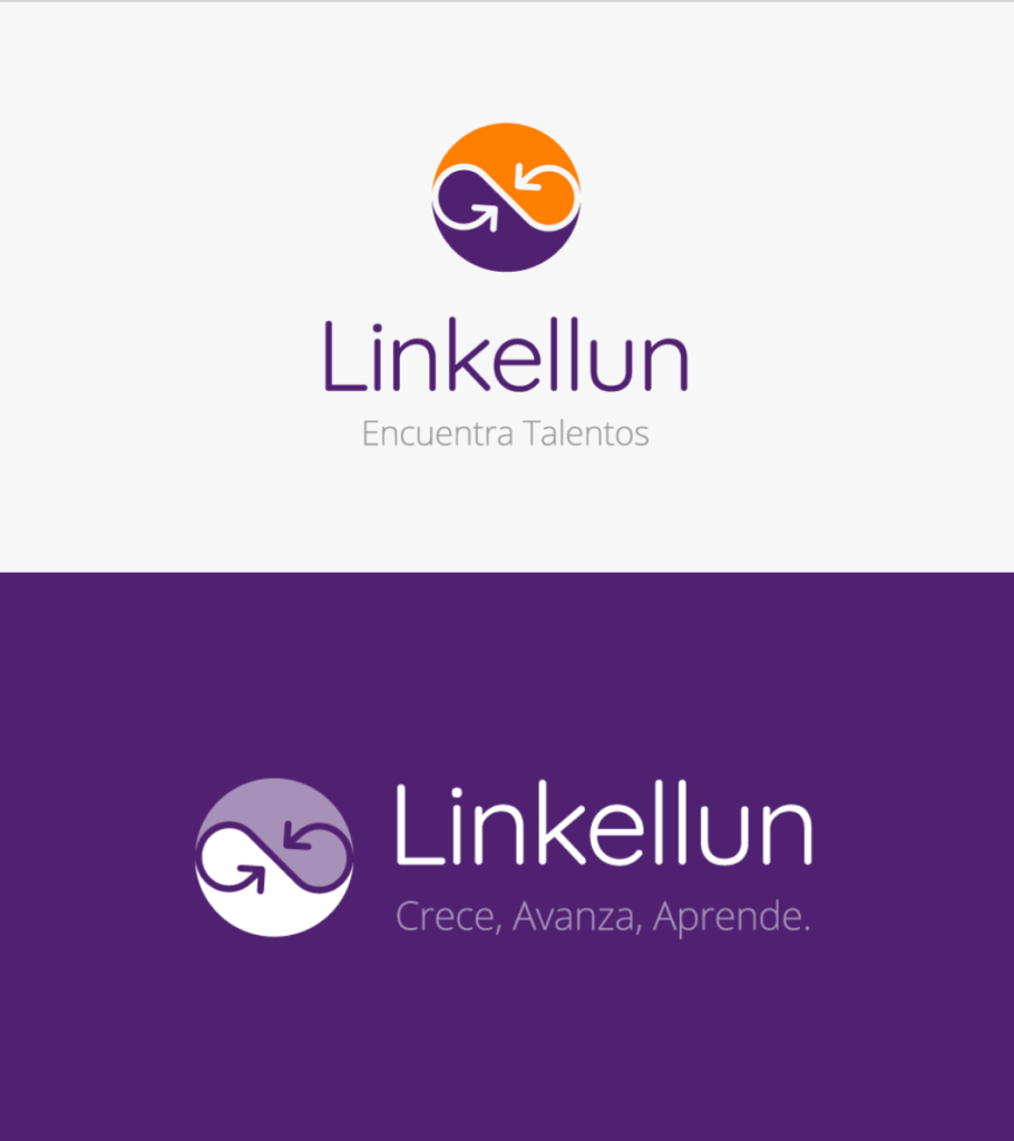
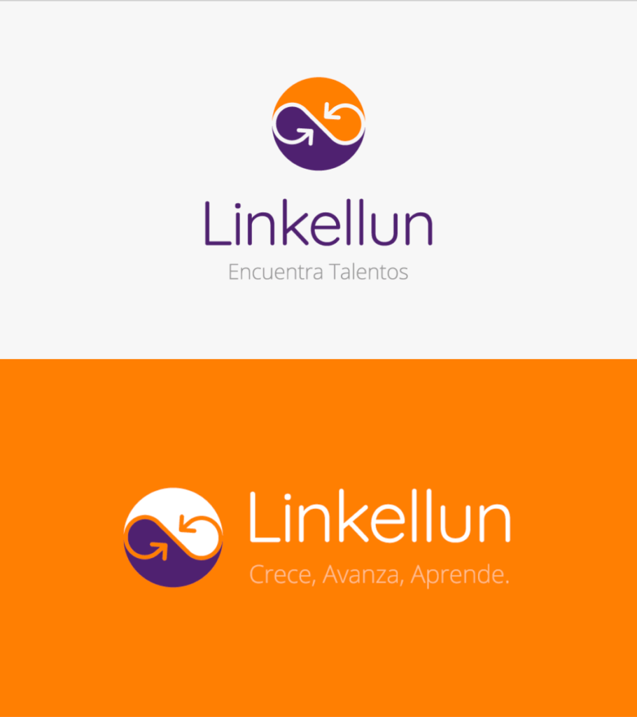
Background variations
Here the uses of color in the brand are presented, according to the context in which it is located and the particularities of the communication piece in which it is working, you can choose the version of the logo that best suits your needs.
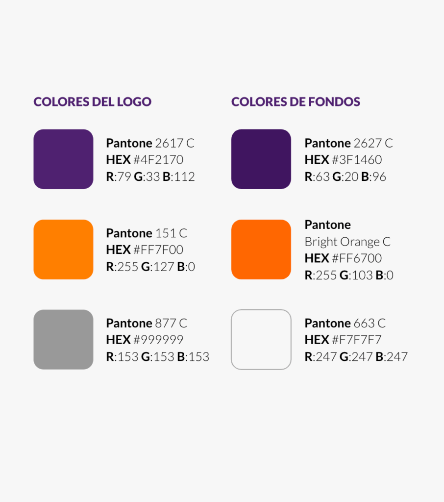
Color palette
Through color, we reinforce the conceptual sensation that we want to reflect. Purple symbolizes magic, spirituality, and creativity.
Purple promotes harmony of mind and emotions, contributes to balance, mental stability, peace of mind, the link between the spiritual and physical worlds, between thought and action. It inspires selfless and unconditional love, free of ego, encouraging sensitivity and compassion. It signifies loyalty, well-being, success, and wisdom.
We also have orange, which represents joy, enthusiasm, and fun. Stimulates the mind and is the perfect antidepressant. It is the intellectual force at its peak and in full search of knowledge. Provides well-being and good humor.
The color references are the HEX, RGB and Pantones specified here. If the printing conditions do not allow its use, the logo may be printed in four-color or black.
Typography
This section specifies the font used to create the logo. And a complementary font to use in body text and other texts.
Quicksand is a sans-serif typeface with unique curvature and fluid rhythm. Its shapes make it very distinguishable and legible when in context.
It combines styles from many entertaining typefaces and is suitable for any design medium. Quicksand’s modern design is ideal for the web and adapts to any environment.