About Timebooks
A Chilean company that has more than 20 years of experience in the sale and distribution of books and educational materials. We are mainly oriented to the preschool and school stage with the material in Spanish and English.
Time Books comes from the Time Life brand, a prestigious American company that is characterized by the seriousness and quality of its products.
We seek not only to sell a book, but also the experience, moments, and bonds that are generated between a parent and their child when reading. Delivering quality material, from selected publishers to promote reading and knowledge of boys and girls.
Our vision is to continue promoting child-youth reading, knowing that technology continues to gain ground, but with the intact conviction that it is necessary to turn this situation around, because we believe that reading is a key tool for the development of children. children.
The request
They needed to refresh their logo in order to give the brand identity a new look and make it grow in the market as a young oriented brand.
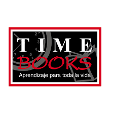
The original logo
Conceptualization
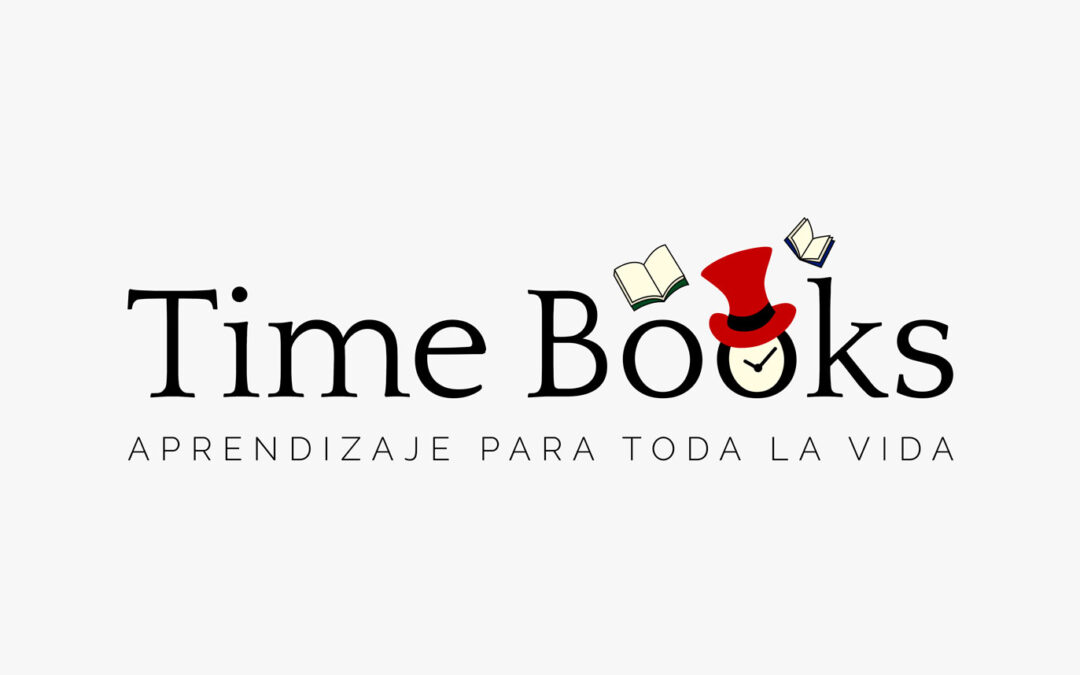
The main concept of Time Books is related to time, books, and the magic of learning through reading. This magic is represented by the magician’s hat, which through color is related to the realities of young children.
In terms of color, we have red as the main color. From the psychology of colors, which studies the psychic effects of color derived mainly from their social and cultural perception (symbolism) and its effect on the brain, we can highlight the following associations in the case of red.
Red is associated with heat, passion, and energy. It is also linked to affection and love, prosperity, strength, life and vitality, dynamism, and happiness.
It is also related to spontaneity, it encourages a more outgoing behavior. It is an activating color for the human being and helps to generate movement and act to achieve one’s goals. It is also related to success, independence, and autonomy.
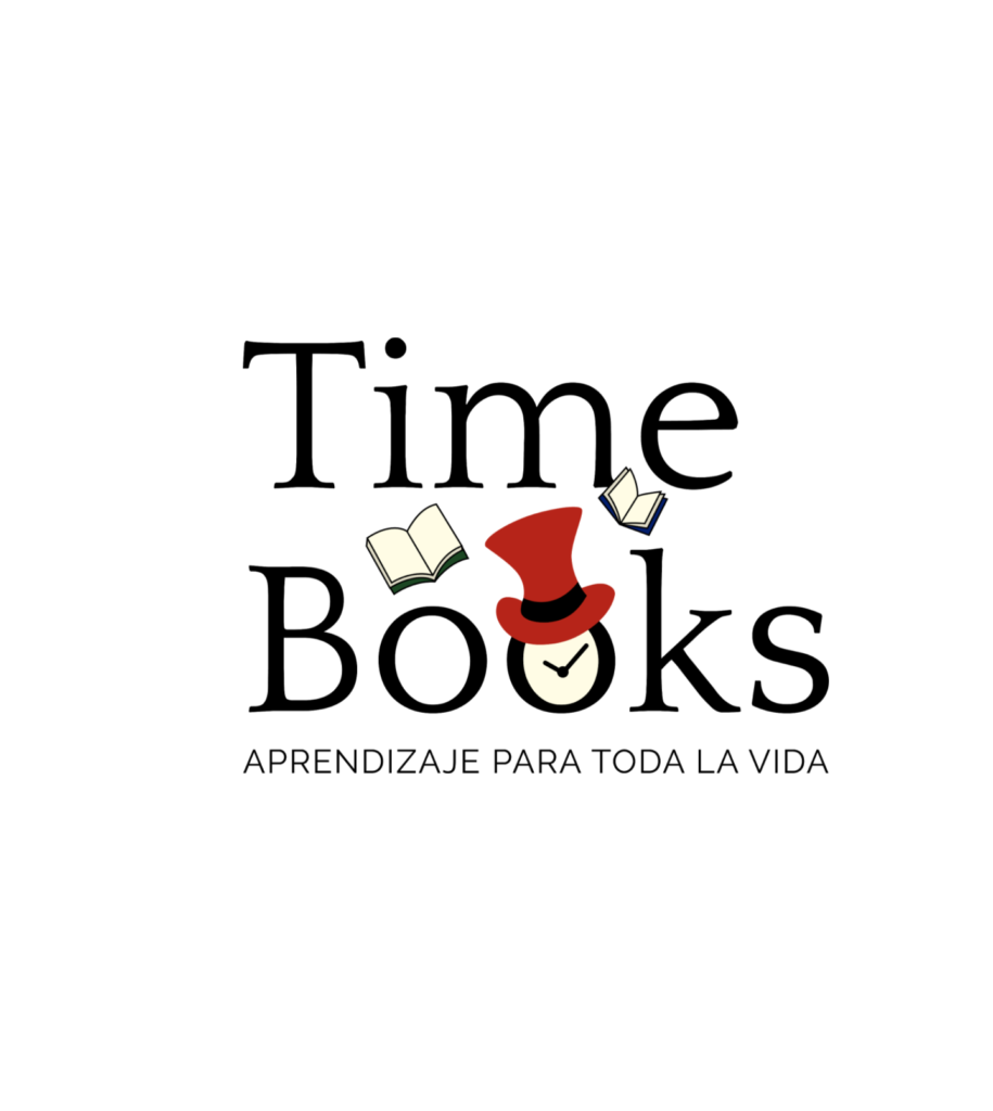
The logotype

Logo Versions
The color version and other variants are presented on this page. These can be applied when there are technical restrictions that prevent the use of the preferential alternative.
GRAYSCALE LOGO AND HIGH CONTRAST
This page establishes the grayscale version for use in reproduction systems that do not allow the printing of colors but do support the use of grayscale.
Also, the high-contrast version of the brand is established. It only supports spot colors and should only be used for printing systems that do not allow the use of colors or grays.
Background variations
Here the uses of color in the brand are presented, according to the context in which it is located and the particularities of the communication piece in which you are working, you can choose the version of the logo that best suits your needs.
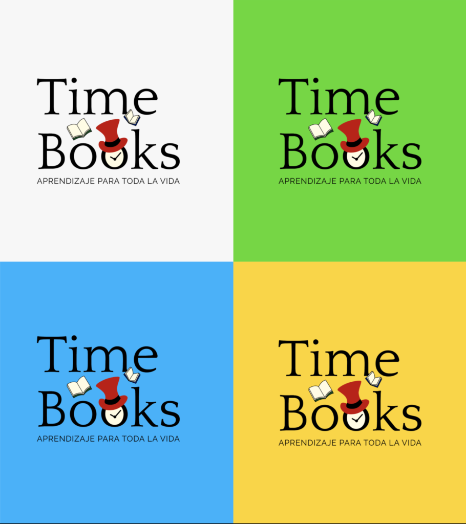
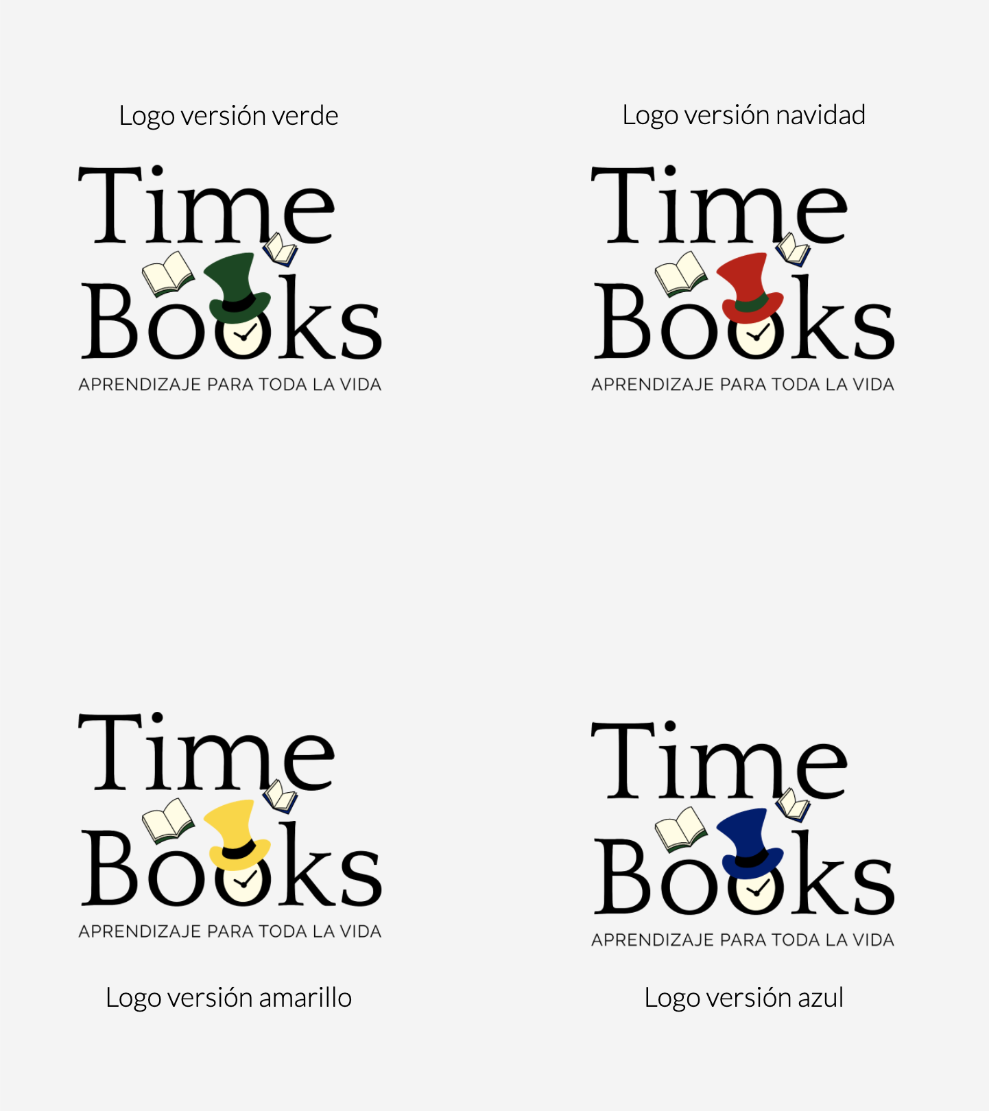
Color variations in the logo
To give the brand more flexibility I created a color theme for different occasions. Here the uses of color in the brand are presented, according to the context in which it is located and the particularities of the communication piece in which you are working, you can choose the version of the logo that best suits your needs.
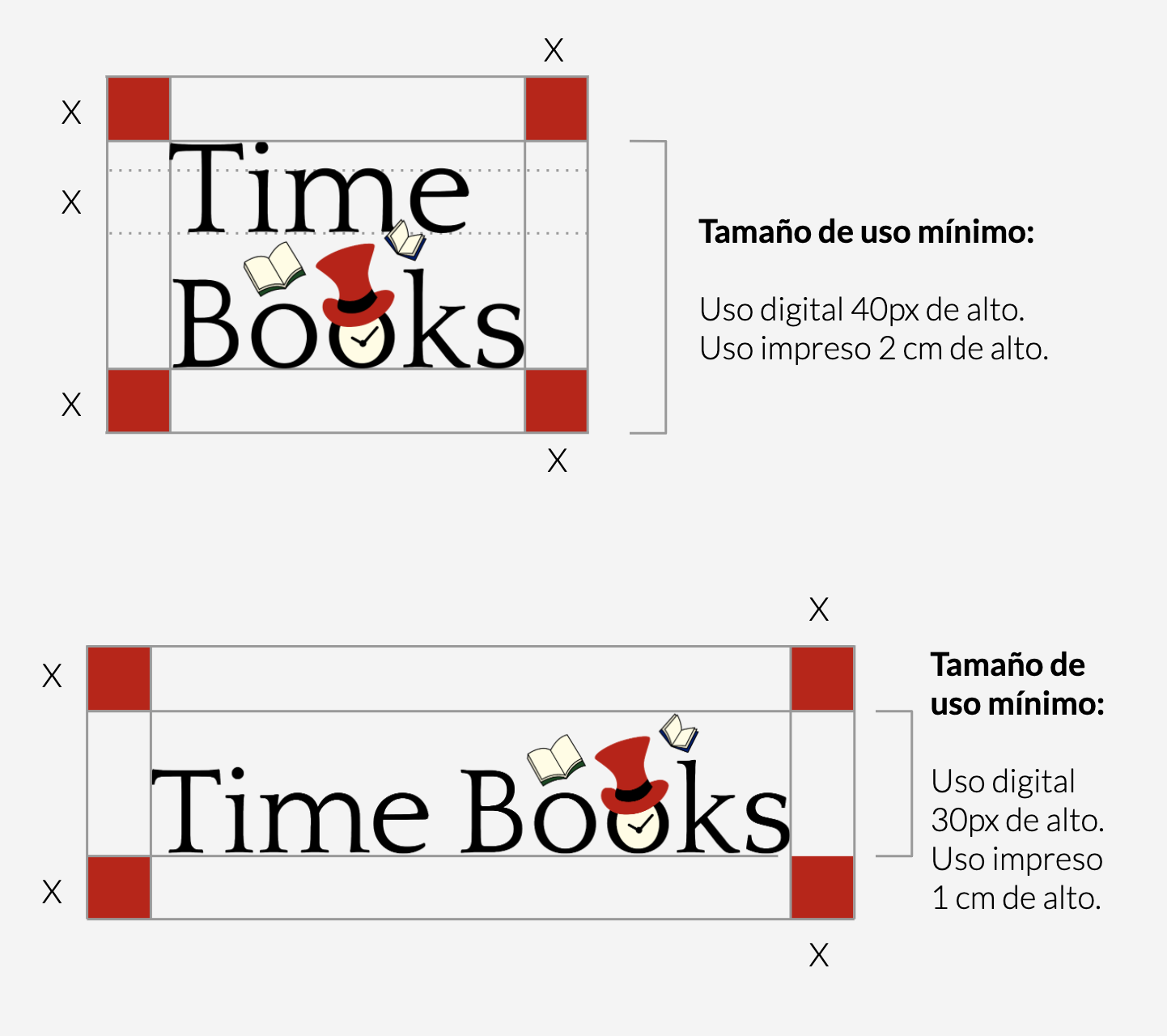
Sizes and space
For the correct use of the logo, we have security spaces and minimum sizes of use. Since by excessively reducing the space of your logo or the logo itself, there is a point where it is not legible and that visually your brand is not seen properly.
MINIMUM USE SIZE
For enlargement sizes there are usually no problems, for small-scale sizes perception is usually distorted. To facilitate reading and / or maintain the brand’s pregnancies, its reduced applications must respect a minimum size, which is expressed on this page.
GUARD
Here it is established which is the minimum white space or protection area that must be respected in its application. This will prevent the brand from being invaded by elements that are alien to it.
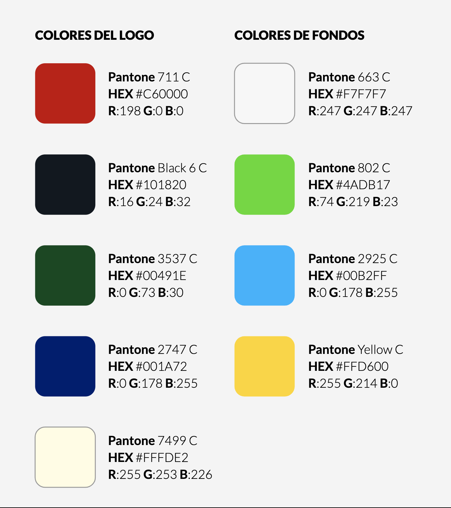
Color palette
Through color, we reinforce the conceptual sensation that we want to reflect. The palette represents the colors that you learn when you are at school.
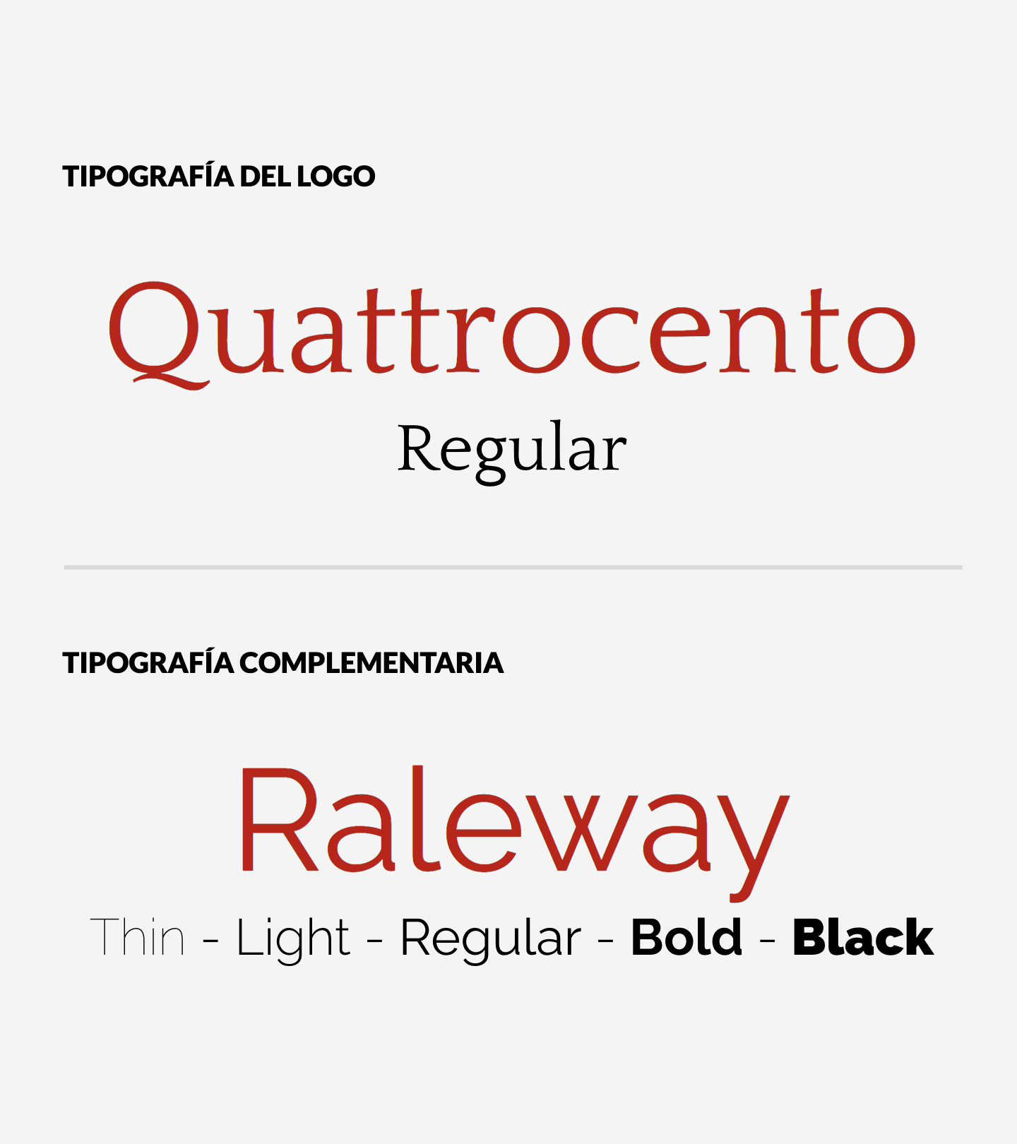
Typography
This section specifies the typeface used to create the logo. And a complementary font to use in body text and other texts.
Quattrocento is a serif typeface, which has a very strong personality and is very elegant. Delivery order and formality. Also widely used in the world of fashion and beauty.
The complementary typeface is sans serif, according to the psychology of the typeface they convey modernity, security, and on certain occasions neutrality and minimalism. On the other hand, its rounded shapes are closed due to their soft shapes. For this reason, they are ideal for children’s products.