Overview
The problem
Ecomovers branding was not representing fully all the great initiatives that they have. They needed to show the purpose of the brand and how they contribute to the world.
My role
As the only designer I work on the entire process, from re-designing the brand to creating the website and stationery.
Breakdown
About Ecomovers
EcoMovers is a company inserted in the Moving Industry, which is mainly dedicated to providing moving and recycling services, which could be classified as its key strategic business units, the services they carry out under the use of biofuels and mitigation of their operations, with which they have a triple impact system: social, economic and environmental.
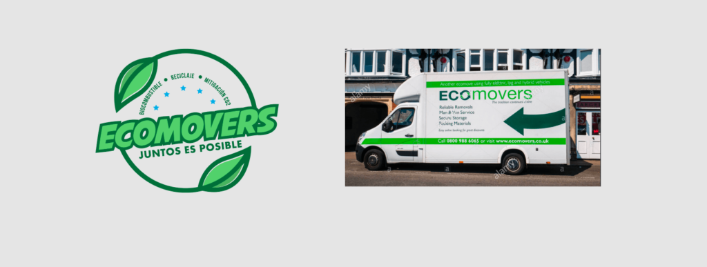
Original brand
The process
Re-designing the isotype
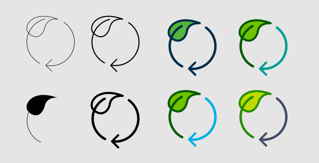
The first element that I work was the isotype, constructing the concept of recycling along with a leaf, both indicating progress by following the circle shape. The isotype of the logo symbolizes recycling, ecology, innovation, circular economy, and movement.
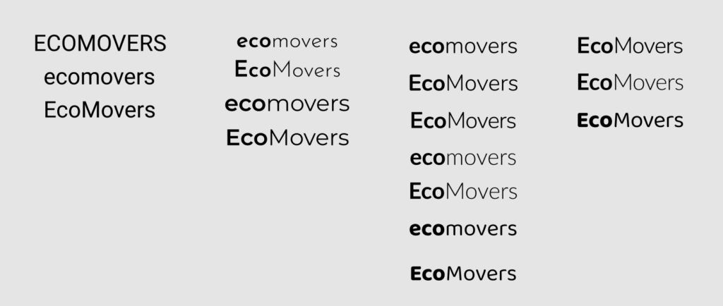
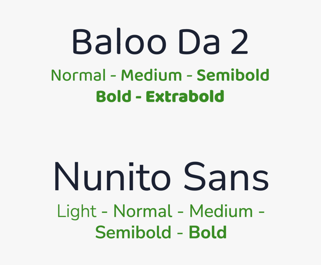
Typography selection
The selection of fonts was driven by a clean and modern style.
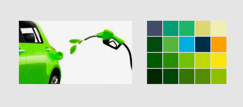
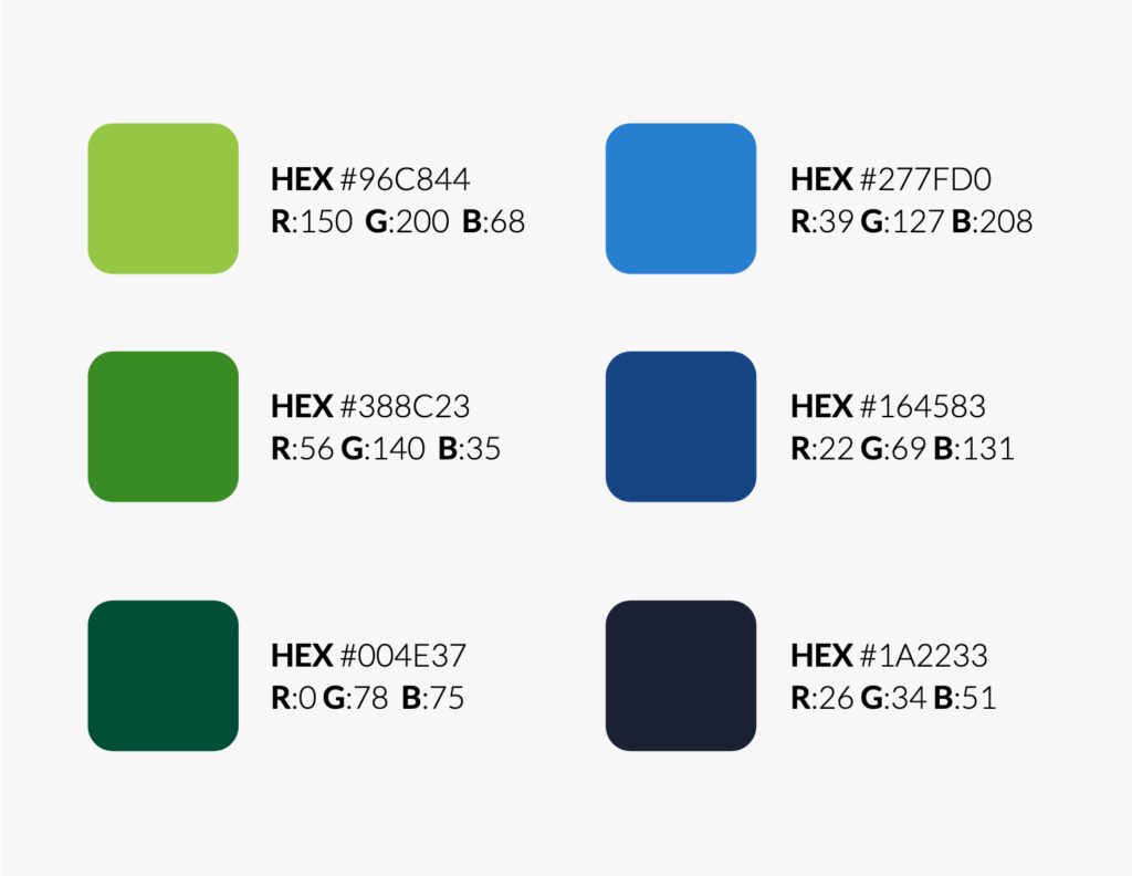
Color palette
The selection was made thinking in the psychology of each color. Green usually has a series of tremendously positive connotations in the human psyche. In the first place it is linked to birth, life, strength and energy. It is the color associated with nature, freshness, hope, optimism and good luck. On the other hand we have blue which is related to serenity, calm, understanding and protection. It is also linked to caring for others and to trust and credibility, intelligence and power.
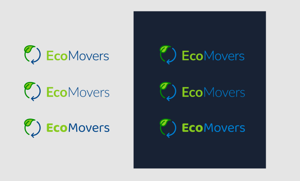
Final variants
The result
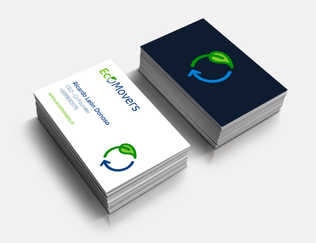
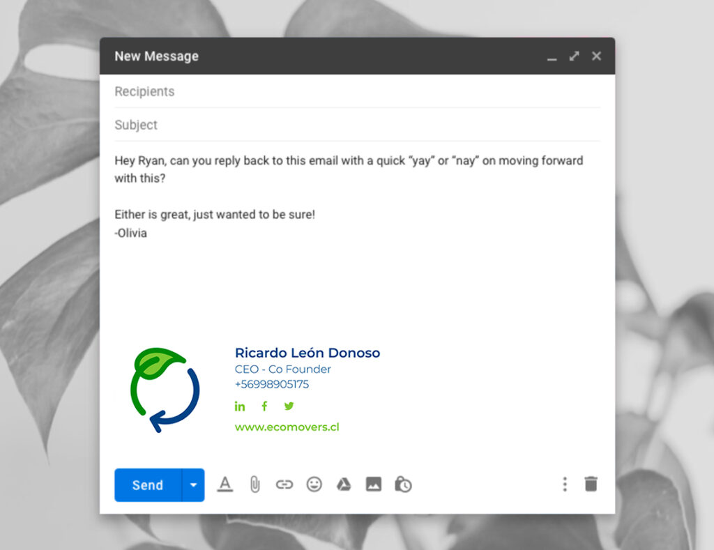
Logo and branding
Logo Concept
This logo is a set of professionalism with innovation. All this conceptualization is reinforced with the use of color.
Sizes and space
For the correct use of the logo, we have security spaces and minimum sizes of use. Since by excessively reducing the space of your logo or the logo itself there is a point at which it is not legible and that visually your brand is not seen adequately.
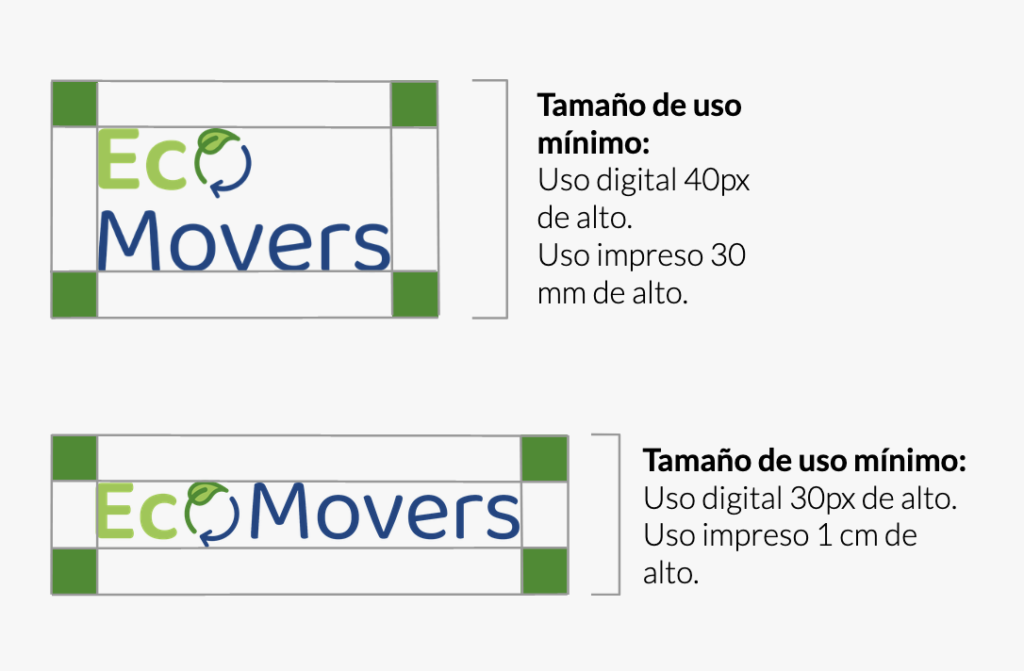
MINIMUM USE SIZE
For magnification sizes there are usually no problems, in small scale sizes the perception is usually distorted. To make it easier to read and/or maintain brand awareness, your reduced applications must respect a minimum size, which is expressed on this page.
GUARD
Here you establish what is the minimum white space or buffer area that must be respected in your application. In this way, the brand will be prevented from being invaded by elements.
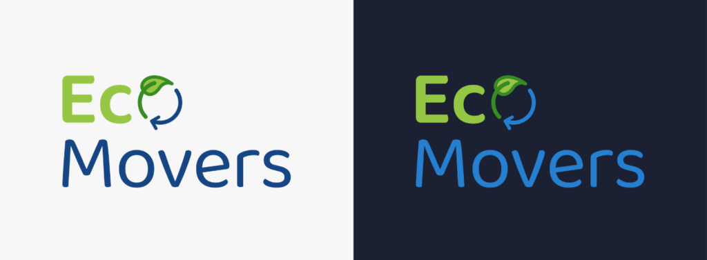
Logo Versions
This page presents the color version and other variants. These can be applied when there are technical restrictions that prevent the use of the preferential alternative.
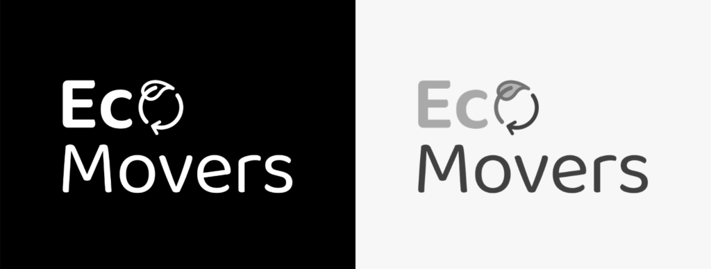
GRAYSCALE AND HIGH CONTRAST LOGO
This page establishes the grayscale version for use in reproduction systems that do not allow color printing, but do admit the use of grayscale. In addition, the high-contrast version of the brand is established. This only admits flat colors and should only be used for printing systems that do not allow the use of colors or graying.
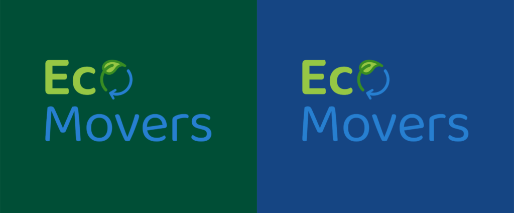
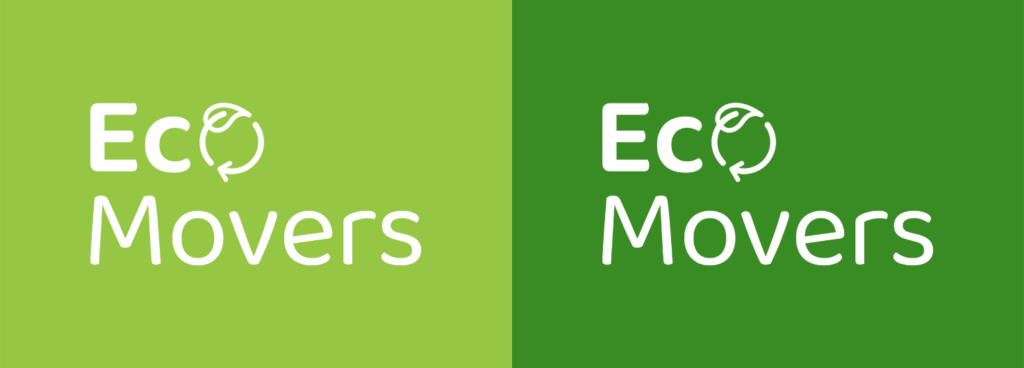
Background variations
Here are the uses of color in the brand, according to the context in which it is located and the particularities of the piece of communication in which you are working, you can choose the version of the logo that best suits your needs.
Color palette
Here we have both the colors of the logo and the backgrounds.
Typography
This section specifies the font used to create the logo. And a complementary font to use in the body of the text and other texts. The typeface used is sans serif, according to the psychology of typography they transmit modernity, security and on certain occasions neutrality and minimalism.
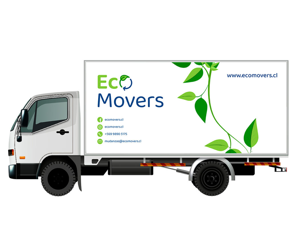
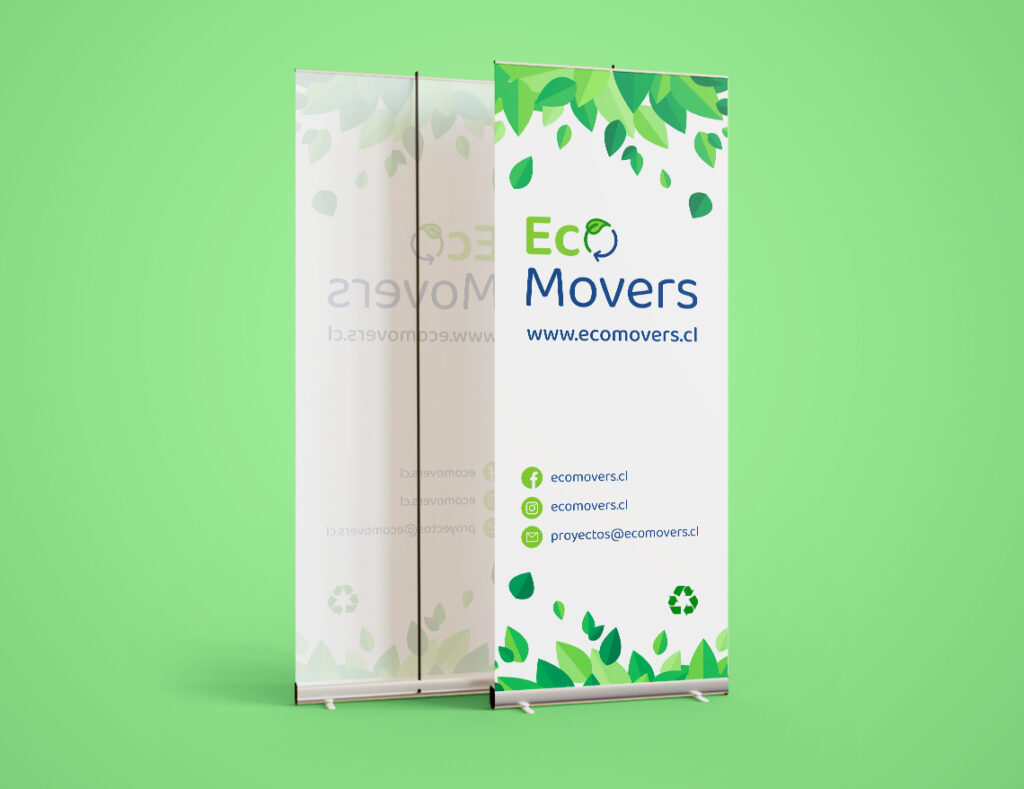
Branding
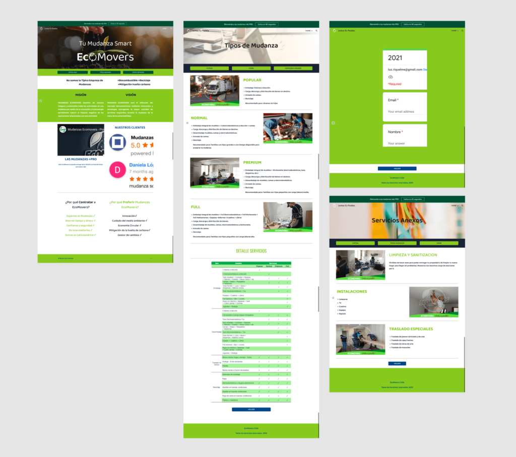
Web design
Original web design state
Competitive analysis
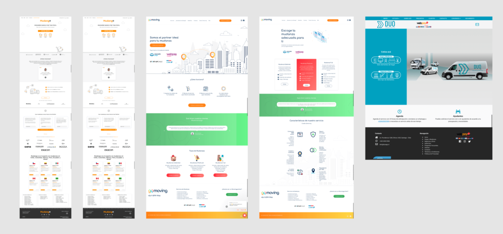
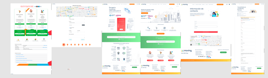
Web design proposals
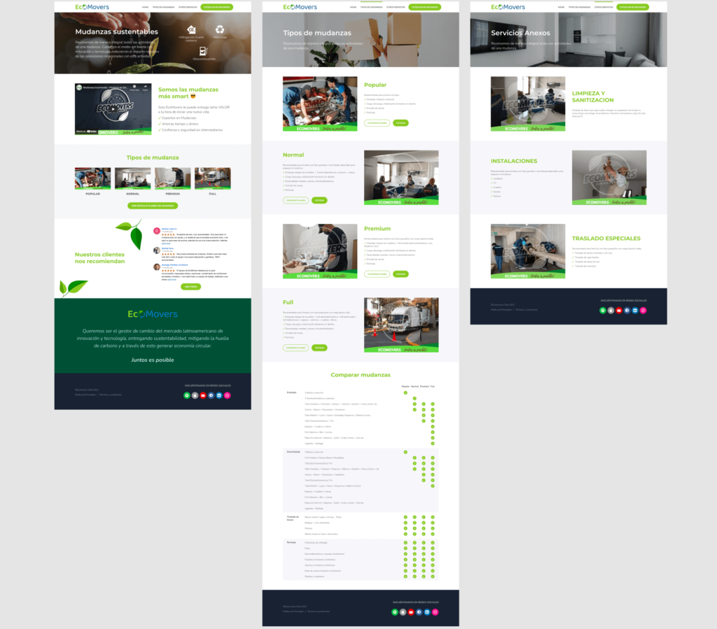
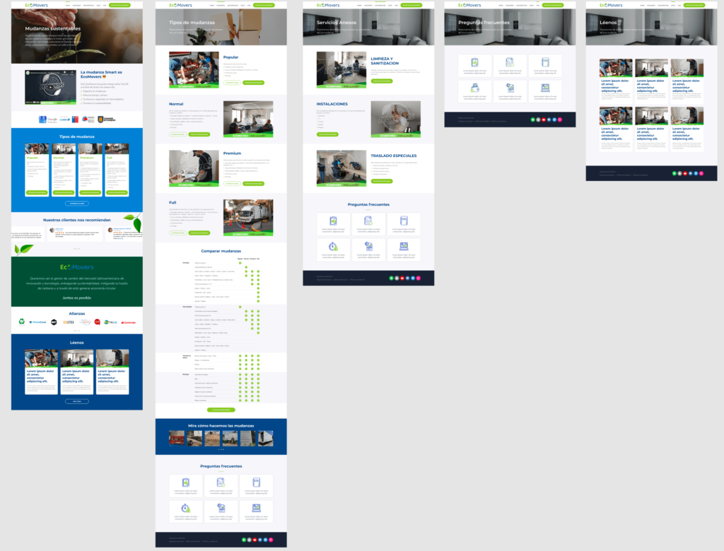
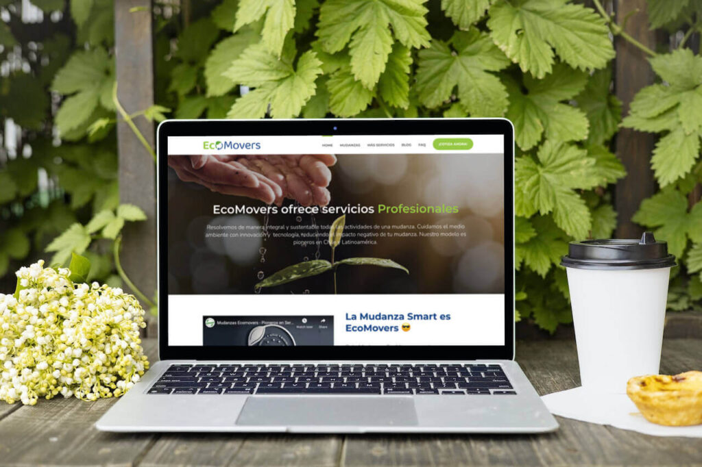
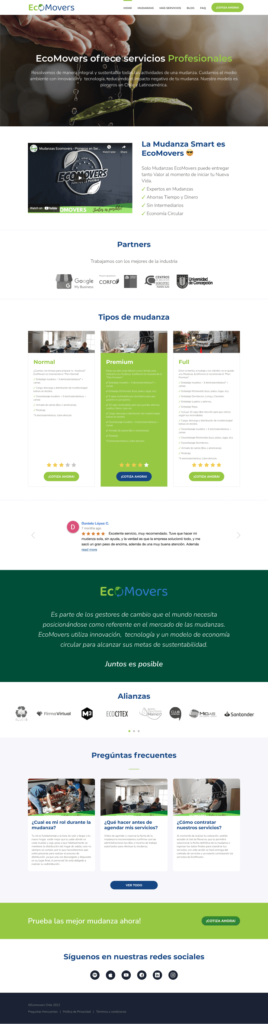
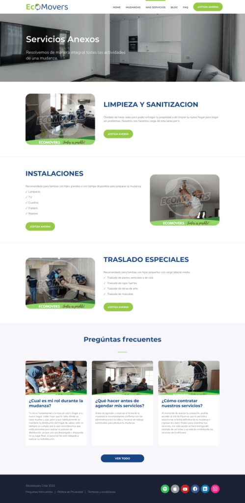
Final web design