
Overview
The problem
Note taking apps have a very complex sharing experience, which stops the teachers from sharing more material with their students.
The goal
Design a simple note taking app, with a easy sharing experience.
My role
UX designer leading the Noty website design
Responsibilities
Conducting interviews, paper and digital wireframing, low and high-fidelity prototyping, conducting usability studies, accounting for accessibility, iterating on designs and responsive design.
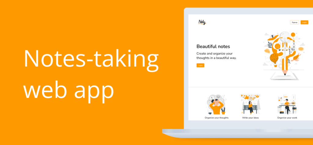
The product
Noty is a web app design for taking notes easily and beautifully.

Understanding
the user
User research: summary
I conducted user interviews, which I then turned into empathy maps to better understand the target user and their needs. I discovered that many target users already have note taking apps.
However, many note taking websites are overwhelming and confusing to navigate, which frustrated many target users. This caused a normally enjoyable experience to become challenging for them, defeating the purpose of sharing.
Ideation phase
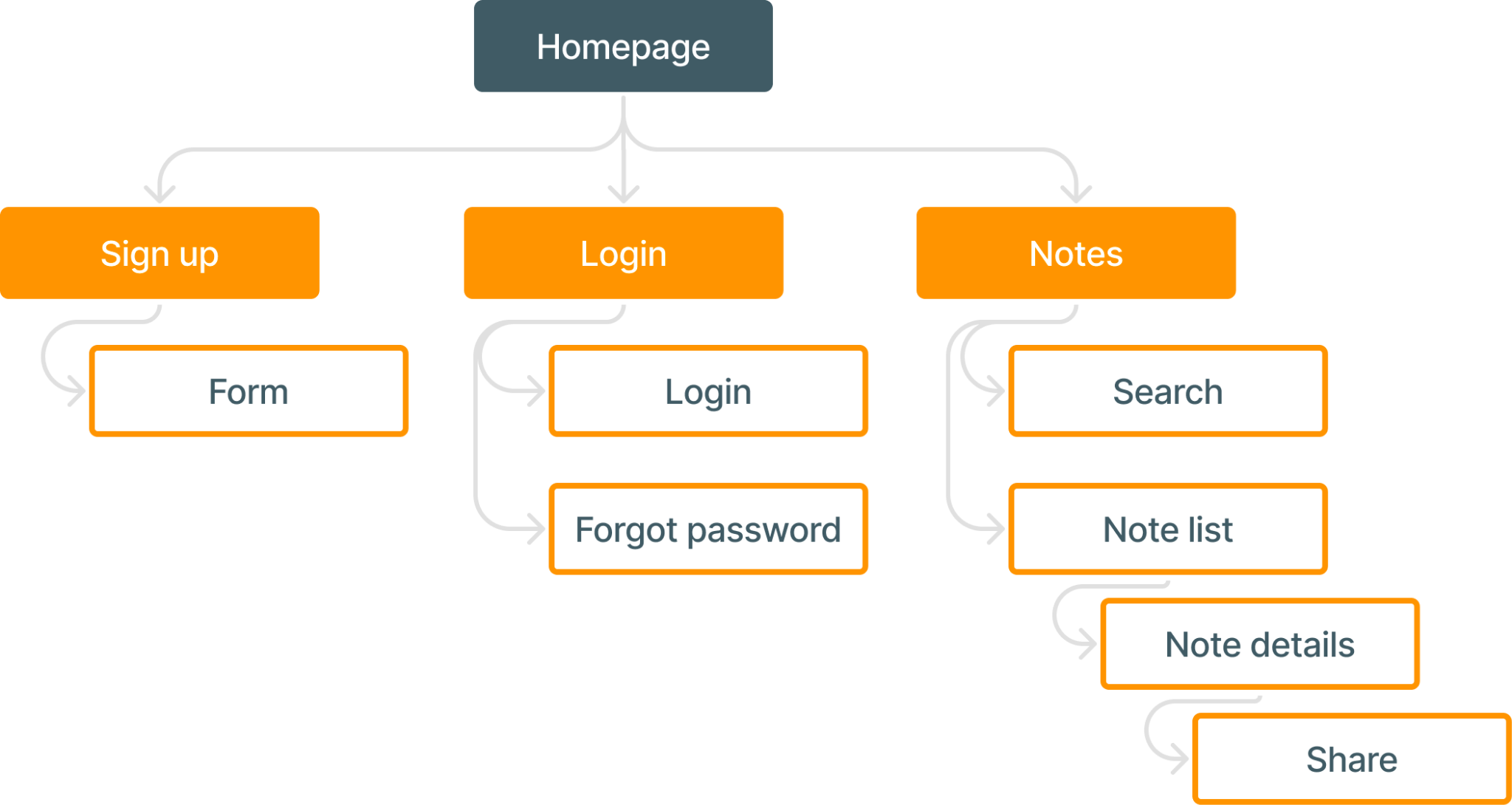
Creating a sitemap
Difficulty with website navigation was a primary pain point for users, so I used that knowledge to create a sitemap.
My goal here was to make strategic information architecture decisions that would improve overall website navigation. The structure I chose was designed to make things simple and easy.
Paper wireframes
Next, I sketched out paper wireframes for each screen in my app, keeping the user pain points about navigation, browsing, and sharing flow in mind.
The home screen paper wireframe variations to the right focus on optimizing the browsing experience for users.

Digital wireframes
Moving from paper to digital wireframes made it easy to understand how the design could help address user pain points and improve the user experience.
Prioritizing useful button locations and visual element placement on the home page was a key part of my strategy.

Prototyping phase
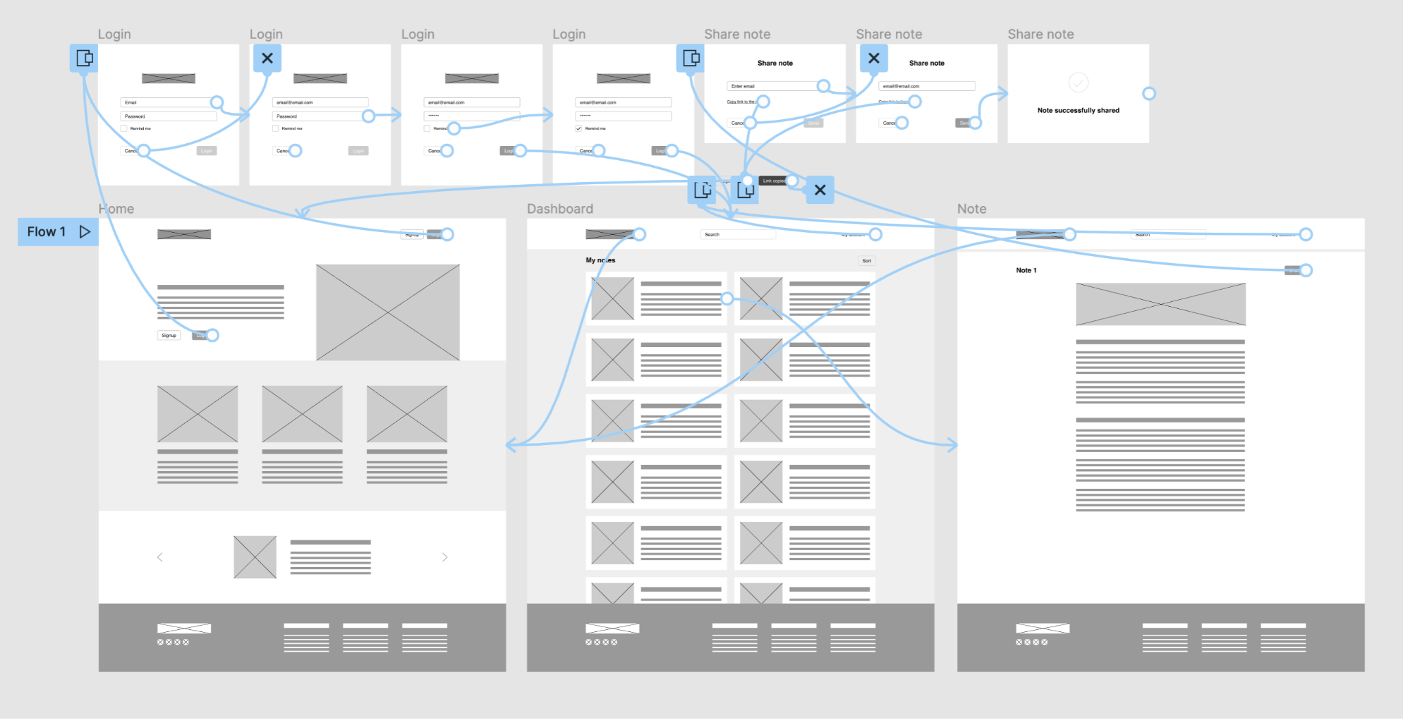
Low-fidelity
To create a low-fidelity prototype, I connected all of the screens involved in the primary user flow.
At this point, I had received feedback on my designs from members of my team about things like placement of buttons and page organization. I made sure to listen to their feedback, and I implemented several suggestions in places that addressed user pain points.
High-fidelity prototype
My hi-fi prototype followed the same user flow as the lo-fi prototype, and included the design changes made after the usability study, as well as several changes suggested by members of my team.

Moving forward
Takeaways
Impact:
Our target users shared that the design was intuitive to navigate through, more engaging with the ilustrations, and demonstrated a clear visual hierarchy.
What I learned:
I learned that even a small design change can have a huge impact on the user experience. The most important takeaway for me is to always focus on the real needs of the user when coming up with design ideas and solutions.
Next steps
- Conduct follow-up usability testing on the new website
- Identify any additional areas of need and ideate on new features