Project Overview
Ciclophone was a project proposal of a native IOS app that allows users to manage their cycling activities by giving them necessary and vital information about routes, health information, news and online store access.
In this project I developed the information architecture in addition to flowcharts and wireframes. The identity of the app, including logotype, app icon and app layouts. I created a book to gather all the research information related, then to present I created functional prototypes.
Conceptualization
Currently in Chile there is a large number of mobile devices, which increase day by day due to the social impact that produces continuous and instant connectivity in the population. This progressive consumption is a response to all the comforts and utilities that gives us portability.
When mobilizing these devices are key, since, in addition to being able to connect via telephone, we can surf the internet and receive great information instantly.
The population is constantly interconnected in all transport times, for example the bicycle, either recreational or sports transportation. Bicycle users take this medium, as an escape from the rush hour and traffic jams, is also as a monetary relief, which is increasingly tightened with the increase of price in public transport. Also the use of the bicycle presents positive implications in the health of the people.
App definition
In a simple way, maps will be displayed to access addresses and visualize recommendations that emerge from the same users. Where you want
Get, what you want to eat, buy, related to the activity “to ride a bicycle”: spare parts, clothes nutritional supplements, healthy, fast and light diet.
We will have an application, which has a great social reach because it encompasses a wide target audience and fairly transverse in socioeconomic and age terms. This translates into a significantly greater benefit when it comes to generating resources that make it a sustainable and sustainable application over time.
The application is mainly focused on the trip itself, but also has utilities to plan, either routes or activities, and at the end of the journey the user will be able to evaluate their physical condition, the kilometers they traveled and the places they visited.
Graphic definition
The selection of graphic elements was based on the search for elements that were daily for the rider, with the aim of facilitating the understanding and use of the application. Thus, the icons used are of a universal character so that they are predictable and easy to remember in time.
The conceptualization itself, is the gearbox with which the bicycle is handled and with it, life itself. The colors of the application are contrasting to facilitate the quick distinction once the application is determined.
And the buttons respond to clearly recognizable and simple icons.
Logotype and icon
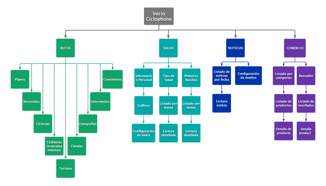
Flowchart
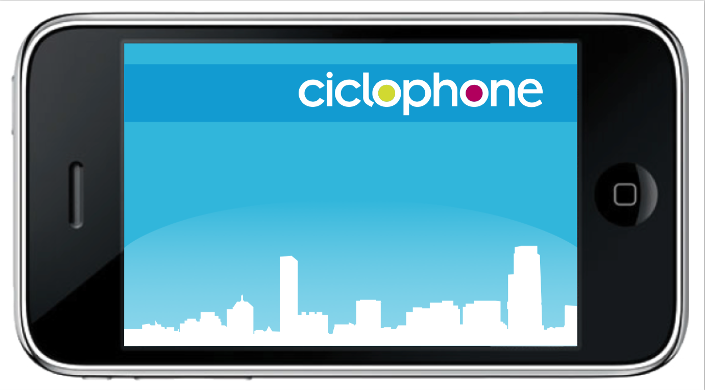
App splash
Book