
Usability Study Pyvana
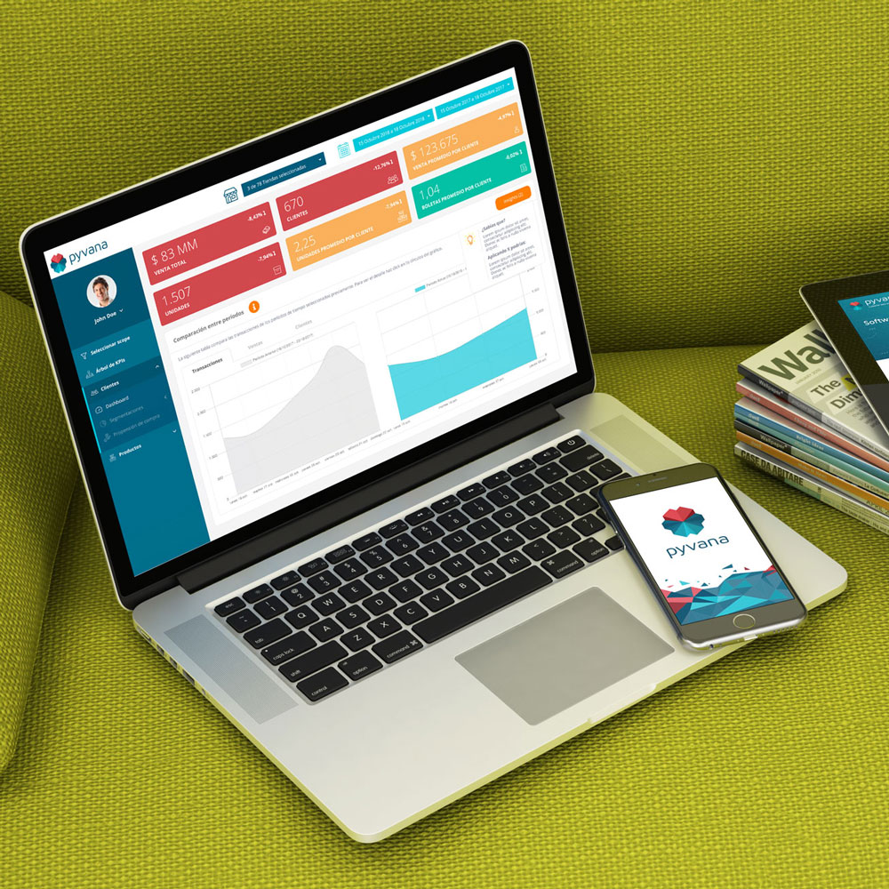
Pyvana is a Software aimed at small and medium retailers who wish to improve their analytics about their sales and other commercial KPI. Through the processing of your business data as SKU and with Artificial Intelligence and Machine Learning techniques, you model the data and identify groups of customers and products to help retail make smarter decisions in critical aspects of your business such as allocation, assortment, and promotions under models of demand prediction, purchase propensity, and KPI business keys.
Vision: To be a valuable tool that allows Latin American retail to generate the processes and efficiencies that large multinational retailers are able to obtain with technologies that are not currently available to local budgets.
About this study
This usability study was carried out for Pyvana’s online application.
Based on an initial meeting with the client, we designed this study to identify particular and general usability problems, as well as complicated points for users.
This study is carried out and based on the experience of the user and not of the Pyvana client or the potential client of the platform, in order to explore what could make the user experience more adequate and functional.
This document describes the study we conducted and includes the usability test with individual users, competence review, review of platform flow, accessibility review, and analysis of target users.
Objective
The objective of this project is to analyze the flow of navigation and usability, the structure of the software (information architecture) and the visual hierarchy of all the components of the Pyvana platform.
In order to standardize the usability, order, and navigation of this platform so that the user experience is as fluid as possible both on desktop and mobile.
For this, we will review and propose the restructuring of the current views of the application that are necessary to achieve this objective. The idea is to improve it through design resources without altering the structural functioning.
The process of testing with users
Testing plan
- Define objectives
- Define research questions
- Choose testing technique
- Define the target user
- Choose usability metrics
Execution
- Choose participants
- Do the testing sessions
Analysis
- Analyze qualitative data
Testing Technique
The method chosen for this usability test was qualitative analysis with in-person interviews using the Concurrent Think Aloud (CTA) technique, where participants were asked to express their thoughts and emotions as they performed the tasks. The disadvantage of this technique is that it can interfere with time in the accuracy of the task, but since the system will not be evaluated in comparison to a reference point or a concurrent design, CTA works well for this study.
A usability test with users consists of monitoring users interacting with the platform. They are asked to navigate and perform specific tasks. While the user performs these tasks, the user’s facial reactions, the verbalization of the steps he or she performs while performing various tasks, and the screen at each moment are recorded.
User person
For the usability study, users of medium and advanced technological level are sought in order to know how to operate in the use of platforms with similar characteristics.
As usual in a study of these characteristics, a small sample of person users is chosen who may be prone to the use of this platform, but who are neither ideal users nor their counterparts so as not to affect the outcome of the study.
In this case, three users of the target demographic group were selected, with people present in the commercial, logistics, and medium-sized and small-scale retailer operations present.
For the purpose of this study, the group is broad enough to include a wide range of potential Pyvana users.
Usability metrics.
Critical errors
It was considered a critical error all deviations when completing the objectives of the scenario or the inability of the user to complete the scenario. Significant errors were also assigned when the participant initiated (or attempted to initiate) an action that would result in a scam of proposed goals.
Non-critical errors
Non-critical errors were errors found by the participant but that do not present a significant problem to achieve the proposed objectives or the use of the tool.
Impact levels
The impact is the classification of the consequences of the problem or error. By defining the level of impact, the problem has on the successful completion of the task.
Three levels of impact were considered:
High: prevents the user from completing the task (critical error)
Moderate: it causes difficulties for the user, but the task can be completed (non-critical error)
Low: that do not significantly affect the completion of the task (non-critical error) But that leave option to improve them.
User interviews
I did three interviews with selected users, who are given a general introduction to the platform what it is and what it does.
The new user is introduced to the assignment — a set of simple tasks within the platform and intuitive navigation within it.
At the same time, the users are monitored in real-time using the platform with an audiovisual recording, capturing all their reactions and interactions with the platform.
The videos of the interviews made to the test subjects are attached, which will be delivered together with this document for later review by the client. This material will not only be valuable for the improvements related to this analysis but for everything the customer wishes to use.
User test results.
The platform takes too much time to load, so users lose focus, become confused.
Initial Questions
- What did you study?
- What do you work on, and what is your position?
- What is your technological level?
- Have you used any data analysis software?
Final questions
- Have you used any similar software?
- Can you mention similarities or differences that you remember?
- What would you improve overall?
- How satisfied are you with the app’s performance?
User 1:
Summary
- The platform loads very slowly, which causes delays in decision making.
- The KPIs tree is a bit confusing can be improved.
- The excel that is downloaded with the propensity does not have the category name, so if you download several files will be confused.
- It was hard for him to find the time period selection.
- Consider that the dashboard could be initially deployed, after the scope selection.
- Suggest adding more descriptive icons.
- Suggest that in the period selection you can write the dates you need visualize.
- Suggest multiple choice in column charts to be able to buy data.
- In the seasonal segmentation, he mentions that not all products have the same seasonality, therefore perhaps he could have another form of deployment.
User 2:
Summary
- You are confused with the delay in loading the pages.
- You think insights are valuable and exciting. But it doesn’t give you security alone
- See the result; I would expect to see more data.
- When loading the customer dashboard, it suggests that this is what you would like to see initially.
- Had trouble reading the heatmap.
- He failed to display the info in the KPI tree.
- Did not find the pre-defined periods. Even by clicking on the select period.
- Suggest adding iconography to highlight functionalities.
User 3:
Summary
- You did not see the update button.
- Find that it takes a while to load.
- It is used to applications full of icons.
User Interviews
User 1: https://youtu.be/wI2bWU6PDWQ
User 2: https://youtu.be/gTHC0foQpnM
User 3: https://youtu.be/7S4evKIACes
Platform Analysis
Accessibility
- The platform takes too long to load.
- In the vast majority of screens, the contrast between the font color and the background is acceptable, could be improved, including some colors.
- There are no broken links so far.
- Missing images/icons with links that indicate the content to which they are you will access.
- The platform is accessible in most operating systems and in all browsers, with some flaws of style and lack of graphics in Internet Explorer. In the desktop version.
- The platform handles several terms in English and acronyms that are sometimes not understood by users.
Identity
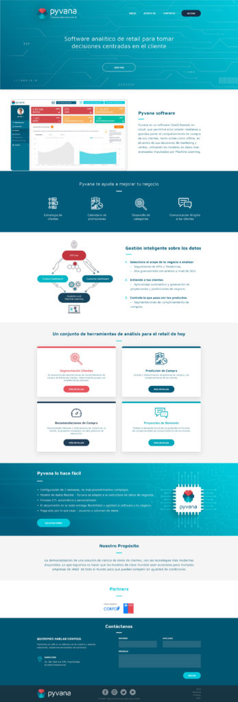
- The company logo is not well applied on the landing page, but it is well applied on the platform.
- The landing page is concise enough to be read in less than 5 minutes. It lacks information related to the software, for example, features, offering a demo, or explaining a little more in detail what areas of the business the application covers.
- Information about the company is offered, but you could have more.
- No information is provided on who is behind the website, that is the team of workers. A visible team builds trust.
Navigation
- It allows simple navigation; the sidebar is quite clear. Not so the options presented in the top menu.
- There is an adequate balance between precise and concise but at the same time, relevant information.
- Links are not always easily recognizable as such.
- The contents and architecture of the site should be better categorized and indexed.
- It is not possible to navigate correctly on mobile devices since the elements are they interpose with others.
- The mobile version from 1024px wide has critical style and navigation flaws.
- You cannot navigate from 768 px wide to mobile since the menu disappears.
Content
- The title of the pages does not always correspond to the information found there.
- The dashboards take advantage of the areas of high information hierarchy of the page for the more relevant content
- The consistency between styles and colors could be improved.
Page analysis
- General: You can only check the desktop since mobile navigation is not achieved.
The more info buttons could be a little bigger and orange to improve visibility.
The buttons must have the same source in all views. - Home page: you need a complete redesign, considering the strategy and objectives.
- Login: You need to have more context.
- Select Scope: It could be a bit more visual, including the selection of weather.
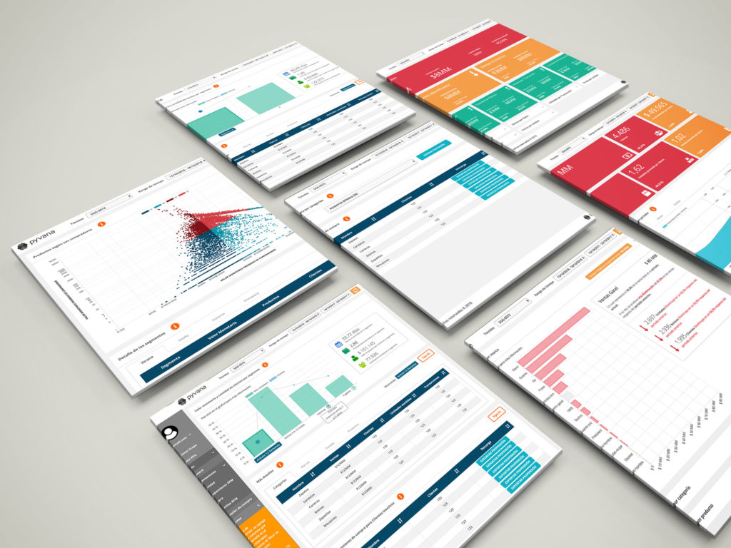
- KPIs tree: this page should be completely restructured, improving the display of the elements, clarity, and hierarchy of information and usability.
For example, dashboard-type, in this way, better organize the information. - Insights: this page will be discarded because insights will be included in the relevant places.
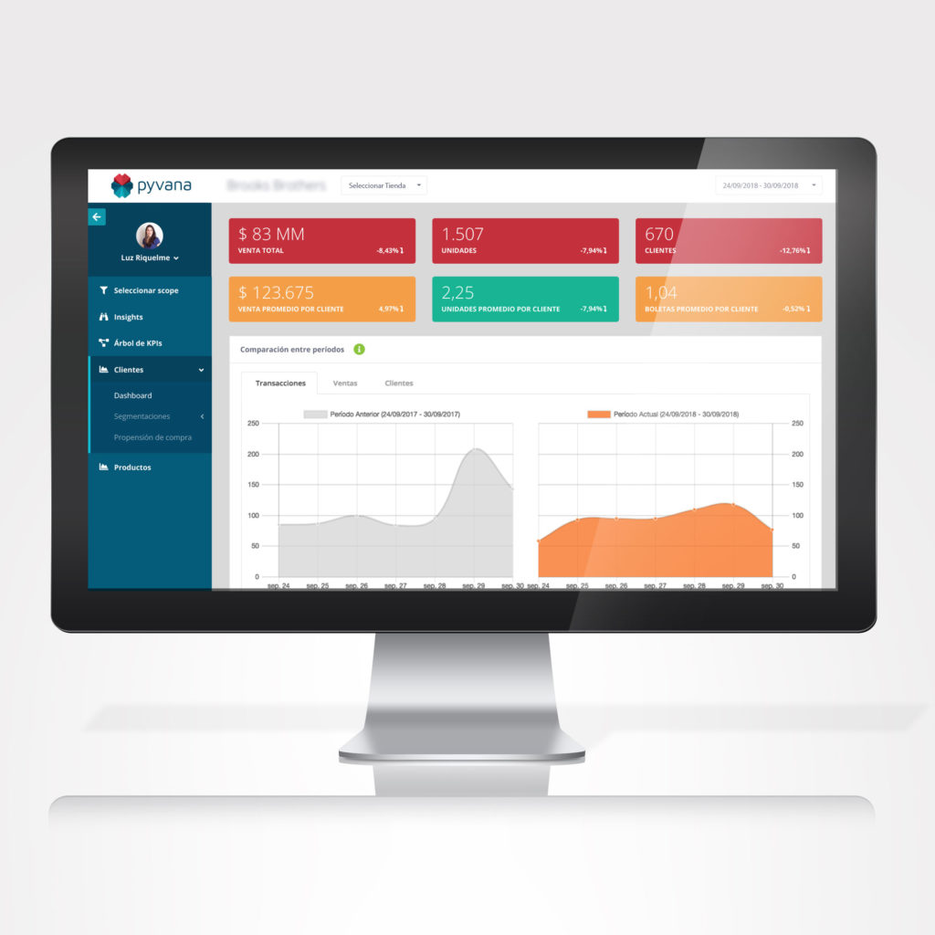
- Customers
- Dashboard: ideas will be included as an improvement.
- Segmentations
- Activity: The graphics can be improved by allowing the selection of more than one column, to preview the data.
- Grouping by RFM: Graphics can be improved by allowing the range of more than one column, to preview the data.
- Gender: The graphics can be improved by allowing the choice of more than one column to preview the data.
- The propensity of purchase: in the section of the tendency of purchases by categories, the deployment of the elements must be restructured, for example to two columns.
- Products
- Dashboard: The info message about the chart might be more visible. And the info you display could be more visual, that is to say, add some badges, labels, and colors.
- Segmentations
- ABC (Pareto): The distribution of the main widget could be everything wide, displaying the information horizontal would take care of better space.
- By Season: You could have some informative summary widget general by season, to improve the hierarchy.
- Heatmap: The graph of buyers versus monetary value the average is complicated in the first instance. Perhaps to improve the visualization, we can divide the number of buyers equally.
- Sales Projections: in this section, you have to restructure the display of the elements, for example to two columns.
Competition Analysis
The competition analysis explains and shows which areas of the business you try to improve and optimize with the software. All competitor websites include a blog with research and related topics.
The competition analysis explains and shows which areas of the business you try to improve and optimize with the software. All competitor websites include a blog with research and related topics.
Direct competitors
JustEnough
Advantages
- Has a Marketing plan
- They have a mobile version.
- Separate navigation by usage levels, offering a menu specialized for each type of user.
- It has modules that can only be dragged and dropped.
Disadvantages
- It has an old and not very clean design.
Celect
Advantages
- It has a very specialized technical offer in allocation, fulfillment, and plan & buy.
Disadvantages:
- It looks a bit visually limited; the interface is unfriendly.
Precima
Advantages
- A complete and robust Marketing plan
- It has a comprehensive program, offering an ecosystem of solutions.
Disadvantages
- It does not show how it is used and what its platform looks like.
Conclusions
The development of this usability study with individual users has helped us to validate critical points in the use of the Pyvana platform.
Together with the analysis made by OrangeLab of the platform and with the use of testing with individual users we have been able to clarify a variety of points that could be improved after the platform is more friendly and intuitive.
Wireframing
After the UX analysis, I proposed high fidelity wireframes for the platform.
Layout Proposal
App Landing Page
Presentation
View the logo conceptualization: