Project Frame
Fundalurp is a non-profit organization built to help people with visual impairments. They offer free training and orientation to people with retinitis pigmentosa.
Nowadays in Chile despite the high numbers of visual disability, there are currently no schools that train guide dogs due to the demanding requirements in Chilean legislation.
Fundalurp has taken the challenge of creating the first guide dog school in Chile. This school will provide guide dogs to people with visual disabilities throughout the national territory free of charge. Along with this, the school will fulfill the mission of educating society on the rights and duties of the visually impaired user with a guide dog.
This project has materialized after a work of about a year, from gathering information, generating relations with institutions in other countries and even having the first puppies. In this stage, they contact me to help them with the project.
Project Goals
I began working on this project when they planned to launch a fundraising campaign. The goal was to get as much money as possible. The first requirement was to create a website to promote and advertise the fundraising process.
I started thinking about the campaign proposal that they had. The concept and what needed to be communicating with this promotion. The creative director had an idea about bills and coins, and make people give them one buck each.
After a while, I thought that all the concept that he had in mind was too related to money instead of appealing to people’s feelings. This project is all about senses, and we should take it that way.
Main Concept
The concept that I worked on was “Join us as a collaborator and leave your paw print.” The metaphor that has is all about raising your hand/paw and collaborating with this noble cause. And with your contribution, you will leave a mark, a paw print.
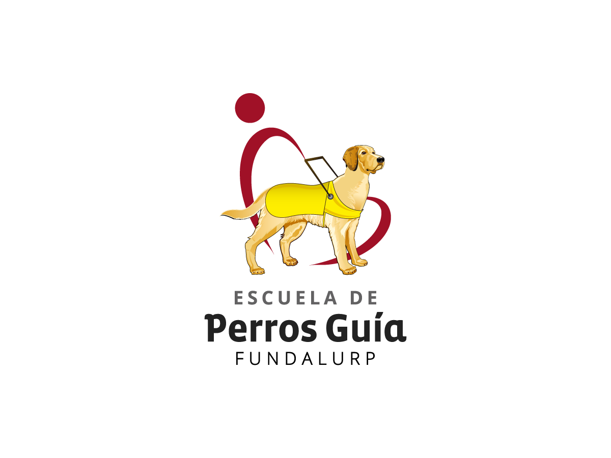
In that way, I had to rethink the logo that they had at the time to suit better the new concept. So my first proposal came with a refreshed logo, but they were using the old logo everywhere, and they were not willing to change it.
After a few proposals, they still wanted to keep the dog from their old logo, and so the coloring that this logo presented. I had to mix it up with my proposal and showcase the last logo, more old than new.
Logo original
Logo proposal
Logo selected
Wireframes and Flows
After proposing a logo and visual style, the next step was to start working on the website’s flows, to define pretty much everything.
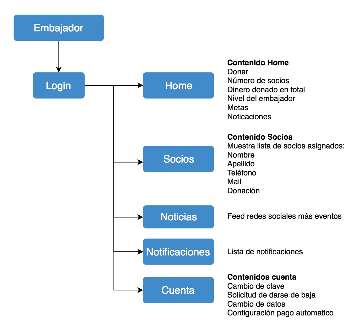
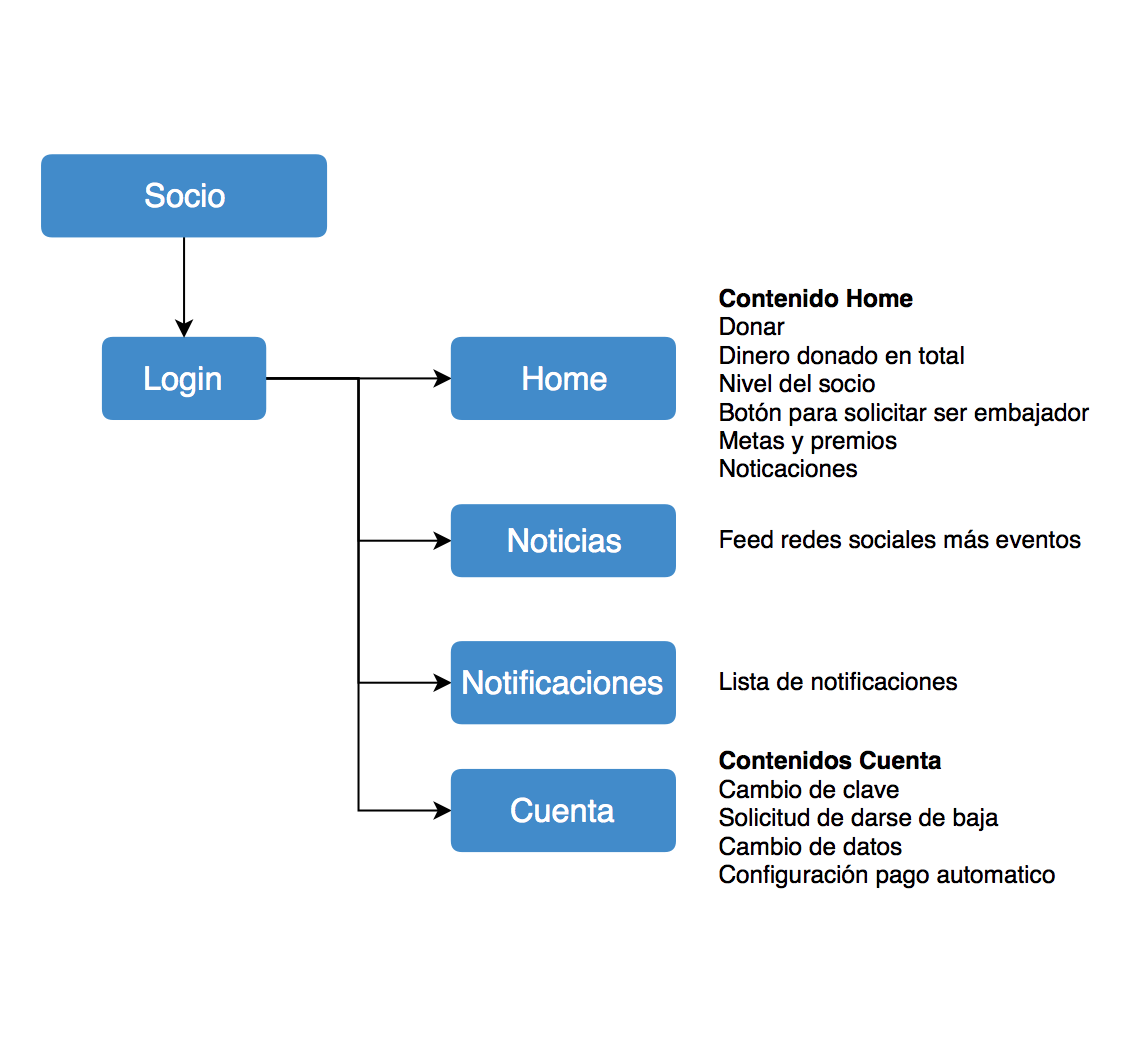
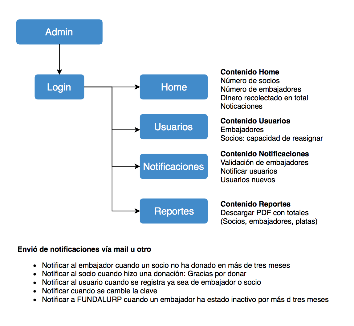
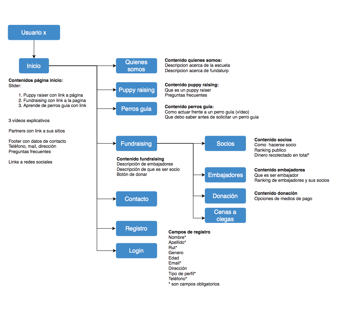
I began working on the website structure, navigation flow and different types of users of this platform, what they can do and see, and the basic functionalities that we needed to succeed in connecting with people.
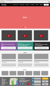
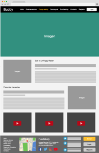
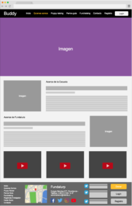
Then I built high fidelity wireframes with a proposal for calls to action and the fundraising main content structure. When I arrived at this project, they already had a working website, so I took some contents from there and integrated the structure that they were using.
I merge the old website, as it was just for informative purposes, with this new fundraising campaign that we were building together.
After presenting the wireframes for this new website, I started working on the contributor’s platform flows. I define how they will interact with the platform and what were the features that each type of user could access.
I created high fidelity wireframes, to guide the development team process. And with this, I could work on the platform styling later on the project.
Flows
Wireframes
► View the full wireframes proposal in PDF
Website and Collaborators Platform
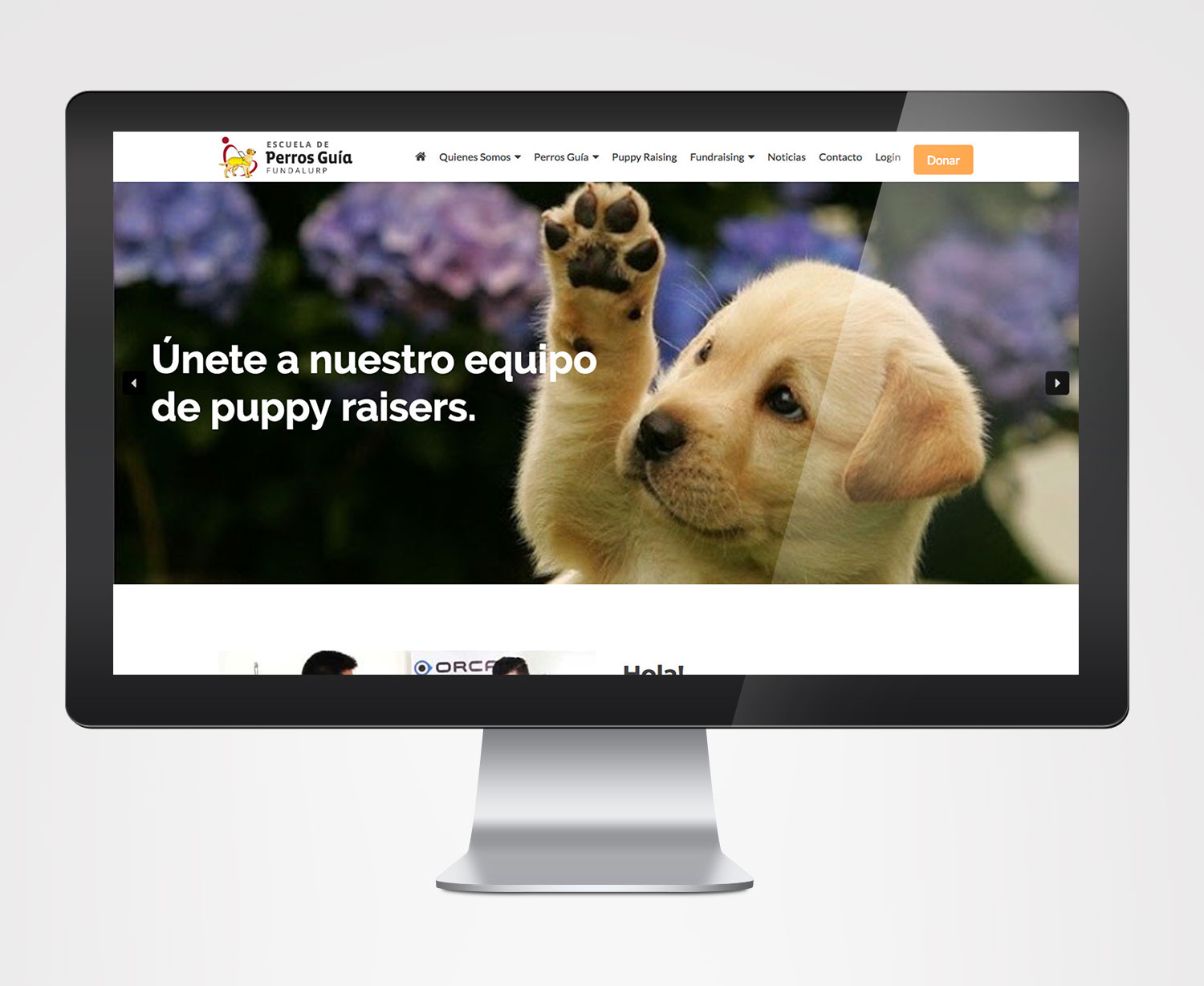
After the flows and wireframes proposals were approved, I commenced working on the open site, creating all the graphics and implementing the planned structure.
I decided to work with WordPress, to provide the tools that they needed to keep publishing news and updating testimonials of people related to the foundation.
I made page by page, with my proposed content structure, and the project team created the detailed content within the process, as they were not sure on how to make the material fit for publishing purposes.
Later on, I styled the collaborator’s platform which was created and built in PHP, I took page by page and gave it style, align the structure and flow.
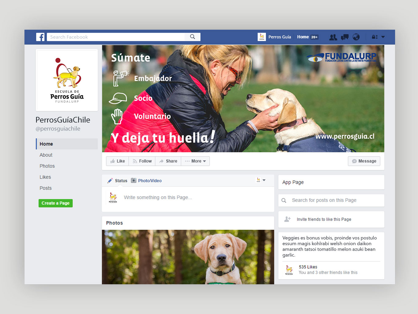
Following I made the social media imagery to align the project identity all across the social network.
Website
Social Media
Merchandise
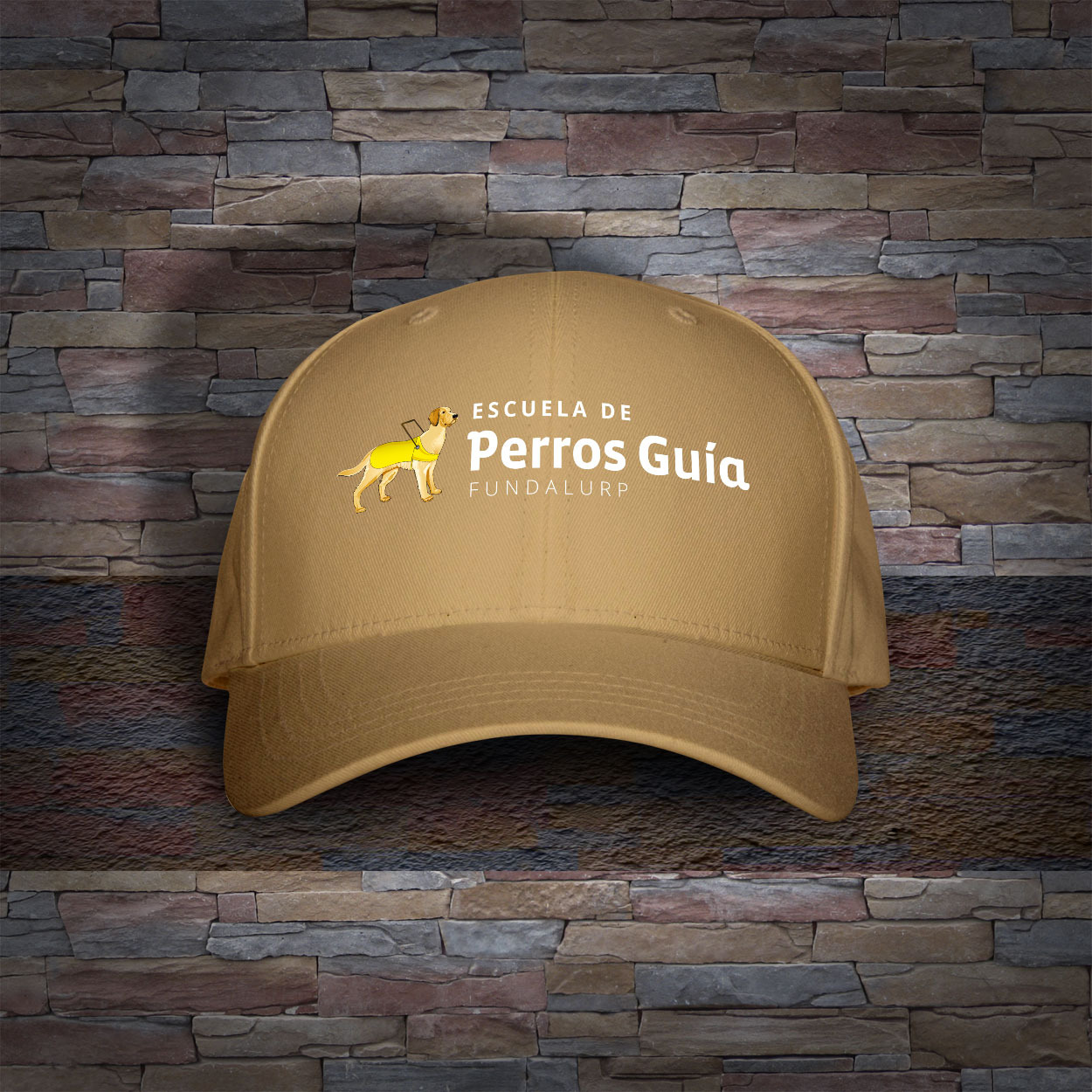
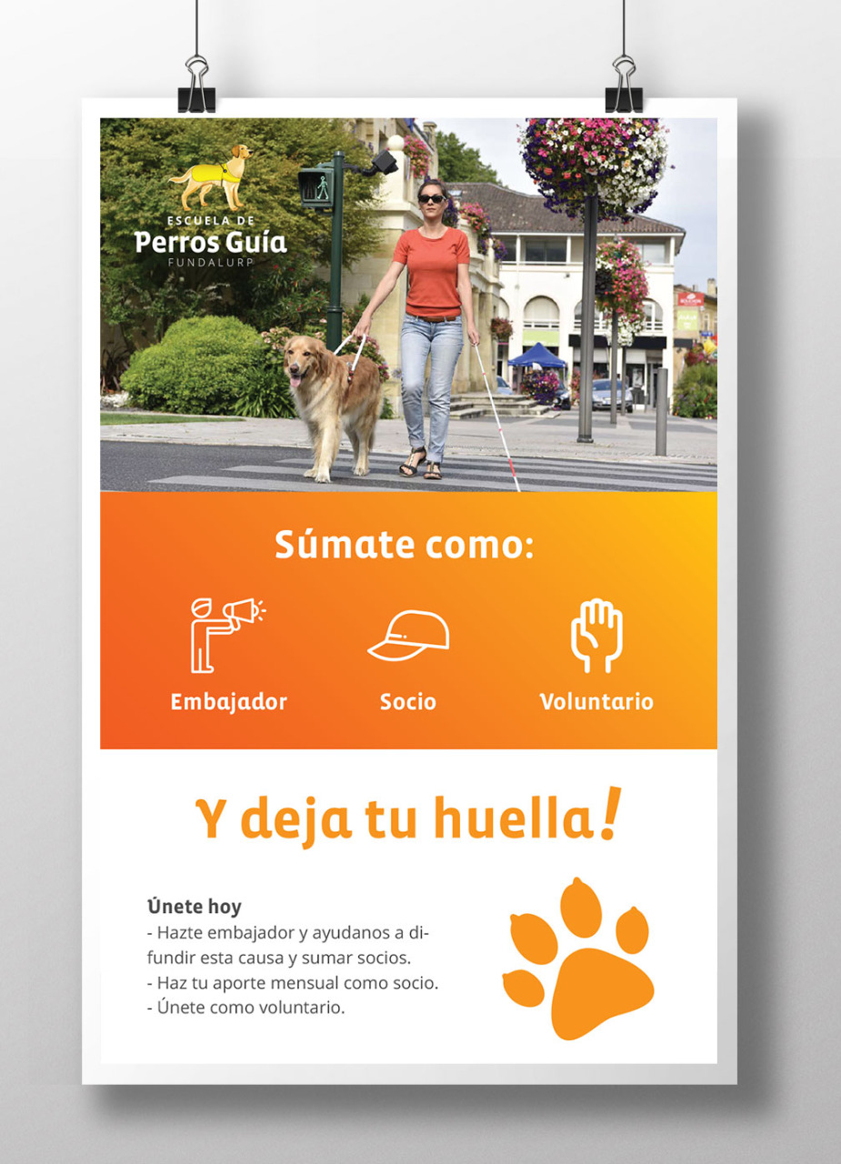
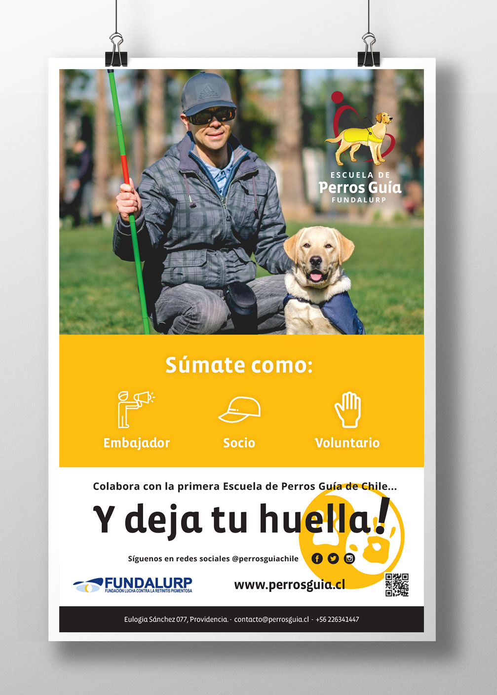
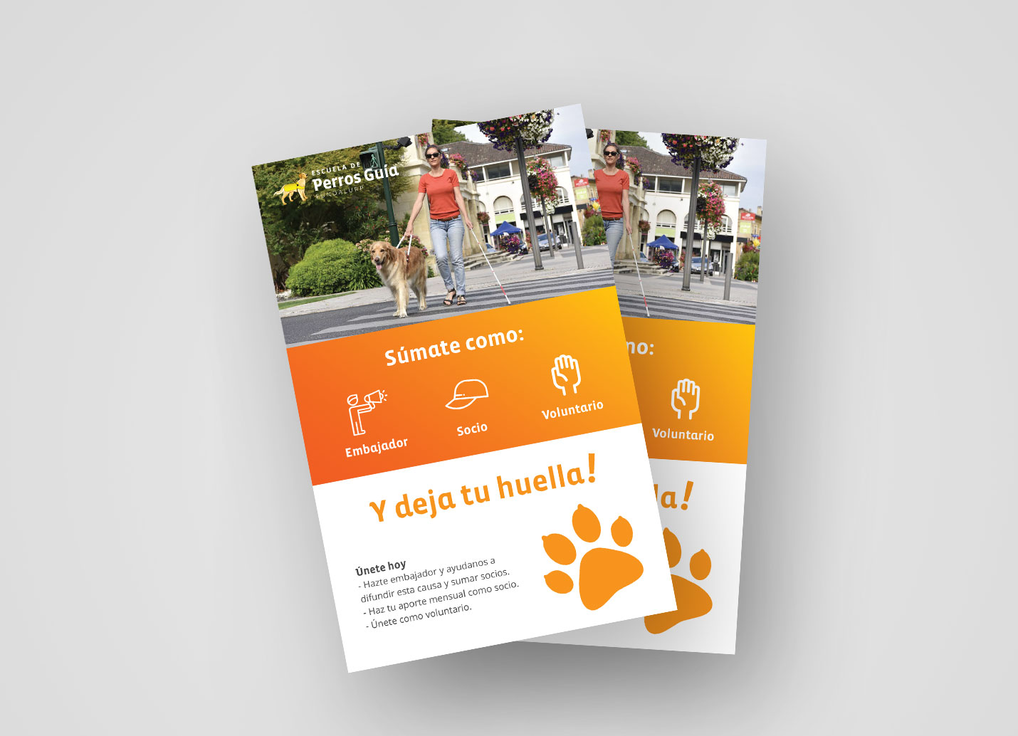
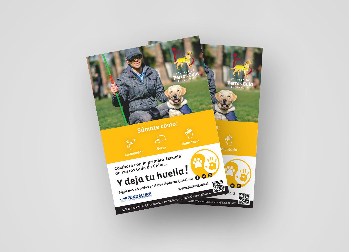
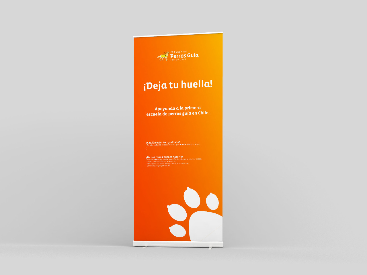
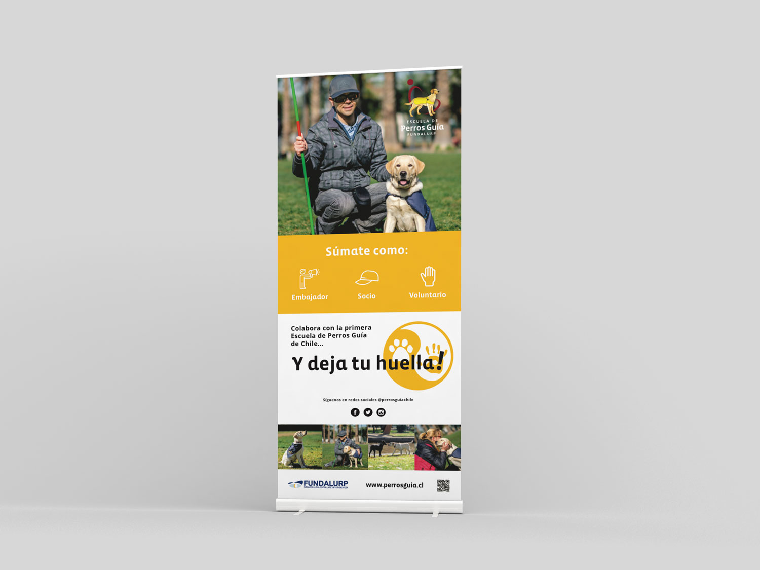
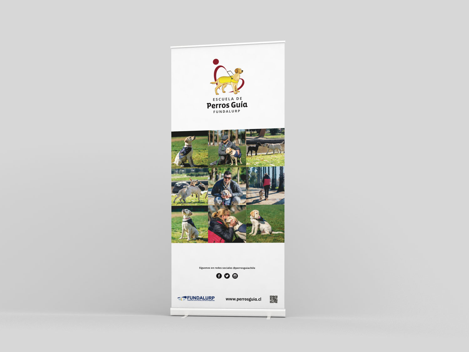
When we were in the process of this new imagery, they realize that they also needed some merchandise pieces. So I worked on flyers, posters, folders, banners, and hats.
Subway
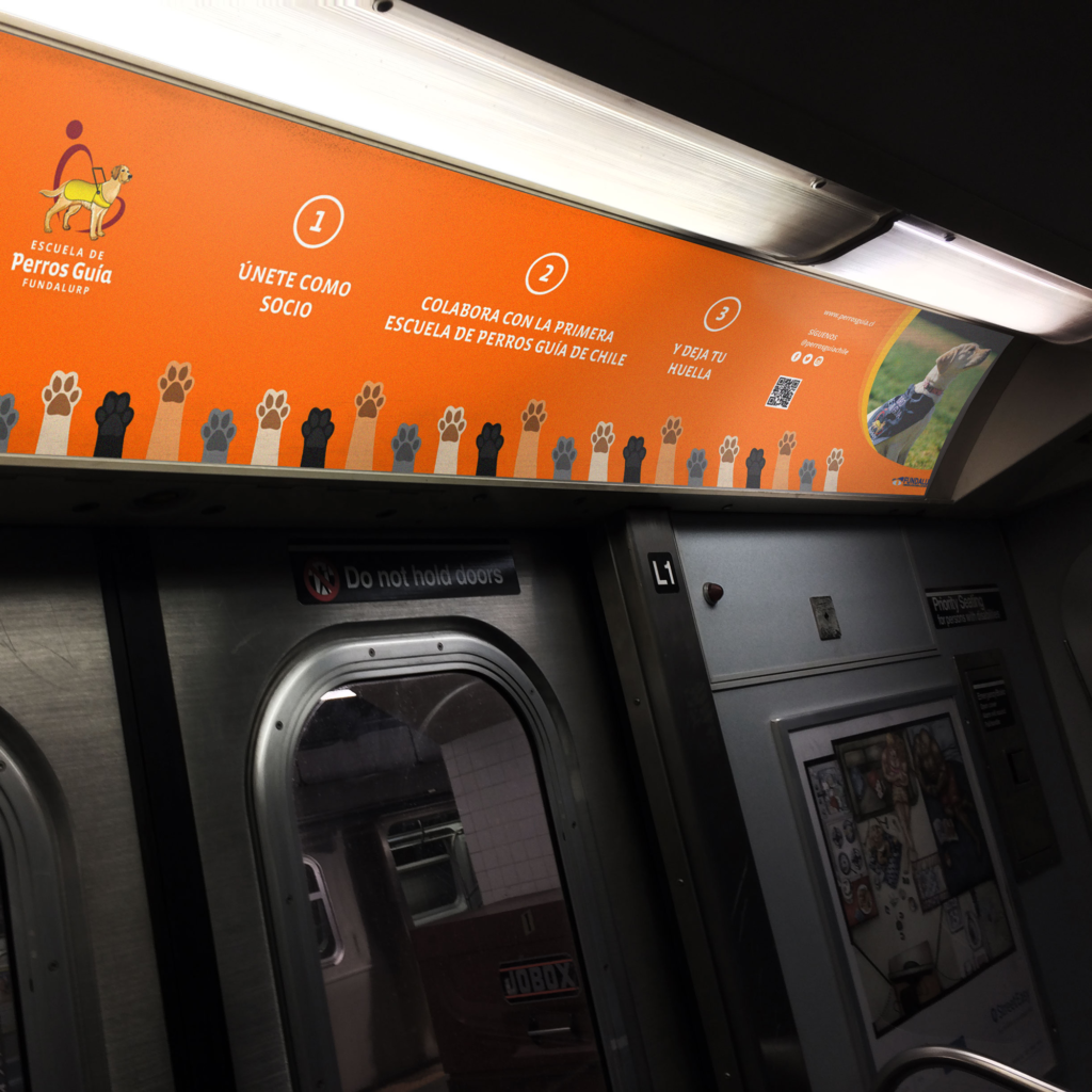
Poster
Flyer
Banner
Merchandise
