Overview
The challenge
Build a design system that can enable the teams to build products with one unified language, so the interfaces and experience are simple and coherent.
My role
As a UX Lead I guided and documented the construction of the design system. I also act as a design systems advocate.
The process
Research
In the research phase we analyzed the internal UI kits and all the different products that the company was developing.
After understanding the patters we started filtering what we wanted to keep.
Definition
In the definition phase, we took into consideration the most important UI patterns that we needed to develop in order to prioritize the main digital products that we were developing.
Design & Document
We started designing at the same time the documentation of that design, which allowed visibility and partnering with development initiatives.
Breakdown
Benchmark
We thoroughly examined the documentation of the standards and the elements of well-known design systems during the benchmarking process.
We discovered from the benchmark that these well-known design systems have some common concepts. Three principles to serve as the cornerstones of our design system based on our demands:
- Visibility
- Flexibility
- Communication
Building
We utilized Figma to lay out all of the components that are used in our platforms in a table and arranged them into an initial structure of atoms, molecules, and organisms for our application of the Atomic Design organization.
Creating Components
We ensured that each of our components is the following during the creation phase:
- Accessible
- Intuitive
- Aesthetic
The results
We combined all available sources of knowledge into a single tool that everyone had access and is willing to use.
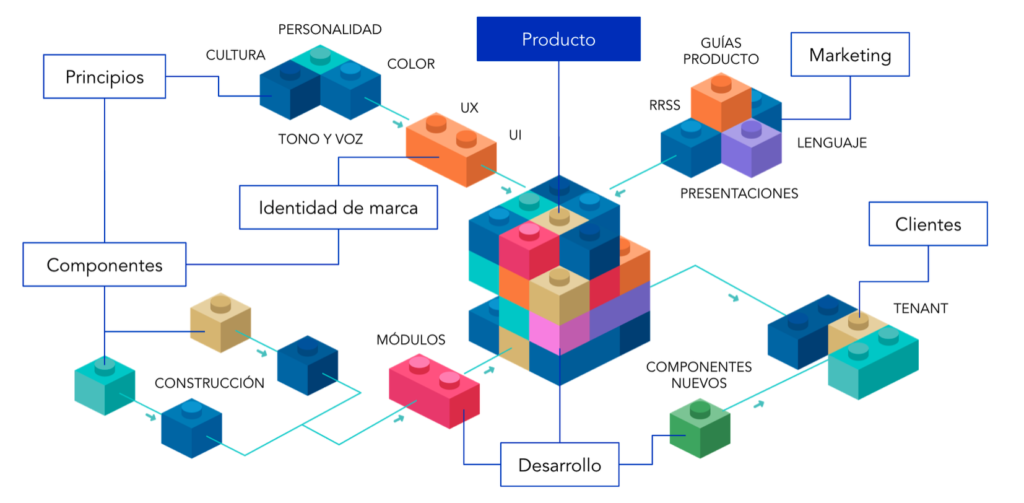
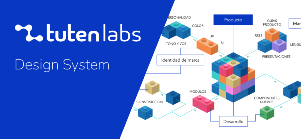
Design system structure
Construction guide
Typography
Typography has an impact on design, creates identity, provides attractiveness and brings information closer to the user. Typography is an essential aspect that should not be overlooked.
Color
Maintaining consistent and attractive digital interfaces across all tutenlabs, be they applications or experiences, calls for expanded guidance on the use of color.
Copywriting
In the interface, we need to resonate with users through dialogue. Clear and precise words are easy to understand, and a proper tone can easily engender a sense of confidence.
Layout
The layout or template is a scheme of the distribution of the elements within a web page. It is made up of a series of blocks of certain dimensions in which the content will be placed.
Components
Components are the building blocks of the design system. Each component solves a specific interface problem, such as presenting a list of options, allowing a form submission, etc.
Testing
User experience testing is the process of testing different aspects of the experience to determine the best way to deliver our solution and improve the interaction users have.
Branding
Identity
The vision of tutenlabs is to build a world in which companies can deliver memorable experiences, transforming the relationship with their clients and collaborators, based on their lifestyle and with values that identify them.
Purpose
It is transforming the customer experience. It is to make companies generate better service experiences and increase the productivity of work teams. We make our capacity for innovation and agility available to each client.
Culture
It is agile and dynamic. Allow the space to self-manage and focus on meeting your goals. Combining lean and agile methodology that allows to deliver a world class product.
Components
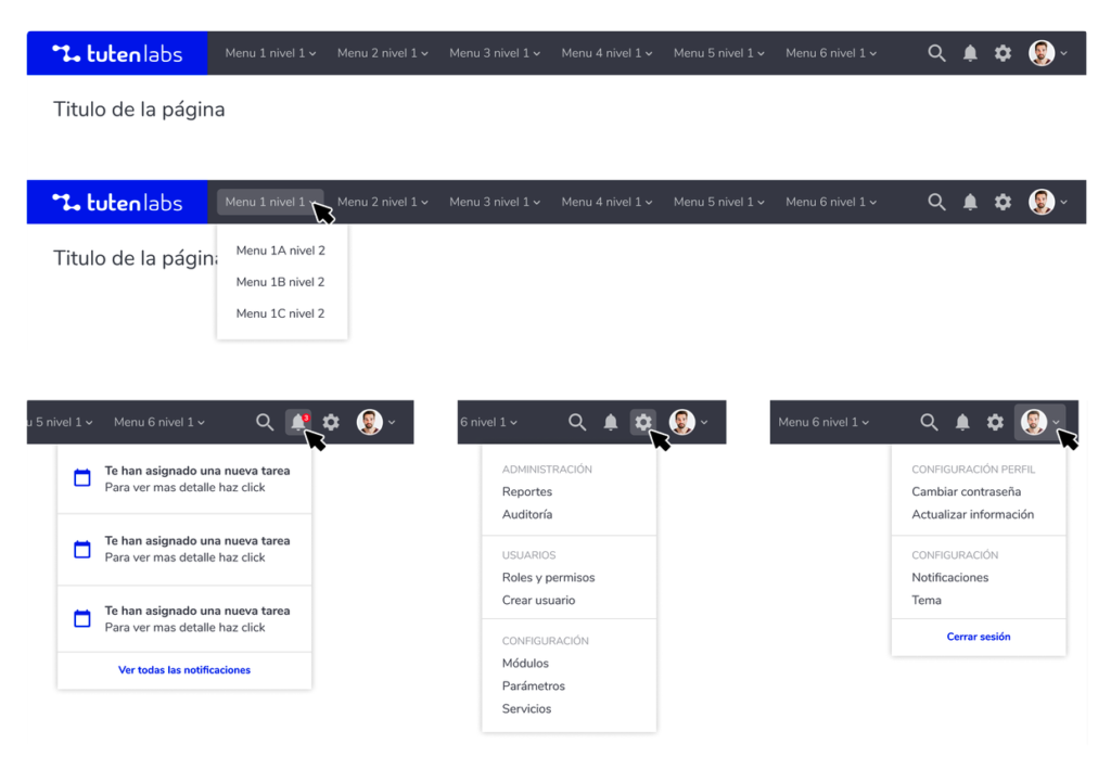
Navigation
The user interface shell consists of three components: the header, the left panel, and the right panel. All three can be used independently, but the components were designed to work together.
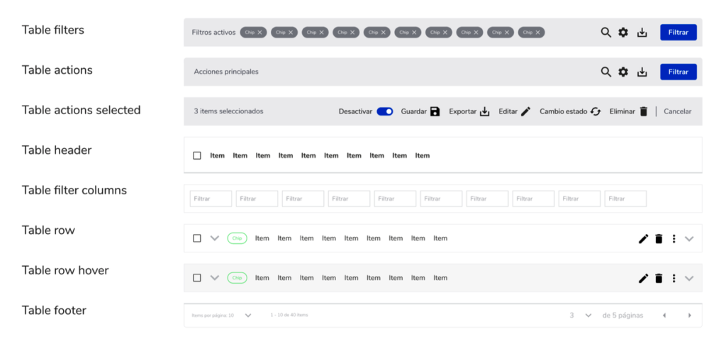
Tables
Data tables are used to organize and display data efficiently. The data table component allows for customization with additional functionality, as needed by the users of your product.
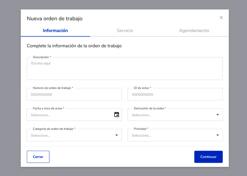
Modal
Modals are a type of dialog used to present critical information or request user information needed to complete a user’s workflow. Modals interrupt a user’s workflow by design.
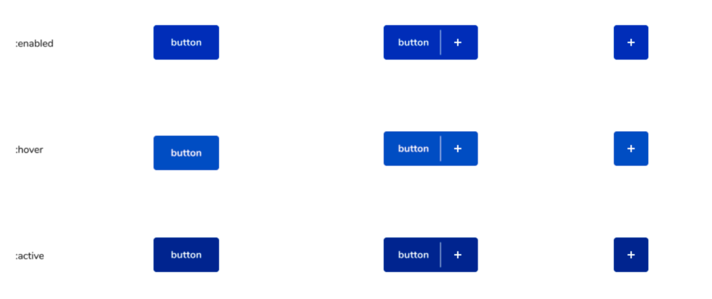
Buttons
Buttons are clickable items that are used to trigger actions. They communicate calls to action to the user and allow users to interact with the pages in a variety of ways.
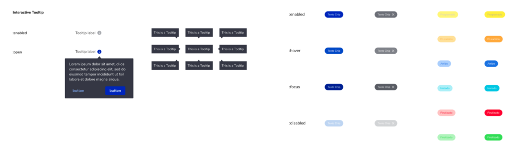
Helpers
Indicators or information. They show additional information when you click, hover, or focus. The information must be contextual, useful and non-essential.
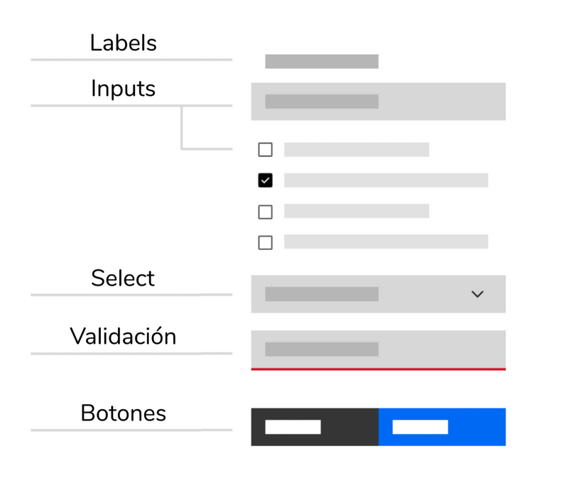
Forms
Forms are used to submit data, so we need to be as concise as possible when designing them. Think about each field and what value the data will provide. What will we gain by collecting this information? Is this valuable information for us? Is this information so valuable that it is worth preventing the user from continuing if they choose not to provide it?
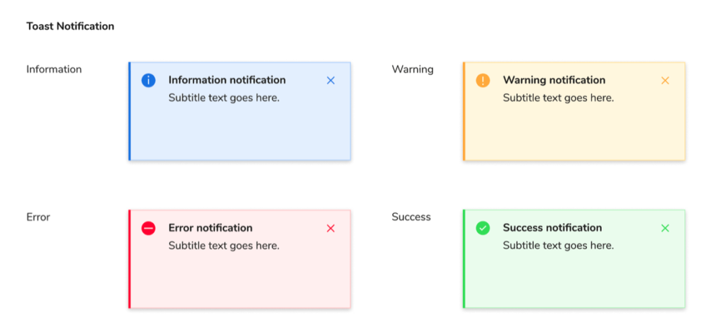
Notifications
Notifications are messages that communicate information to the user. The two main types of notifications are toast notifications and online notifications.
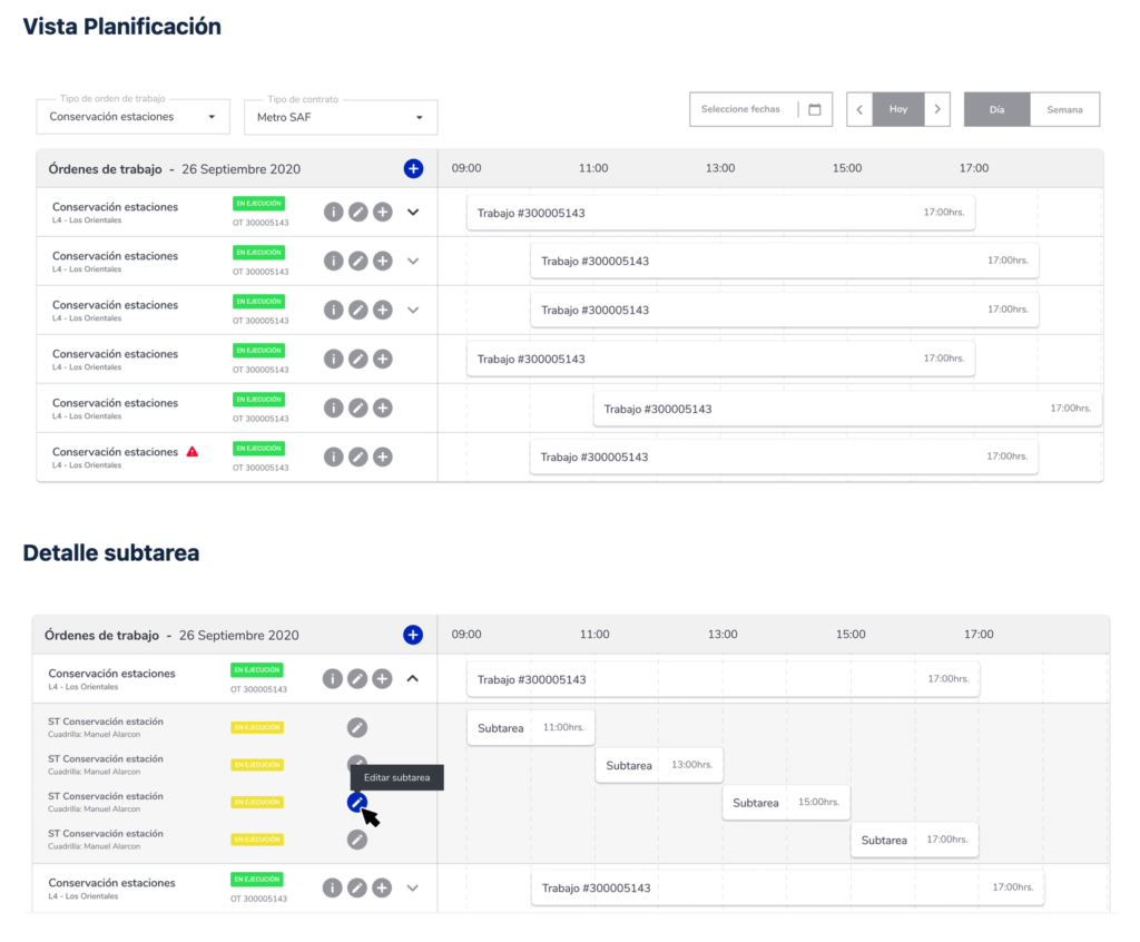
Planning
The construction of the resource planner was based on the Full Calendar code which gave us the initial footing to define the structure and functionalities of this component.
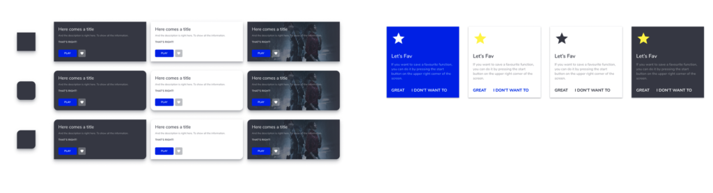
Cards
All the components have been designed to work harmoniously together, as parts of a greater whole.