When developing corporate imagery, we consider many different associations with elements, colors, and typography. These connections trigger powerful ideas and emotions; this means that choosing the right typography in logo design could help you to communicate your brand’s personality. Whether designing a logo with a typeface that’s serious and sober to define a “formal” brand or choosing something more upbeat and edgy, fonts can be crucial to effective brand recognition. When understanding that each font has its different characteristics, and you realize what those are, you can choose the options that share the features that best represent your business.
process
In this logo proposal, the first logos are displayed in black and white because of what we define first is the shape and meaning then we choose and apply colors and texture. After we present the black and white logo, we test it in different color situations.
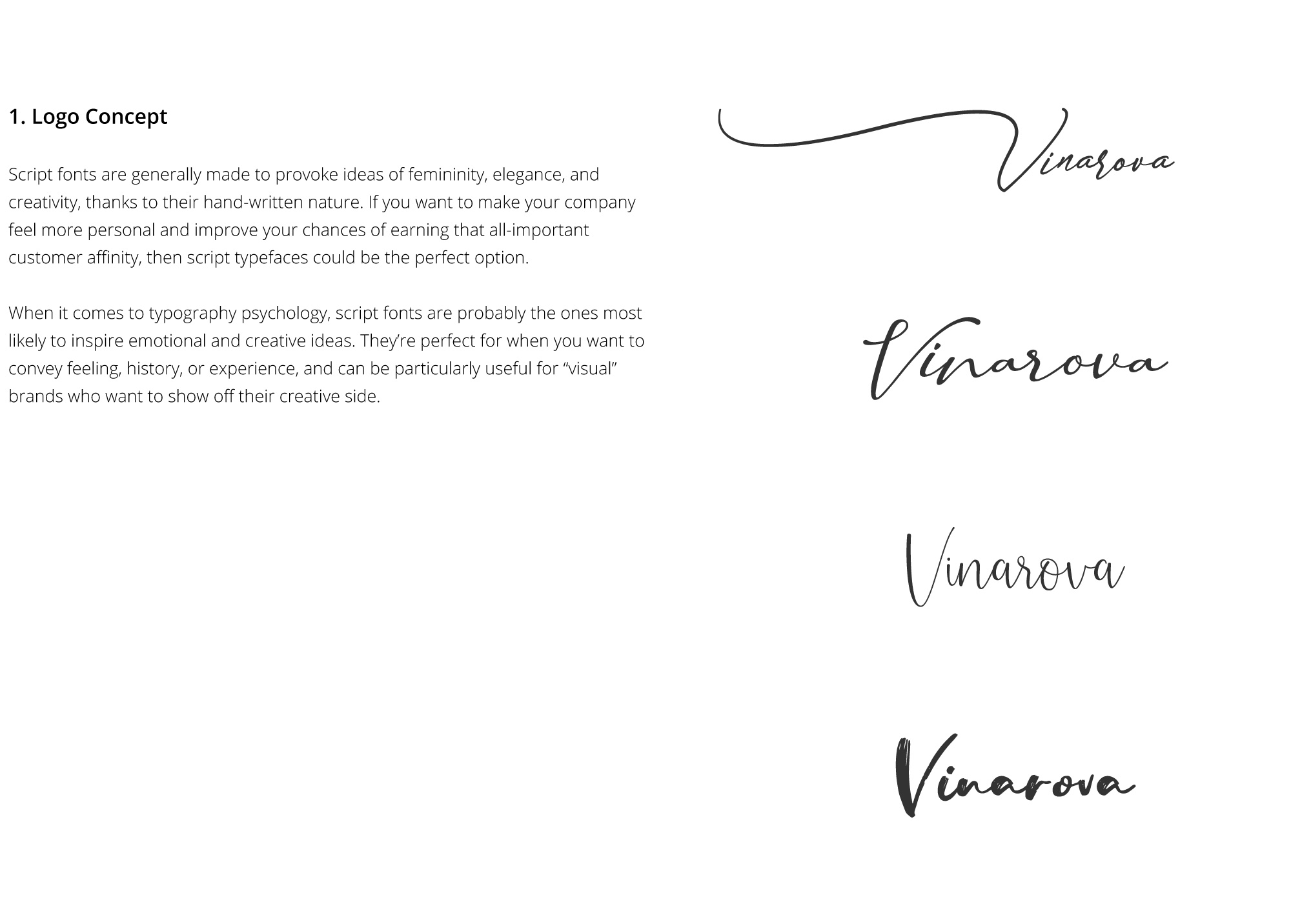
Logo Concept
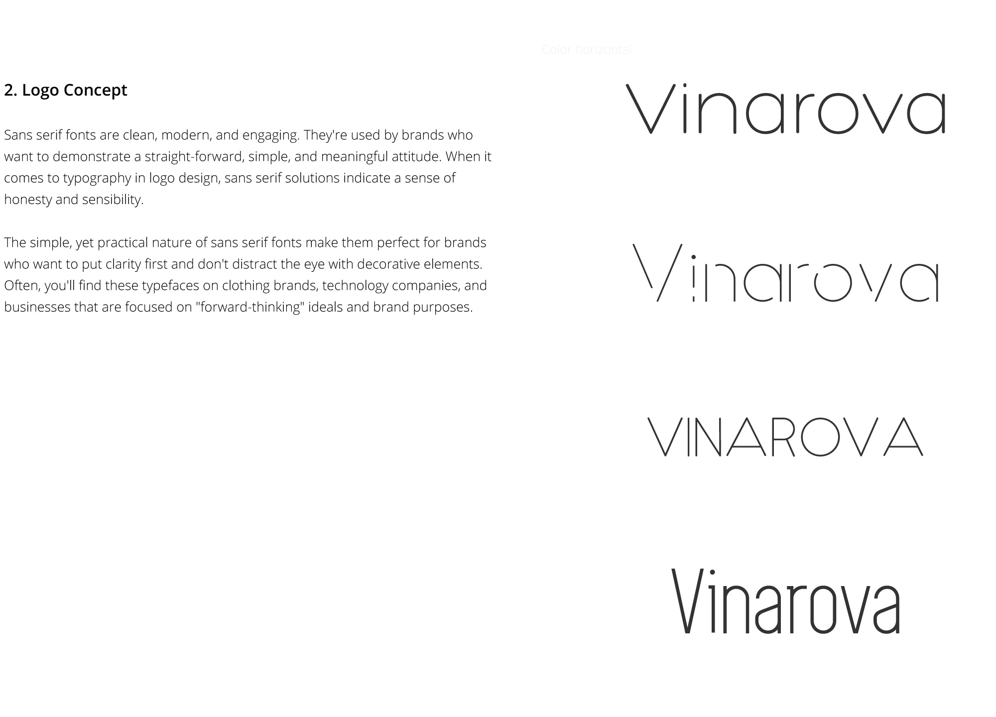
Sans serif fonts are clean, modern, and engaging. They’re used by brands who want to demonstrate a straight-forward, simple, and meaningful attitude. When it comes to typography in logo design, sans serif solutions indicate a sense of honesty and sensibility. The simple, yet practical nature of sans serif fonts make them perfect for brands who want to put clarity first and don’t distract the eye with decorative elements. Often, you’ll find these typefaces on clothing brands, technology companies, and businesses that are focused on “forward-thinking” ideals and brand purposes.
