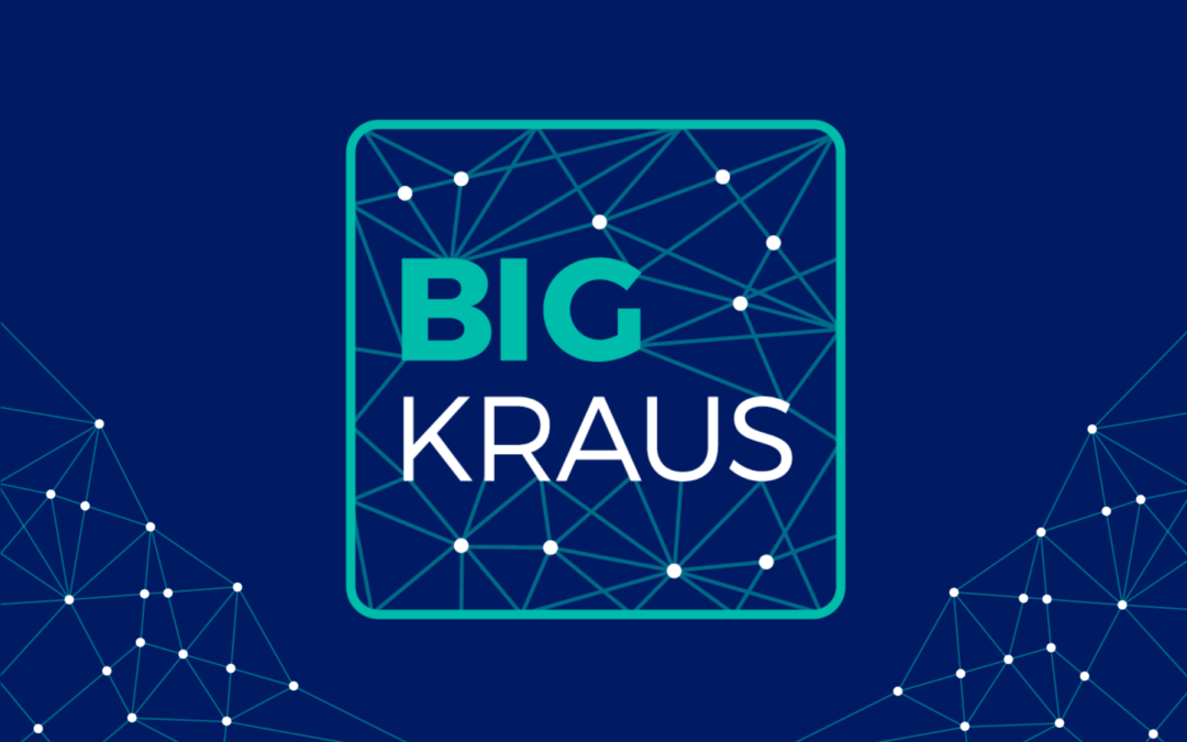
About Bigkraus
It is a platform that provides ERP solutions to companies for the facilitation of their business processes and decision making. Integrating different ERP modules that allow optimizing internal processes of companies.
By delivering business visibility to company decision-makers, as well as through AI we automate information management to have timely information free of errors.
A comprehensive solution for current market needs, supporting on-time accounting, financial, and tax decision making based on automated processes of economic records of companies simply and practically through the management of information in real-time.
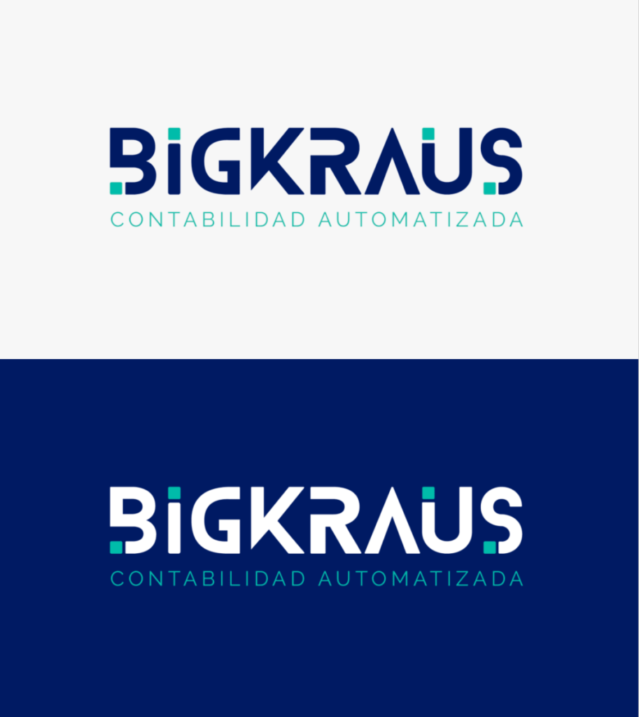
Proposal 1
In this first proposal, it begins with a disruptive idea, represented mainly in its strong and dynamic typography, with a few touches of color in the shapes of squares, which convey strength, solidity, security, and order.
In terms of color, we have blue, which is usually linked to introspection and tolerance, but probably its best-known link is with the idea of serenity and calm.
It is one of the colors most related to tranquility and control of the situation, as well as to peace, understanding, and protection. It is also linked to caring for others and trust and credibility.
The turquoise color helps open the lines of communication between the heart and the spoken word. It is presented as a friendly and cheerful color enjoying life. It’s a great color that helps you think clearly and make decisions. Helps in the development of organizational and management skills.
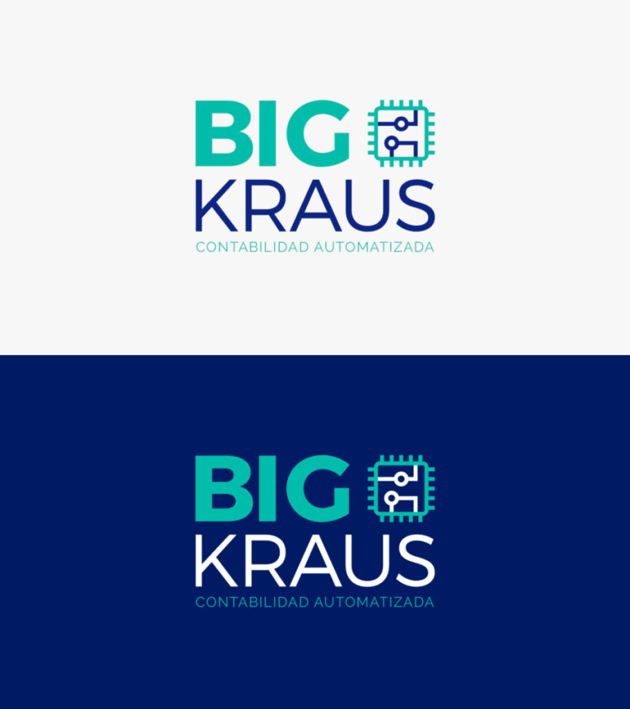
Proposal 2
This proposal begins with the abstraction of the hub and AI. The connectors displayed within the hub represent automation and learning through AI, framed by a square shape providing the necessary stability and confidence.
The external connections to the panel represent all the information channels from various sources that reach the hub, delivering timely information in real-time.
In terms of color, we have turquoise which helps to open the lines of communication in a friendly and cheerful way. It helps you think, make better decisions, and develop organizational and managerial skills.
At the base, we have blue which is associated with tranquility and control of the situation, as well as with peace, understanding, trust, and credibility.
The typeface used is sans serif, according to the psychology of typography they convey modernity, security, and on certain occasions neutrality and minimalism.
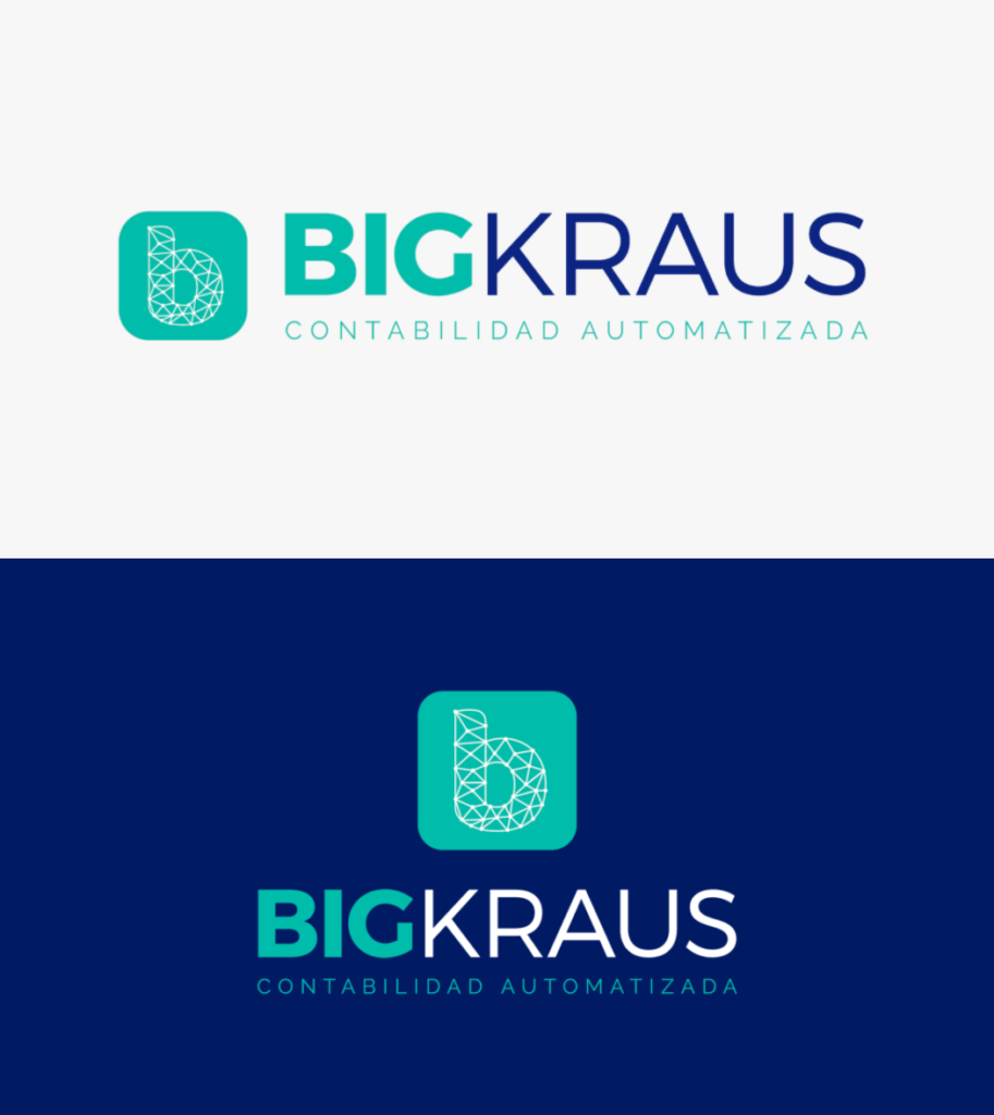
Proposal 3
This proposal begins with the idea of links that connect directly with the B of Bigkraus, which represents the innovation hub, surrounded by a hexagonal shape, which represents perfection, unity, synergy, work, and wisdom.
The diagonal shapes of the hexagon give it the dynamism that this artificial intelligence needs, entering the information through the edges of the shape generates a cyclical and constant movement.
The typeface used is sans serif, according to the psychology of typography they convey modernity, security, and on certain occasions neutrality and minimalism.
Proposal 4
This proposal begins by graphing the infinite connections that an accounting, financial, remuneration, and tax data processing software has.
All of these links are joined within the b of Bigkraus. represented by diagonals ending in a circular connection point.
To give it all the support and stability that this shape needs, it is surrounded by a square. The four-sided figures show something real, solid, fortified, and technological.
As a download of the logo, the phrase Automated Accounting is added, which is proposed. But I think this logo needs to have at least one word that people associate with something existing.
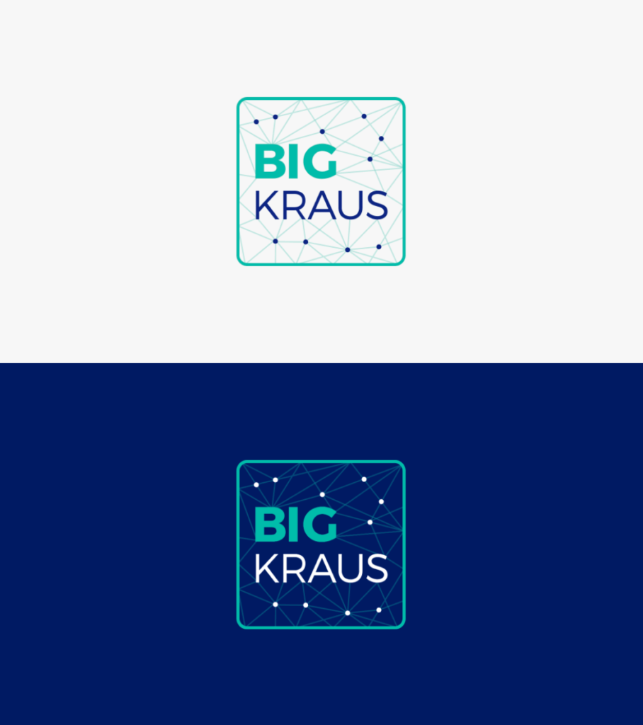
Proposal 5
The idea of a hub represented by a square is taken, with Big Kraus inside, generating connections and vertices. The shape of the chip is simplified, giving more prominence to the brand name.
At the color level, the word Big is related to the square, which is the most natural way to represent stability. Showing itself real and solid, frank and fortified, it is a masculine and technological form.
Then the word Kraus is connected at the color level with the vertices that represent the connections that can be achieved through this platform.
Concept
The logo is the abstraction of a hub with connections and vertices shown inside, representing automation and learning through AI, framed by a square shape providing the necessary stability and trust.
At the color level, the word Big is related to the square, which is the most natural way to represent stability. Showing itself real and solid, frank and fortified, it is a masculine and technological form.
Then the word Kraus is connected at the color level with the vertices that represent the connections that can be achieved through this platform.
Due to the digitization component that this tool entails, Bigkraus has to be a close, elegant, trustworthy, and humane brand. Very explanatory and didactic in the delivery of information about each module that makes up this tool, which provides a lot of value for people. Since users resist change and change represents discomfort, a need for learning, and adaptation.
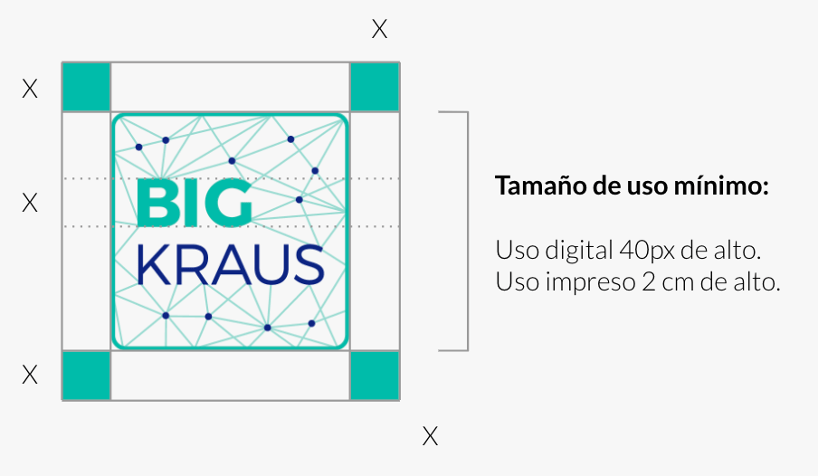
Sizes and space
For the correct use of the logo, we have security spaces and minimum sizes of use. Since by excessively reducing the space of your logo or the logo itself, there is a point where it is not legible and your brand does not visually be seen properly.
MINIMUM USE SIZE
For enlargement sizes there are usually no problems, for small-scale sizes perception is usually distorted. To facilitate reading and / or maintain the brand’s pregnancies, its reduced applications must respect a minimum size, which is expressed on this page.
GUARD
Here it is established what is the minimum white space or safeguard area that must be respected in its application. This will prevent the brand from being invaded by elements that are alien to it.
Logo Versions
The color version and other variants are presented on this page. These can be applied when there are technical restrictions that prevent the use of the preferential alternative.
GRAYSCALE LOGO AND HIGH CONTRAST
On this page, the grayscale version is established for use in reproduction systems that do not allow the printing of colors but do support the use of grayscale.
In addition, the high-contrast version of the brand is established. This only supports spot colors and should only be used for printing systems that do not allow the use of colors or grays.
Background variations
Here the uses of color in the brand are presented, according to the context in which it is located and the particularities of the communication piece in which it is being worked, you can choose the version of the logo that best suits your needs.
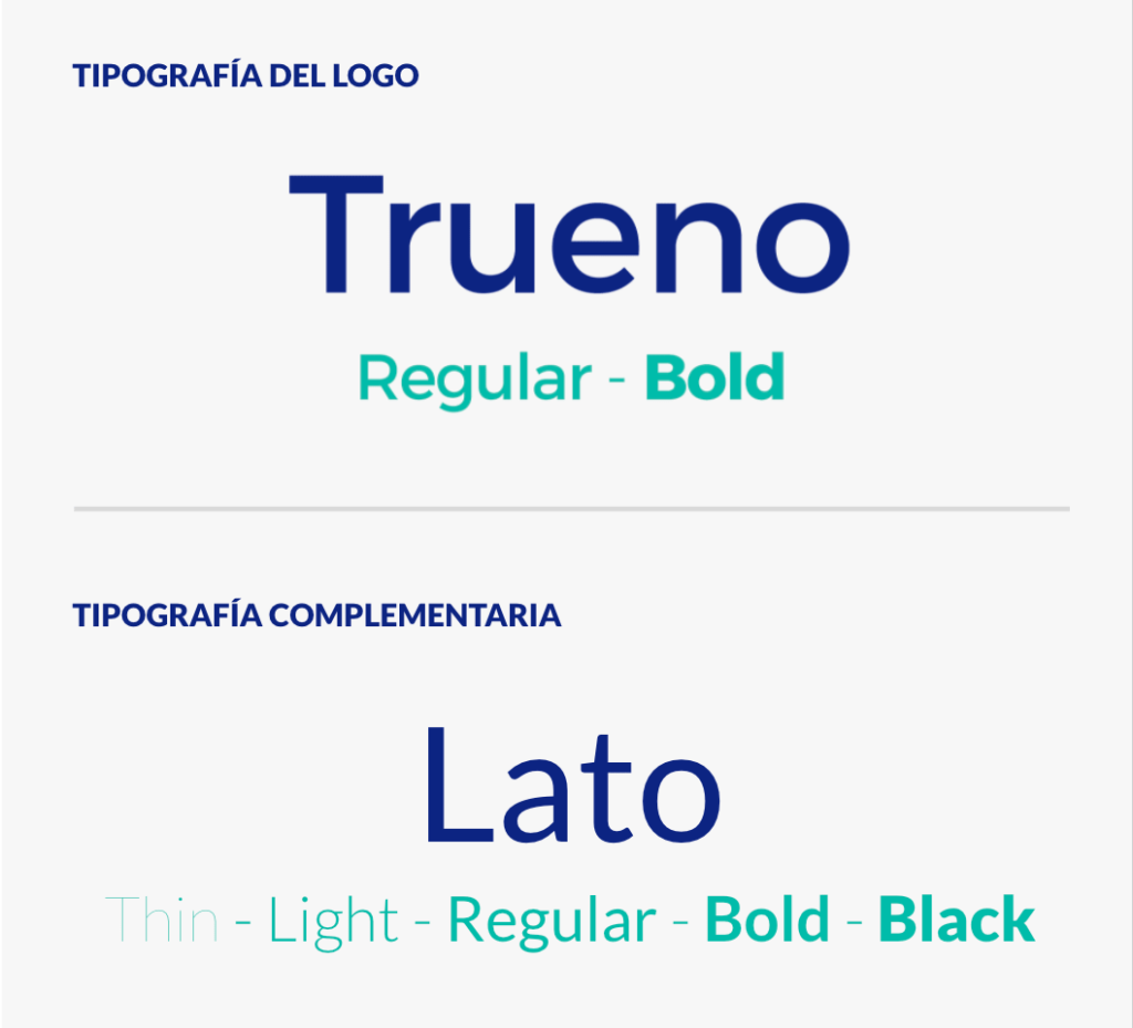
Typography
This section specifies the font used to create the logo. And a complementary font to use in body text and other texts.
The typeface used is sans serif, according to the psychology of typography they convey modernity, security, and on certain occasions neutrality and minimalism.
Thunder is a sans-serif typeface with unique curvature and fluid rhythm. Its shapes make it very distinguishable and legible when in context.
It combines styles from many entertaining typefaces and is suitable for any design medium. Trueno’s modern design is ideal for the web and adapts to any environment.