About Gamifiwork
GamifiWork is an application designed to make the process of knowledge and integration of content within organizations more effective in a simple and easy-to-use environment through the Gamification methodology.
Within the application, you can find different environments: learning microcapsules, learning challenges, trivia, videos, paper, technical content, learning verification surveys, measurements, communication campaigns, ranking, etc. For each iteration of the collaborator, a score and prizes are obtained that will be agreed with the client.
The client has an “Administrator” environment, in which he can configure the contents that are shown to the collaborator, review comments, and results of the assigned activities.
Conceptualization
Under the idea of never stopping dreaming and continuing to maintain the premise of living adventures, seeing the world, and learning, GamifiWork takes the rocket icon as the base icon for its conceptualization.
The rockets are original, happy, and optimistic, they represent the desire to travel, to live new adventures. Rockets can make us travel through time until we reach our childhood. Where we used to entertain ourselves for hours playing with an object and generating learning based on observation through all our senses.
In addition to the rocket, we have geometric figures that represent education. Enclosed in one of them, the circle. The circular shape of this logo brings memorability and strength, It is also synonymous with protection, movement and adaptability, and creativity.
In terms of color, we have mainly magenta, which represents a feeling of welcome and friendship. It produces happiness and avoids confrontation, generates a feeling of enthusiasm and vitality.
Sizes and space
For the correct use of the logo, we have security spaces and minimum sizes of use. Since by excessively reducing the space of your logo or the logo itself, there is a point where it is not legible and that visually your brand is not seen properly.
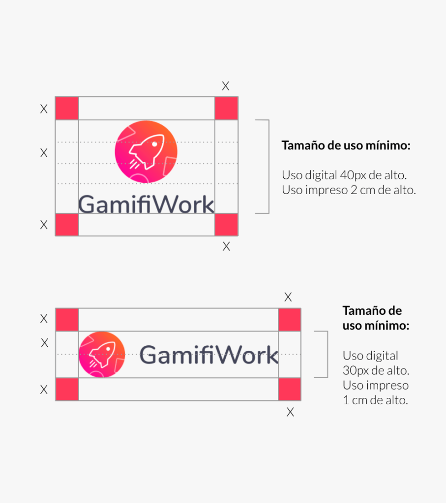
MINIMUM USE SIZE
For enlargement sizes there are usually no problems, for small-scale sizes perception is usually distorted. To facilitate reading and / or maintain the brand’s pregnancies, its reduced applications must respect a minimum size, which is expressed on this page.
GUARD
Here it is established which is the minimum white space or protection area that must be respected in its application. This will prevent the brand from being invaded by elements that are alien to it.
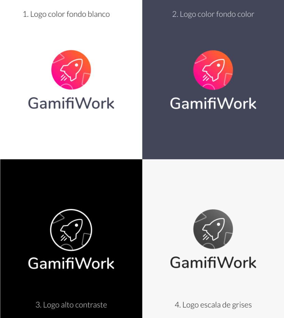
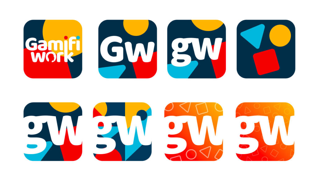
Logo Versions
The color version and other variants are presented on this page. These can be applied when there are technical restrictions that prevent the use of the preferential alternative.
GRAYSCALE LOGO AND HIGH CONTRAST
This page establishes the grayscale version for use in reproduction systems that do not allow color printing but do support the use of grayscale.
In addition, the high-contrast version of the brand is established. This only supports spot colors and should only be used for printing systems that do not allow the use of colors or grays.
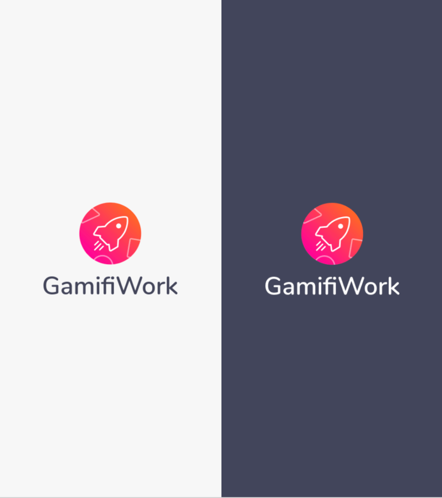
Background variations
Here the uses of color in the brand are presented, according to the context in which it is located and the particularities of the communication piece in which it is being worked, you can choose the version of the logo that best suits your needs.
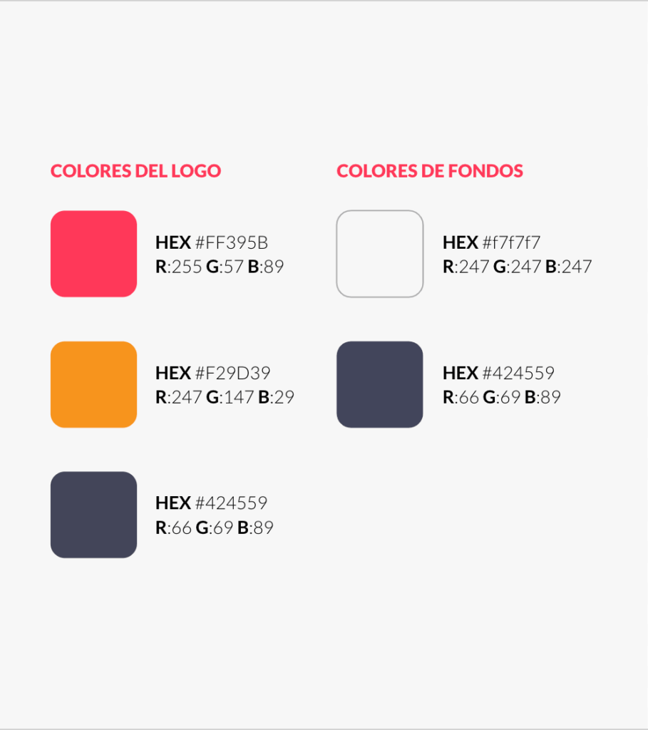
Color palette
Through color, we reinforce the conceptual sensation that we want to reflect. Purple symbolizes magic, spirituality, and creativity.
The color references are the HEX, RGB and Pantones specified here. If the printing conditions do not allow its use, the logo may be printed in four-color or black.
Typography
This section specifies the font used to create the logo. And a complementary font to use in body text and other texts.
Nunito is a sans-serif typeface with unique curvature and fluid rhythm. Its shapes make it very distinguishable and legible when in context.
It combines styles from many entertaining typefaces and is suitable for any design medium. Nunito’s modern design is ideal for the web and adapts to any environment.
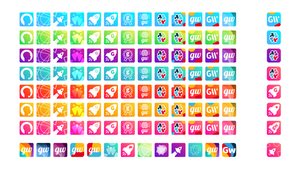
Icon Design
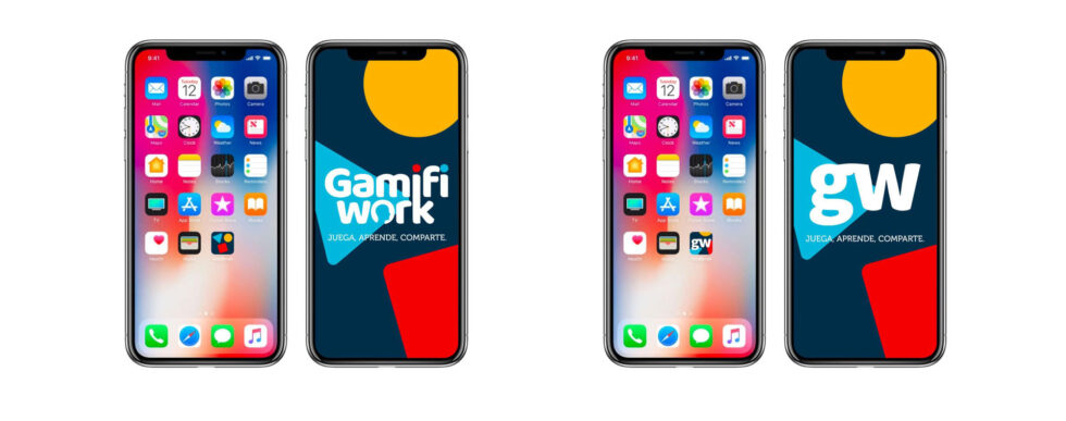
App design
Screens
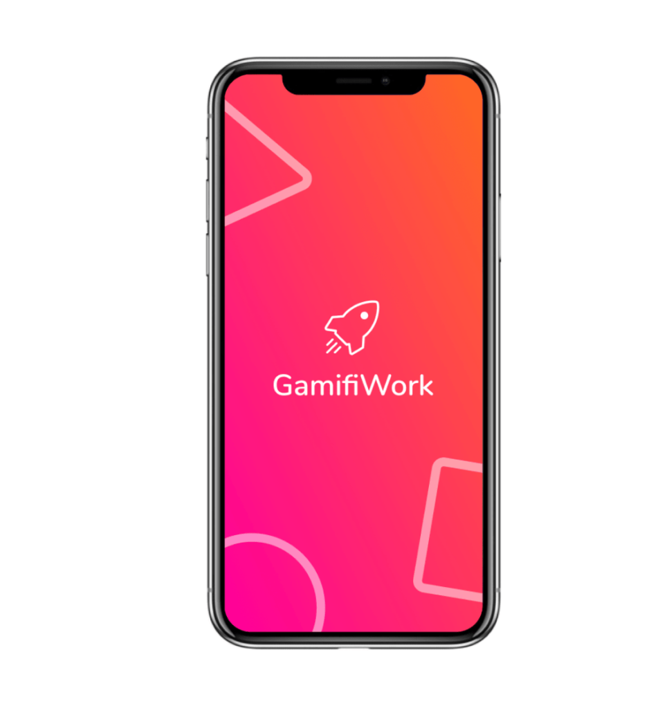
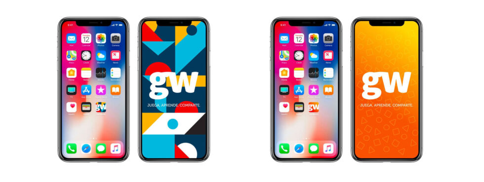
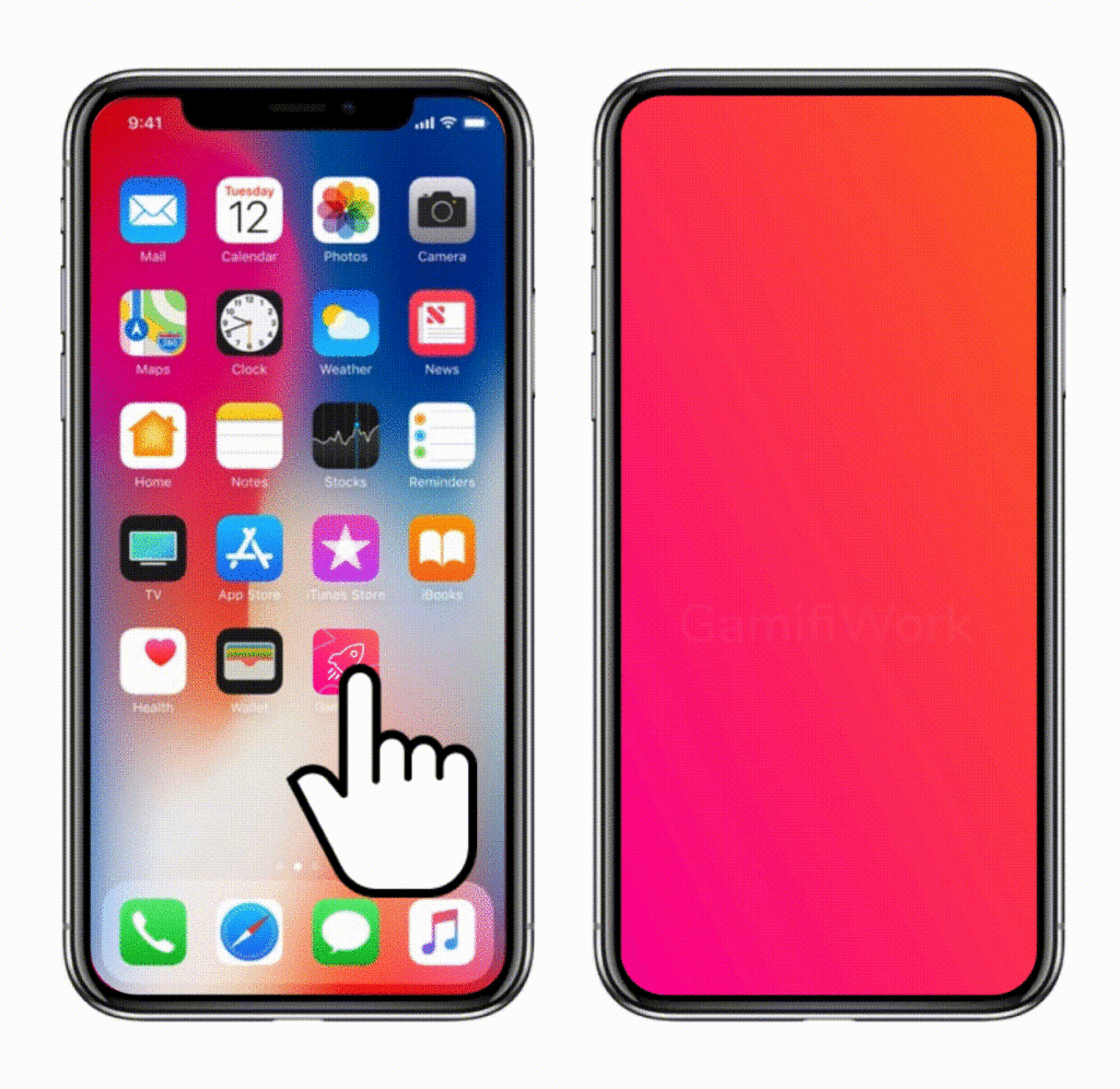
Launch application
Click on the application icon and load the animated splash.
The animated splash consists of the rocket and the geometric figures entering from different sides, giving the rocket an appearance of speed.
Interactions
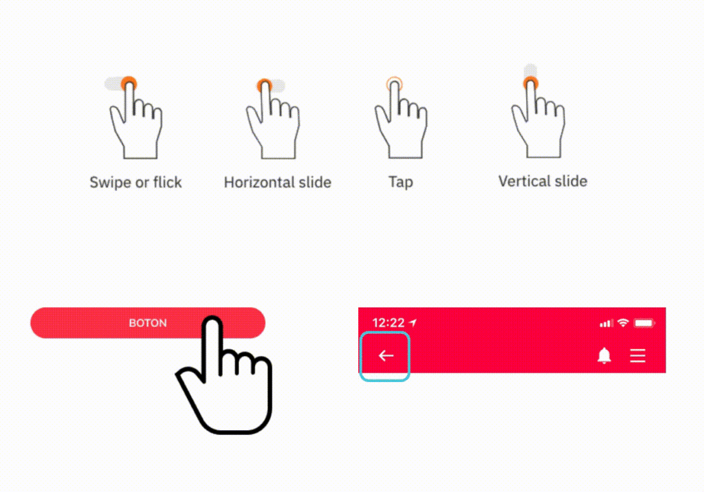
To define the interactions of the app we are going to use the names of each of the possible interactions, understand swipe, horizontal slide, tap, vertical slide, which we exemplify on the right of the page.
LOADING PAGES
Fade in and Fade out
Slide right and left
GENERAL
Buttons: -tap- on the button decreases the size (see example) and uses the standard sound.
Back button: every time the back button is present the user must be able to swipe to the right to go back.
SOUND
Here are some sound suggestions that can accompany the animations.
Sound of tadá! for congratulations.
Rocket sound for when it passes.
Sound on buttons
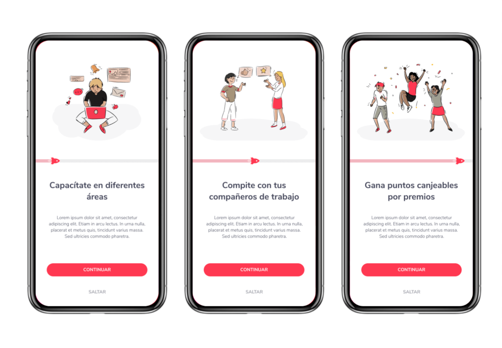
Onboarding
Timeline (rocket): The rocket must move forward with each step of the onboarding.
Swipe left and right: to move forward, move between the onboarding steps.
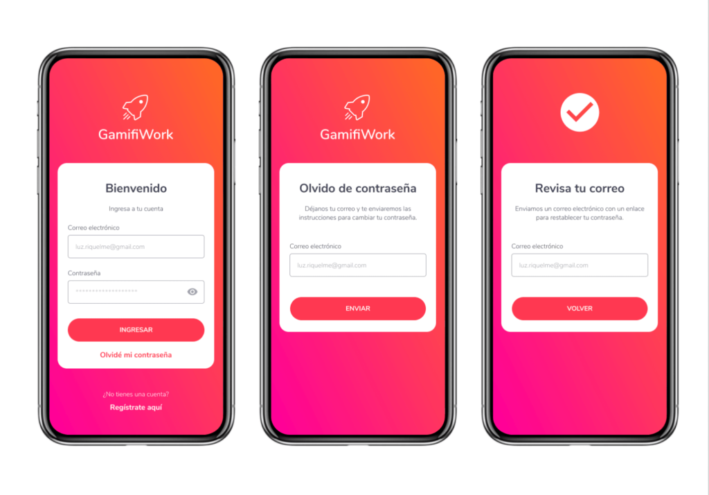
Login, registration and forget password
The user enters their data and the screen loads with fade.
When you tap on Register here the screen loads from the right.
Once the recovery email is sent, the check that appears above.
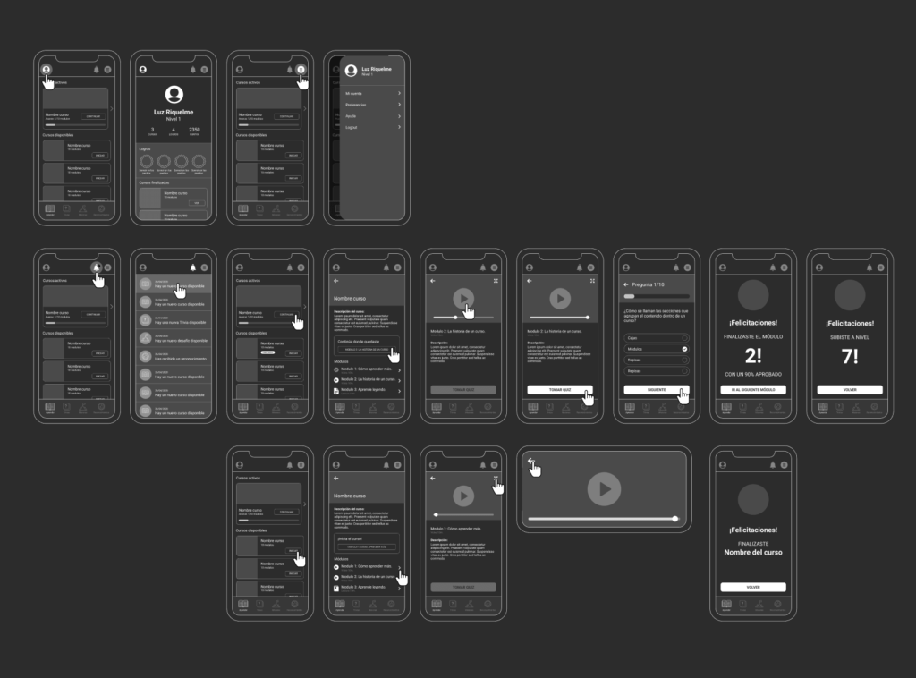
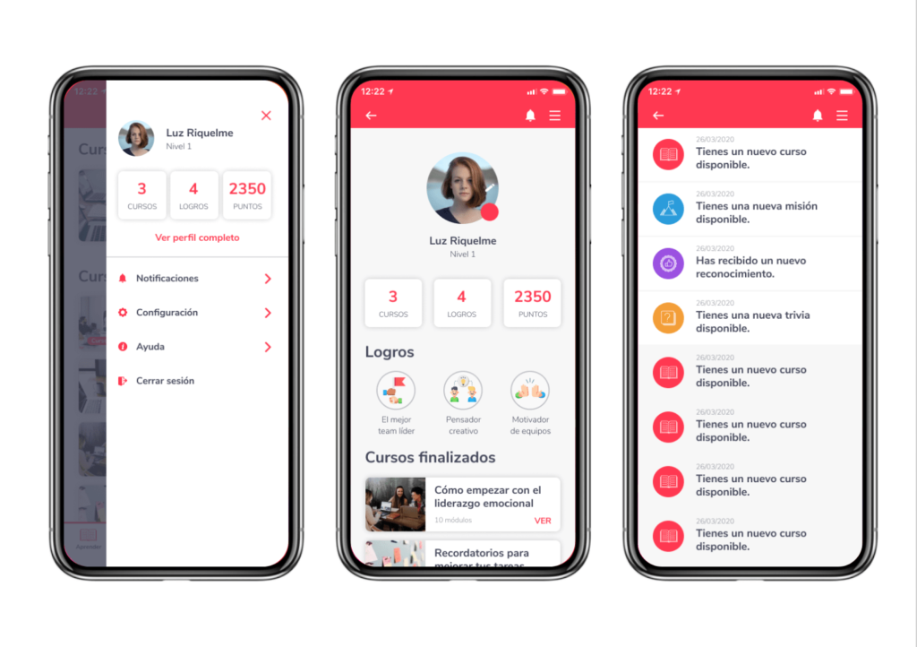
Menu and Profile
The menu slides out from the right.
The profile and notifications appear with fade in.
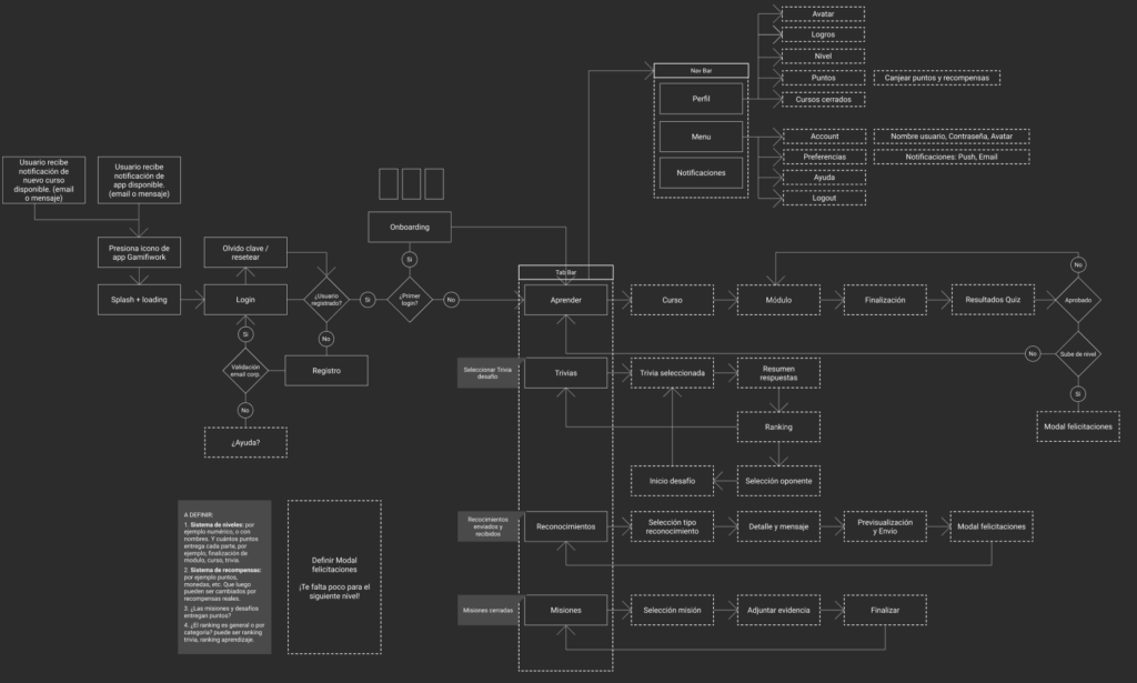
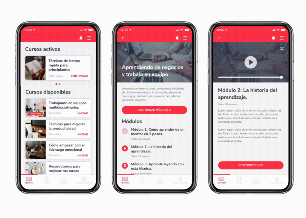
Learning
In the learning view, the active courses are moved with a left or right swipe according to position.
Course detail
In the course detail, the module icons have two states: active and finished (which is less intense).
Module detail
In detail the video can be played both vertically and horizontally.
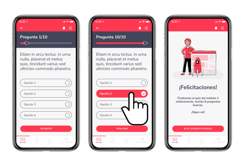
Quiz
In the quiz, the rocket progresses according to the questions that the user answers.
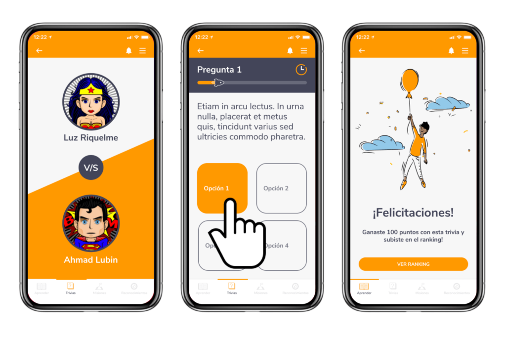
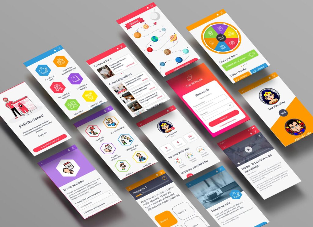
Congratulations
Once the quiz is finished it shows you the congratulations view.
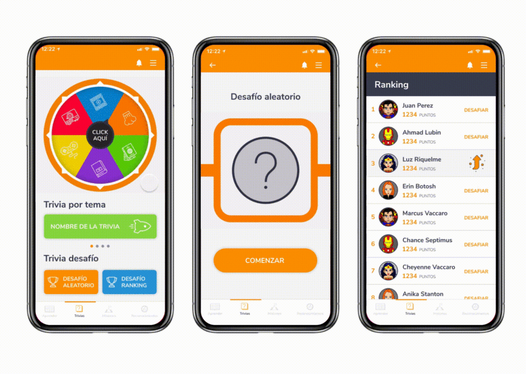
Trivia
Animated roulette lets the user select a random topic and trivia.
Also below is a button with the available trivia, which has the color of each background theme.
Below are the challenge trivia, where the user can randomly select or select someone from the ranking to challenge.
Once the opponent is selected, the avatars of both users are shown.
In the detail of the trivia, the rocket progresses according to the questions that the user answers.
It also has a timer that at the end advances to the next question.